All in One View
Content from Introduction to Omics Translation in AD
Last updated on 2026-04-21 | Edit this page
Introduction
This workshop will deliver hands-on training using the most recent computational techniques and omics data resources to improve awareness and utility of integrating multi-scale data from model systems and humans to uncover the mechanistic drivers of Alzheimer’s Disease (AD).
Despite considerable effort in drug development for AD, high rate of failure in clinical trials emphasize the need for more effective preclinical strategies, including targeted use of mouse models to study heterogenous disease phenotypes. In this era of omics-driven research, interspecies alignment of disease relevant molecular signatures relies heavily on bioinformatics tools and field-specific data infrastructures.
The goal of this workshop is to accelerate translational research in AD by training interested scientists on how to develop robust computational workflows for both hypothesis-driven and data-driven research strategies. The AD-specific, bespoke lessons will use resources from the AD Knowledge Portal, a NIA designated FAIR data repository that shares data from human and non-human studies generated by multiple collaborative research programs focused on aging, dementia, and AD.
Lesson material
Here are the R scripts and data files used in this workshop.
Content from Synapse and AD Knowledge Portal
Last updated on 2026-04-21 | Edit this page
Overview
Questions
- How can we work with the Synapse R client?
- How can we work with data in AD Knowledge Portal?
Objectives
- Explain how to use
SynapserPackage. - Demonstrate how to locate data and metadata in the AD Knowledge Portal.
- Demonstrate how to download data from the AD Knowledge Portal programmatically.
Working with AD Portal metadata
We have now downloaded several metadata files and an RNAseq counts file from the portal. For our next exercises, we want to read those files in as R data so we can work with them.
We can see from the download_table we got during the
bulk download step that we have five metadata files. Two of these should
be the individual and biospecimen files, and three of them are assay
metadata files.
R
download_table %>%
  dplyr::select(name, metadataType, assay)
We are only interested in RNAseq data, so we will only read in the individual, biospecimen, and RNAseq assay metadata files.
R
# counts matrix
counts <- read_tsv("data/htseqcounts_5XFAD.txt",
                   show_col_types = FALSE)

# individual metadata
ind_meta <- read_csv("data/Jax.IU.Pitt_5XFAD_individual_metadata.csv",
                     show_col_types = FALSE)

# biospecimen metadata
bio_meta <- read_csv("data/Jax.IU.Pitt_5XFAD_biospecimen_metadata.csv",
                     show_col_types = FALSE)

# assay metadata
rna_meta <- read_csv("data/Jax.IU.Pitt_5XFAD_assay_RNAseq_metadata.csv",
                     show_col_types = FALSE)
Let’s examine the data and metadata files a bit before we begin our
analyses. We start by exploring the counts data that we
read in using the tidyverse read_tsv()
(read_tab-separated values)
function. This function reads data in as a tibble, a kind of
data table with some nice features that avoid some bad habits of the
base R read.csv() function. Calling a tibble
object will print the first ten rows in a nice tidy output. Doing the
same for a base R dataframe read in with read.csv() will
print the whole thing until it runs out of memory. If you want to
inspect a large dataframe, use head(df) to view the first
several rows only.
R
counts
OUTPUT
# A tibble: 55,489 × 73
   gene_id `32043rh` `32044rh` `32046rh` `32047rh` `32048rh` `32049rh` `32050rh`
   <chr>       <dbl>     <dbl>     <dbl>     <dbl>     <dbl>     <dbl>     <dbl>
 1 ENSG00…     22554         0         0         0     16700         0         0
 2 ENSG00…    344489         4         0         1    260935         6         8
 3 ENSMUS…      5061      3483      3941      3088      2756      3067      2711
 4 ENSMUS…         0         0         0         0         0         0         0
 5 ENSMUS…       208       162       138       127        95       154       165
 6 ENSMUS…        44        17        14        28        23        24        14
 7 ENSMUS…       143        88       121       117       115       109        75
 8 ENSMUS…        22         6        10        11        11        19        24
 9 ENSMUS…      7165      5013      5581      4011      4104      5254      4345
10 ENSMUS…      3728      2316      2238      1965      1822      1999      1809
# ℹ 55,479 more rows
# ℹ 65 more variables: `32052rh` <dbl>, `32053rh` <dbl>, `32057rh` <dbl>,
#   `32059rh` <dbl>, `32061rh` <dbl>, `32062rh` <dbl>, `32065rh` <dbl>,
#   `32067rh` <dbl>, `32068rh` <dbl>, `32070rh` <dbl>, `32073rh` <dbl>,
#   `32074rh` <dbl>, `32075rh` <dbl>, `32078rh` <dbl>, `32081rh` <dbl>,
#   `32088rh` <dbl>, `32640rh` <dbl>, `46105rh` <dbl>, `46106rh` <dbl>,
#   `46107rh` <dbl>, `46108rh` <dbl>, `46109rh` <dbl>, `46110rh` <dbl>, …
The data file has a column of ENSEMBL gene_ids and then
a bunch of columns with count data, where the column headers correspond
to the specimenIDs. These specimenIDs should
all be in the RNAseq assay metadata file, so let’s check.
R
# what does the RNAseq assay metadata look like?
rna_meta
OUTPUT
# A tibble: 72 × 12
   specimenID platform   RIN   rnaBatch libraryBatch sequencingBatch libraryPrep
   <chr>      <chr>      <lgl>    <dbl>        <dbl>           <dbl> <chr>
 1 32043rh    IlluminaN… NA           1            1               1 polyAselec…
 2 32044rh    IlluminaN… NA           1            1               1 polyAselec…
 3 32046rh    IlluminaN… NA           1            1               1 polyAselec…
 4 32047rh    IlluminaN… NA           1            1               1 polyAselec…
 5 32049rh    IlluminaN… NA           1            1               1 polyAselec…
 6 32057rh    IlluminaN… NA           1            1               1 polyAselec…
 7 32061rh    IlluminaN… NA           1            1               1 polyAselec…
 8 32065rh    IlluminaN… NA           1            1               1 polyAselec…
 9 32067rh    IlluminaN… NA           1            1               1 polyAselec…
10 32070rh    IlluminaN… NA           1            1               1 polyAselec…
# ℹ 62 more rows
# ℹ 5 more variables: libraryPreparationMethod <lgl>, isStranded <lgl>,
#   readStrandOrigin <lgl>, runType <chr>, readLength <dbl>
R
# are all the column headers from the counts matrix
# (except the first "gene_id" column) in the assay metadata?
all(colnames(counts[-1]) %in% rna_meta$`specimenID`)
OUTPUT
[1] TRUEAssay metadata
The assay metadata contains information about how data was generated
on each sample in the assay. Each specimenID represents a
unique sample. We can use some tools from dplyr to explore
the metadata.
R
# how many unique specimens were sequenced?
n_distinct(rna_meta$`specimenID`)
OUTPUT
[1] 72R
# were the samples all sequenced on the same platform?
distinct(rna_meta, platform)
OUTPUT
# A tibble: 1 × 1
  platform
  <chr>
1 IlluminaNovaseq6000
R
# were there multiple sequencing batches reported?
distinct(rna_meta, sequencingBatch)
OUTPUT
# A tibble: 1 × 1
  sequencingBatch
            <dbl>
1               1
Biospecimen metadata
The biospecimen metadata contains specimen-level information,
including organ and tissue the specimen was taken from, how it was
prepared, etc. Each specimenID is mapped to an
individualID.
R
# all specimens from the RNAseq assay metadata file should be in the biospecimen file
all(rna_meta$`specimenID` %in% bio_meta$`specimenID`)
OUTPUT
[1] TRUER
# but the biospecimen file also contains specimens from different assays
all(bio_meta$`specimenID` %in% rna_meta$`specimenID`)
OUTPUT
[1] FALSEIndividual metadata
The individual metadata contains information about all the
individuals in the study, represented by unique
individualIDs. For humans, this includes information on
age, sex, race, diagnosis, etc. For MODEL-AD mouse models, the
individual metadata has information on model genotypes, stock numbers,
diet, and more.
R
# all `individualID`s in the biospecimen file should be in the individual file
all(bio_meta$`individualID` %in% ind_meta$`individualID`)
OUTPUT
[1] TRUER
# which model genotypes are in this study?
distinct(ind_meta, genotype)
OUTPUT
# A tibble: 2 × 1
  genotype
  <chr>
1 5XFAD_carrier
2 5XFAD_noncarrier
Joining metadata
We use the three-file structure for our metadata because it allows us
to store metadata for each study in a tidy format. Every line in the
assay and biospecimen files represents a unique specimen, and every line
in the individual file represents a unique individual. This means the
files can be easily joined by specimenID and
individualID to get all levels of metadata that apply to a
particular data file. We will use the left_join() function
from the dplyr package, and the %\>%
operator from the magrittr package. If you are unfamiliar
with the pipe, think of it as a shorthand for “take this (the preceding
object) and do that (the subsequent command)”. See magrittr for more info on
piping in R.
R
# join all the rows in the assay metadata
# that have a match in the biospecimen metadata
joined_meta <- rna_meta %>%               # start with the rnaseq assay metadata
  left_join(bio_meta, by = "specimenID") %>%  # join rows from biospecimen
                                                # that match specimenID
  left_join(ind_meta, by = "individualID") # join rows from individual
                                              # that match individualID

joined_meta
OUTPUT
# A tibble: 72 × 53
   specimenID platform   RIN   rnaBatch libraryBatch sequencingBatch libraryPrep
   <chr>      <chr>      <lgl>    <dbl>        <dbl>           <dbl> <chr>
 1 32043rh    IlluminaN… NA           1            1               1 polyAselec…
 2 32044rh    IlluminaN… NA           1            1               1 polyAselec…
 3 32046rh    IlluminaN… NA           1            1               1 polyAselec…
 4 32047rh    IlluminaN… NA           1            1               1 polyAselec…
 5 32049rh    IlluminaN… NA           1            1               1 polyAselec…
 6 32057rh    IlluminaN… NA           1            1               1 polyAselec…
 7 32061rh    IlluminaN… NA           1            1               1 polyAselec…
 8 32065rh    IlluminaN… NA           1            1               1 polyAselec…
 9 32067rh    IlluminaN… NA           1            1               1 polyAselec…
10 32070rh    IlluminaN… NA           1            1               1 polyAselec…
# ℹ 62 more rows
# ℹ 46 more variables: libraryPreparationMethod <lgl>, isStranded <lgl>,
#   readStrandOrigin <lgl>, runType <chr>, readLength <dbl>,
#   individualID <dbl>, specimenIdSource <chr>, organ <chr>, tissue <chr>,
#   BrodmannArea <lgl>, sampleStatus <chr>, tissueWeight <lgl>,
#   tissueVolume <lgl>, nucleicAcidSource <lgl>, cellType <lgl>,
#   fastingState <lgl>, isPostMortem <lgl>, samplingAge <lgl>, …
We now have a very wide dataframe that contains all the available metadata on each specimen in the RNAseq data from this study. This procedure can be used to join the three types of metadata files for every study in the AD Knowledge Portal, allowing you to filter individuals and specimens as needed based on your analysis criteria!
R
# convert columns of strings to month-date-year format
joined_meta_time <- joined_meta %>%
  mutate(dateBirth = mdy(dateBirth), dateDeath = mdy(dateDeath)) %>%

  # create a new column that subtracts dateBirth from dateDeath in days,
  # then divide by 30 to get months
  mutate(timepoint = as.numeric(difftime(dateDeath, dateBirth, units ="days"))/30) %>%

  # convert numeric ages to timepoint categories
  mutate(timepoint = case_when(timepoint > 10 ~ "12 mo",
                               timepoint < 10 & timepoint > 5 ~ "6 mo",
                               timepoint < 5 ~ "4 mo"))

covars_5XFAD <- joined_meta_time %>%
  dplyr::select(individualID, specimenID, sex, genotype, timepoint) %>%
  distinct() %>%
  as.data.frame()
rownames(covars_5XFAD) <- covars_5XFAD$specimenID

head(covars_5XFAD)
OUTPUT
        individualID specimenID    sex         genotype timepoint
32043rh        32043    32043rh female    5XFAD_carrier     12 mo
32044rh        32044    32044rh   male 5XFAD_noncarrier     12 mo
32046rh        32046    32046rh   male 5XFAD_noncarrier     12 mo
32047rh        32047    32047rh   male 5XFAD_noncarrier     12 mo
32049rh        32049    32049rh female 5XFAD_noncarrier     12 mo
32057rh        32057    32057rh female 5XFAD_noncarrier     12 mo
We will save joined_meta for the next lesson.
R
saveRDS(covars_5XFAD, file = "data/covars_5XFAD.rds")
Single Specimen files
For files that contain data from a single specimen (e.g. raw sequencing files, raw mass spectra, etc.), we can use the Synapse annotations to associate these files with the appropriate metadata.
Exercise
Use Explore Data to find all RNAseq files from the
Jax.IU.Pitt_5XFAD study. If we filter for data where
Study = "Jax.IU.Pitt_5XFAD" and
Assay = "rnaSeq" we will get a list of 148 files, including
raw fastqs and processed counts data.
We can use the function synGetAnnotations to view the
annotations associated with any file without downloading the file.
R
# the synID of a random fastq file from this list
random_fastq <- "syn22108503"

# extract the annotations as a nested list
fastq_annotations <- synGetAnnotations(random_fastq)

fastq_annotations
The file annotations let us see which study the file is associated
with (Jax.IU.Pitt.5XFAD), which species it is from (mouse),
which assay generated the file (rnaSeq), and a whole bunch of other
properties. Most importantly, single-specimen files are annotated with
the specimenID of the specimen in the file, and the
individualID of the individual that specimen was taken
from. We can use these annotations to link files to the rest of the
metadata, including metadata that is not in annotations. This is
especially helpful for human studies, as potentially identifying
information like age, race, and diagnosis is not included in file
annotations.
R
# find records belonging to the individual this file maps
# to in our joined metadata
joined_meta %>%
  filter(`individualID` == fastq_annotations$individualID[[1]])
Annotations during bulk download
When bulk downloading many files, the best practice is to preserve
the download manifest that is generated which lists all the files, their
synIDs, and all their annotations. If using the Synapse R
client, follow the instructions in the Bulk download files section
above.
If we use the “Programmatic Options” tab in the AD Portal download menu to download all 148 rnaSeq files from the 5XFAD study, we would get a table query that looks like this:
R
query <- synTableQuery("SELECT * FROM syn11346063.37
                       WHERE ( ( \"study\" HAS ( 'Jax.IU.Pitt_5XFAD' ) )
                       AND ( \"assay\" HAS ( 'rnaSeq' ) ) )")
As we saw previously, this downloads a csv file with the results of our AD Portal query. Opening that file lets us see which specimens are associated with which files:
R
annotations_table <- read_csv(query$filepath,
                              show_col_types = FALSE)
annotations_table
You could then use
purrr::walk(download_table$id, ~synGet(.x, downloadLocation = ))
to walk through the column of synIDs and download all 148
files. However, because these are large files, it might be preferable to
use the Python client or command line client for increased speed.
Once you’ve downloaded all the files in the id column,
you can link those files to their annotations by the name
column.
We’ll use the “random fastq” that we got annotations for earlier to
avoid downloading the whole 3GB file, we’ll use synGet with
downloadFile = FALSE to get only the Synapse entity
information, rather than the file. If we downloaded the actual file, we
could find it in the directory and search using the filename. Since
we’re just downloading the Synapse entity wrapper object, we’ll use the
file name listed in the object properties.
R
fastq <- synGet(random_fastq, downloadFile = FALSE)

# filter the annotations table to rows that match the fastq filename
annotations_table %>%
  filter(name == fastq$properties$name)
Multispecimen files
Multispecimen files in the AD Knowledge Portal are files that contain
data or information from more than one specimen. They are not annotated
with individualIDs or specimenIDs, since these
files may contain numbers of specimens that exceed the annotation
limits. These files are usually processed or summary data (gene counts,
peptide quantifications, etc), and are always annotated with
isMultiSpecimen = TRUE.
If we look at the processed data files in the table of 5XFAD RNAseq
file annotations we just downloaded, we will see that it
isMultiSpecimen = TRUE, but individualID and
specimenID are blank:
R
annotations_table %>%
  filter(fileFormat == "txt") %>%
  dplyr::select(name, individualID, specimenID, isMultiSpecimen)
The multispecimen file should contain a row or column of
specimenIDs that correspond to the specimenIDs
used in a study’s metadata, as we have seen with the 5XFAD counts
file.
In this example, we take a slice of the counts data to reduce
computation, transpose it so that each row represents a single specimen,
and then join it to the joined metadata by the
specimenID.
R
counts %>%
  slice_head(n = 5) %>%
  t() %>%
  as_tibble(rownames = "specimenID") %>%
  left_join(joined_meta, by = "specimenID")
OUTPUT
# A tibble: 73 × 58
   specimenID V1    V2    V3    V4    V5    platform RIN   rnaBatch libraryBatch
   <chr>      <chr> <chr> <chr> <chr> <chr> <chr>    <lgl>    <dbl>        <dbl>
 1 gene_id    "ENS… "ENS… "ENS… "ENS… "ENS… <NA>     NA          NA           NA
 2 32043rh    " 22… "344… "  5… "   … "   … Illumin… NA           1            1
 3 32044rh    "   … "   … "348… "   … " 16… Illumin… NA           1            1
 4 32046rh    "   … "   … "394… "   … " 13… Illumin… NA           1            1
 5 32047rh    "   … "   … "308… "   … " 12… Illumin… NA           1            1
 6 32048rh    " 16… "260… "  2… "   … "   … Illumin… NA           1            1
 7 32049rh    "   … "   … "306… "   … " 15… Illumin… NA           1            1
 8 32050rh    "   … "   … "271… "   … " 16… Illumin… NA           1            1
 9 32052rh    " 19… "337… "  3… "   … "   … Illumin… NA           1            1
10 32053rh    " 14… "206… "  3… "   … "   … Illumin… NA           1            1
# ℹ 63 more rows
# ℹ 48 more variables: sequencingBatch <dbl>, libraryPrep <chr>,
#   libraryPreparationMethod <lgl>, isStranded <lgl>, readStrandOrigin <lgl>,
#   runType <chr>, readLength <dbl>, individualID <dbl>,
#   specimenIdSource <chr>, organ <chr>, tissue <chr>, BrodmannArea <lgl>,
#   sampleStatus <chr>, tissueWeight <lgl>, tissueVolume <lgl>,
# nucleicAcidSource <lgl>, cellType <lgl>, fastingState <lgl>, …Content from Differential expression analysis
Last updated on 2026-04-21 | Edit this page
Overview
Questions
- What transcriptomic changes do we observe in mouse models carrying AD-related mutations?
Objectives
- Read in a count matrix and metadata.
- Understand the data from AD mouse models
- Format the data for differential analysis
- Perform differential analysis using DESeq2.
- Pathway enrichment of differentially expressed genes
- Save data for next lessons
Differential Expression Analysis
WARNING
Warning: replacing previous import 'S4Arrays::makeNindexFromArrayViewport' by
'DelayedArray::makeNindexFromArrayViewport' when loading 'SummarizedExperiment'
Reading Gene Expression Count matrix from previous lesson
In this lesson, we will use the raw counts matrix and metadata downloaded in the previous lesson and will perform differential expression analysis.
R
counts <- read.delim("data/htseqcounts_5XFAD.txt",
                      check.names = FALSE)
Reading Sample Metadata from Previous Lesson
R
covars <- readRDS("data/covars_5XFAD.rds")
Let’s explore the data:
Let’s look at the top of the metadata.
R
head(covars)
OUTPUT
        individualID specimenID    sex         genotype timepoint
32043rh        32043    32043rh female    5XFAD_carrier     12 mo
32044rh        32044    32044rh   male 5XFAD_noncarrier     12 mo
32046rh        32046    32046rh   male 5XFAD_noncarrier     12 mo
32047rh        32047    32047rh   male 5XFAD_noncarrier     12 mo
32049rh        32049    32049rh female 5XFAD_noncarrier     12 mo
32057rh        32057    32057rh female 5XFAD_noncarrier     12 mo
identify distinct groups using sample metadata
R
distinct(covars, sex, genotype, timepoint)
OUTPUT
           sex         genotype timepoint
32043rh female    5XFAD_carrier     12 mo
32044rh   male 5XFAD_noncarrier     12 mo
32049rh female 5XFAD_noncarrier     12 mo
46105rh female 5XFAD_noncarrier      6 mo
46108rh   male 5XFAD_noncarrier      6 mo
46131rh female 5XFAD_noncarrier      4 mo
46877rh   male 5XFAD_noncarrier      4 mo
46887rh female    5XFAD_carrier      4 mo
32053rh   male    5XFAD_carrier     12 mo
46111rh female    5XFAD_carrier      6 mo
46865rh   male    5XFAD_carrier      6 mo
46866rh   male    5XFAD_carrier      4 mo
How many mice were used to produce this data?
R
covars %>%
  group_by(sex, genotype, timepoint) %>%
  dplyr::count()
OUTPUT
# A tibble: 12 × 4
# Groups:   sex, genotype, timepoint [12]
   sex    genotype         timepoint     n
   <chr>  <chr>            <chr>     <int>
 1 female 5XFAD_carrier    12 mo         6
 2 female 5XFAD_carrier    4 mo          6
 3 female 5XFAD_carrier    6 mo          6
 4 female 5XFAD_noncarrier 12 mo         6
 5 female 5XFAD_noncarrier 4 mo          6
 6 female 5XFAD_noncarrier 6 mo          6
 7 male   5XFAD_carrier    12 mo         6
 8 male   5XFAD_carrier    4 mo          6
 9 male   5XFAD_carrier    6 mo          6
10 male   5XFAD_noncarrier 12 mo         6
11 male   5XFAD_noncarrier 4 mo          6
12 male   5XFAD_noncarrier 6 mo          6
How many rows and columns are there in counts?
R
dim(counts)
OUTPUT
[1] 55489 73In the counts matrix, genes are in rows and samples are in columns. Let’s look at the first few rows.
R
head(counts, n=5)
OUTPUT
             gene_id 32043rh 32044rh 32046rh 32047rh 32048rh 32049rh 32050rh
1    ENSG00000080815   22554       0       0       0   16700       0       0
2    ENSG00000142192  344489       4       0       1  260935       6       8
3 ENSMUSG00000000001    5061    3483    3941    3088    2756    3067    2711
4 ENSMUSG00000000003       0       0       0       0       0       0       0
5 ENSMUSG00000000028     208     162     138     127      95     154     165
  32052rh 32053rh 32057rh 32059rh 32061rh 32062rh 32065rh 32067rh 32068rh
1   19748   14023       0   17062       0   15986      10       0   18584
2  337456  206851       1  264748       0  252248     172       4  300398
3    3334    3841    4068    3306    4076    3732    3940    4238    3257
4       0       0       0       0       0       0       0       0       0
5     124     103     164     116     108     134     204     239     148
  32070rh 32073rh 32074rh 32075rh 32078rh 32081rh 32088rh 32640rh 46105rh
1       1       0       0   22783   17029   16626   15573   12721       4
2       4       2       9  342655  280968  258597  243373  188818      19
3    3351    3449    4654    4844    3132    3334    3639    3355    4191
4       0       0       0       0       0       0       0       0       0
5     159     167     157     211     162     149     160     103     158
  46106rh 46107rh 46108rh 46109rh 46110rh 46111rh 46112rh 46113rh 46115rh
1       0       0       0       0       0   17931       0   19087       0
2       0       0       1       5       1  293409       8  273704       1
3    3058    4265    3248    3638    3747    3971    3192    3805    3753
4       0       0       0       0       0       0       0       0       0
5     167     199     113     168     175     203     158     108     110
  46121rh 46131rh 46132rh 46134rh 46138rh 46141rh 46142rh 46862rh 46863rh
1       0       0   12703   18833       0   18702   17666       0   14834
2       0       1  187975  285048       0  284499  250600       0  218494
3    4134    3059    3116    3853    3682    2844    3466    3442    3300
4       0       0       0       0       0       0       0       0       0
5     179     137     145     183     171     138      88     154     157
  46865rh 46866rh 46867rh 46868rh 46871rh 46872rh 46873rh 46874rh 46875rh
1   10546   10830   10316   10638   15248       0       0   11608   11561
2  169516  152769  151732  190150  229063       6       1  165941  171303
3    3242    3872    3656    3739    3473    3154    5510    3657    4121
4       0       0       0       0       0       0       0       0       0
5     131     152     152     155     140      80     240     148     112
  46876rh 46877rh 46878rh 46879rh 46881rh 46882rh 46883rh 46884rh 46885rh
1       0       0   12683   15613       0   14084   20753       0       0
2       0       2  183058  216122       0  199448  306081       0       5
3    3422    3829    3996    4324    2592    2606    4600    2913    3614
4       0       0       0       0       0       0       0       0       0
5     147     166     169     215     115     101     174     127     151
  46886rh 46887rh 46888rh 46889rh 46890rh 46891rh 46892rh 46893rh 46895rh
1   16639   16072       0   16680   13367       0   25119      92       0
2  242543  258061       0  235530  196721       0  371037    1116       0
3    3294    3719    3899    4173    4008    3037    5967    3459    4262
4       0       0       0       0       0       0       0       0       0
5     139     128     210     127     156     116     260     161     189
  46896rh 46897rh
1   15934       0
2  235343       6
3    3923    3486
4       0       0
5     179     117
As you can see, the gene ids are ENSEMBL IDs. There is some risk that these may not be unique. Let’s check whether any of the gene symbols are duplicated. We will sum the number of duplicated gene symbols.
R
sum(duplicated(rownames(counts)))
OUTPUT
[1] 0The sum equals zero, so there are no duplicated gene symbols, which is good. Similarly, samples should be unique. Once again, let’s verify this:
R
sum(duplicated(colnames(counts)))
OUTPUT
[1] 0Formatting the count matrix
Now, as we see that gene_id is in first column of count
matrix, but we will need only count data in matrix, so we will change
the gene_id column to rownames.
R
# Converting the `gene_id` as `rownames` of `counts` matrix
counts <- counts %>%
          column_to_rownames(., var = "gene_id") %>%
          as.data.frame()
Let’s confirm if change is done correctly.
R
head(counts, n=5)
OUTPUT
                   32043rh 32044rh 32046rh 32047rh 32048rh 32049rh 32050rh
ENSG00000080815      22554       0       0       0   16700       0       0
ENSG00000142192     344489       4       0       1  260935       6       8
ENSMUSG00000000001    5061    3483    3941    3088    2756    3067    2711
ENSMUSG00000000003       0       0       0       0       0       0       0
ENSMUSG00000000028     208     162     138     127      95     154     165
                   32052rh 32053rh 32057rh 32059rh 32061rh 32062rh 32065rh
ENSG00000080815      19748   14023       0   17062       0   15986      10
ENSG00000142192     337456  206851       1  264748       0  252248     172
ENSMUSG00000000001    3334    3841    4068    3306    4076    3732    3940
ENSMUSG00000000003       0       0       0       0       0       0       0
ENSMUSG00000000028     124     103     164     116     108     134     204
                   32067rh 32068rh 32070rh 32073rh 32074rh 32075rh 32078rh
ENSG00000080815          0   18584       1       0       0   22783   17029
ENSG00000142192          4  300398       4       2       9  342655  280968
ENSMUSG00000000001    4238    3257    3351    3449    4654    4844    3132
ENSMUSG00000000003       0       0       0       0       0       0       0
ENSMUSG00000000028     239     148     159     167     157     211     162
                   32081rh 32088rh 32640rh 46105rh 46106rh 46107rh 46108rh
ENSG00000080815      16626   15573   12721       4       0       0       0
ENSG00000142192     258597  243373  188818      19       0       0       1
ENSMUSG00000000001    3334    3639    3355    4191    3058    4265    3248
ENSMUSG00000000003       0       0       0       0       0       0       0
ENSMUSG00000000028     149     160     103     158     167     199     113
                   46109rh 46110rh 46111rh 46112rh 46113rh 46115rh 46121rh
ENSG00000080815          0       0   17931       0   19087       0       0
ENSG00000142192          5       1  293409       8  273704       1       0
ENSMUSG00000000001    3638    3747    3971    3192    3805    3753    4134
ENSMUSG00000000003       0       0       0       0       0       0       0
ENSMUSG00000000028     168     175     203     158     108     110     179
                   46131rh 46132rh 46134rh 46138rh 46141rh 46142rh 46862rh
ENSG00000080815          0   12703   18833       0   18702   17666       0
ENSG00000142192          1  187975  285048       0  284499  250600       0
ENSMUSG00000000001    3059    3116    3853    3682    2844    3466    3442
ENSMUSG00000000003       0       0       0       0       0       0       0
ENSMUSG00000000028     137     145     183     171     138      88     154
                   46863rh 46865rh 46866rh 46867rh 46868rh 46871rh 46872rh
ENSG00000080815      14834   10546   10830   10316   10638   15248       0
ENSG00000142192     218494  169516  152769  151732  190150  229063       6
ENSMUSG00000000001    3300    3242    3872    3656    3739    3473    3154
ENSMUSG00000000003       0       0       0       0       0       0       0
ENSMUSG00000000028     157     131     152     152     155     140      80
                   46873rh 46874rh 46875rh 46876rh 46877rh 46878rh 46879rh
ENSG00000080815          0   11608   11561       0       0   12683   15613
ENSG00000142192          1  165941  171303       0       2  183058  216122
ENSMUSG00000000001    5510    3657    4121    3422    3829    3996    4324
ENSMUSG00000000003       0       0       0       0       0       0       0
ENSMUSG00000000028     240     148     112     147     166     169     215
                   46881rh 46882rh 46883rh 46884rh 46885rh 46886rh 46887rh
ENSG00000080815          0   14084   20753       0       0   16639   16072
ENSG00000142192          0  199448  306081       0       5  242543  258061
ENSMUSG00000000001    2592    2606    4600    2913    3614    3294    3719
ENSMUSG00000000003       0       0       0       0       0       0       0
ENSMUSG00000000028     115     101     174     127     151     139     128
                   46888rh 46889rh 46890rh 46891rh 46892rh 46893rh 46895rh
ENSG00000080815          0   16680   13367       0   25119      92       0
ENSG00000142192          0  235530  196721       0  371037    1116       0
ENSMUSG00000000001    3899    4173    4008    3037    5967    3459    4262
ENSMUSG00000000003       0       0       0       0       0       0       0
ENSMUSG00000000028     210     127     156     116     260     161     189
                   46896rh 46897rh
ENSG00000080815      15934       0
ENSG00000142192     235343       6
ENSMUSG00000000001    3923    3486
ENSMUSG00000000003       0       0
ENSMUSG00000000028     179     117
As you can see from count table there are some genes that start with
ENSG and others start with ENSMUSG.
ENSG refers to human gene ENSEMBL id and
ENSMUSG refer to mouse ENSEMBL id. Let’s check how many
gene_ids are NOT from the mouse genome by searching for the
string “MUS” (as in Mus musculus) in the rownames
of the counts matrix.
R
counts[, 1:6] %>%
  filter(!str_detect(rownames(.), "MUS"))
OUTPUT
                32043rh 32044rh 32046rh 32047rh 32048rh 32049rh
ENSG00000080815   22554       0       0       0   16700       0
ENSG00000142192  344489       4       0       1  260935       6
Ok, so we see there are two human genes in out count matrix. Why? What genes are they?
Briefly, the 5xFAD mouse strain harbors two human transgenes APP
(ENSG00000142192) and PSEN1 (ENSG00000080815)
and inserted into exon 2 of the mouse Thy1 gene. To validate 5XFAD
strain and capture expression of human transgene APP and PS1, a custom
mouse genomic sequence was created and we quantified expression of human
as well as mouse App (ENSMUSG00000022892) and Psen1
(ENSMUSG00000019969) genes by our MODEL-AD RNA-Seq
pipeline.
Validation of 5xFAD mouse strain
First we convert the dataframe to longer format and join our
covariates by MouseID.
R
count_tpose <-  counts  %>%
                rownames_to_column(., var = "gene_id") %>%
                filter(gene_id %in%
                      c("ENSG00000080815",
                        "ENSMUSG00000019969",
                        "ENSG00000142192",
                        "ENSMUSG00000022892")) %>%
                pivot_longer(., cols    = -"gene_id",
                              names_to  = "specimenID",
                              values_to = "counts") %>%
                as.data.frame() %>%
                left_join(covars, by="specimenID") %>%
                as.data.frame()

head(count_tpose)
OUTPUT
          gene_id specimenID counts individualID    sex         genotype
1 ENSG00000080815    32043rh  22554        32043 female    5XFAD_carrier
2 ENSG00000080815    32044rh      0        32044   male 5XFAD_noncarrier
3 ENSG00000080815    32046rh      0        32046   male 5XFAD_noncarrier
4 ENSG00000080815    32047rh      0        32047   male 5XFAD_noncarrier
5 ENSG00000080815    32048rh  16700        32048 female    5XFAD_carrier
6 ENSG00000080815    32049rh      0        32049 female 5XFAD_noncarrier
  timepoint
1     12 mo
2     12 mo
3     12 mo
4     12 mo
5     12 mo
6     12 mo
Rename the APP and PSEN1 genes to specify whether mouse or human.
R
# make the age column a factor and re-order the levels
count_tpose$timepoint <- factor(count_tpose$timepoint,
                                levels = c("4 mo", "6 mo", "12 mo"))

# rename the gene id to gene symbol
count_tpose$gene_id[count_tpose$gene_id %in% "ENSG00000142192"] <-
  "Human APP"
count_tpose$gene_id[count_tpose$gene_id %in% "ENSG00000080815"] <-
  "Human PSEN1"
count_tpose$gene_id[count_tpose$gene_id %in% "ENSMUSG00000022892"] <-
  "Mouse App"
count_tpose$gene_id[count_tpose$gene_id %in% "ENSMUSG00000019969"] <-
  "Mouse Psen1"
Visualize orthologous genes.
R
# Create simple box plots showing normalized counts
# by genotype and time point faceted by sex.
count_tpose %>%
  ggplot(aes(x = timepoint, y = counts, color = genotype)) +
        geom_boxplot() +
        geom_point(position = position_jitterdodge()) +
        facet_wrap(~ sex + gene_id) +
        theme_bw()
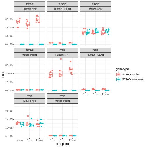
You will notice expression of Human APP is higher in 5XFAD carriers but lower in non-carriers. However mouse App expressed in both 5XFAD carrier and non-carrier.
We are going to sum the counts from both orthologous genes (human APP and mouse App; human PSEN1 and mouse Psen1) and save the summed expression as expression of mouse genes, respectively to match with gene names in control mice.
R
# merge mouse and human APP gene raw count
counts[rownames(counts)   %in% "ENSMUSG00000022892", ] <-
  counts[rownames(counts) %in% "ENSMUSG00000022892", ] +
  counts[rownames(counts) %in% "ENSG00000142192", ]

counts <- counts[!rownames(counts) %in% c("ENSG00000142192"), ]

# merge mouse and human PS1 gene raw count
counts[rownames(counts)   %in% "ENSMUSG00000019969", ] <-
  counts[rownames(counts) %in% "ENSMUSG00000019969", ] +
  counts[rownames(counts) %in% "ENSG00000080815", ]

counts <- counts[!rownames(counts) %in% c("ENSG00000080815"), ]
Let’s verify if expression of both human genes have been merged or not:
R
counts[, 1:6] %>%
  filter(!str_detect(rownames(.), "MUS"))
OUTPUT
[1] 32043rh 32044rh 32046rh 32047rh 32048rh 32049rh
<0 rows> (or 0-length row.names)
What proportion of genes have zero counts in all samples?
R
gene_sums <- data.frame(gene_id = rownames(counts),
                        sums    = Matrix::rowSums(counts))
sum(gene_sums$sums == 0)
OUTPUT
[1] 9691We can see that 9,691 (17%) genes have no reads at all associated with them. In the next lesson, we will remove genes that have no counts in any samples.
Differential Analysis using DESeq2
Now, after exploring and formatting the data, We will look for differential expression between the control and 5xFAD mice at different ages for both sexes. The differentially expressed genes (DEGs) can inform our understanding of how the 5XFAD mutation affects biological processes.
DESeq2 analysis consist of multiple steps. We are going to briefly understand some of the important steps using a subset of data and then we will perform differential analysis on the whole dataset.
First, order the data (so counts and metadata specimenID
orders match) and save as another variable name.
R
rawdata  <- counts[, sort(colnames(counts))]
metadata <- covars[sort(rownames(covars)), ]
Subset the counts matrix and sample metadata to include only 12-month old male mice. You can amend the code to compare wild type and 5XFAD mice from either sex, at any time point.
R
meta.12M.Male <- metadata[(metadata$sex           == "male" &
                           metadata$timepoint     == "12 mo"), ]

meta.12M.Male
OUTPUT
        individualID specimenID  sex         genotype timepoint
32044rh        32044    32044rh male 5XFAD_noncarrier     12 mo
32046rh        32046    32046rh male 5XFAD_noncarrier     12 mo
32047rh        32047    32047rh male 5XFAD_noncarrier     12 mo
32053rh        32053    32053rh male    5XFAD_carrier     12 mo
32059rh        32059    32059rh male    5XFAD_carrier     12 mo
32061rh        32061    32061rh male 5XFAD_noncarrier     12 mo
32062rh        32062    32062rh male    5XFAD_carrier     12 mo
32073rh        32073    32073rh male 5XFAD_noncarrier     12 mo
32074rh        32074    32074rh male 5XFAD_noncarrier     12 mo
32075rh        32075    32075rh male    5XFAD_carrier     12 mo
32088rh        32088    32088rh male    5XFAD_carrier     12 mo
32640rh        32640    32640rh male    5XFAD_carrier     12 mo
R
dat <- as.matrix(rawdata[ , colnames(rawdata) %in%
                            rownames(meta.12M.Male)])
colnames(dat)
OUTPUT
 [1] "32044rh" "32046rh" "32047rh" "32053rh" "32059rh" "32061rh" "32062rh"
 [8] "32073rh" "32074rh" "32075rh" "32088rh" "32640rh"
R
rownames(meta.12M.Male)
OUTPUT
 [1] "32044rh" "32046rh" "32047rh" "32053rh" "32059rh" "32061rh" "32062rh"
 [8] "32073rh" "32074rh" "32075rh" "32088rh" "32640rh"
R
match(colnames(dat), rownames(meta.12M.Male))
OUTPUT
[1] 1 2 3 4 5 6 7 8 9 10 11 12Next, we build the DESeqDataSet using the following
function:
R
ddsHTSeq <- DESeqDataSetFromMatrix(countData = dat,
                                   colData   = meta.12M.Male,
                                   design    = ~ genotype)
WARNING
Warning in DESeqDataSet(se, design = design, ignoreRank): some variables in
design formula are characters, converting to factors
R
ddsHTSeq
OUTPUT
class: DESeqDataSet
dim: 55487 12
metadata(1): version
assays(1): counts
rownames(55487): ENSMUSG00000000001 ENSMUSG00000000003 ...
  ENSMUSG00000118487 ENSMUSG00000118488
rowData names(0):
colnames(12): 32044rh 32046rh ... 32088rh 32640rh
colData names(5): individualID specimenID sex genotype timepoint
Pre-filtering
While it is not necessary to pre-filter low count genes before running the DESeq2 functions, there are two reasons which make pre-filtering useful: by removing rows in which there are very few reads, we reduce the memory size of the dds data object, and we increase the speed of the transformation and testing functions within DESeq2. It can also improve visualizations, as features with no information for differential expression are not plotted.
Here we perform a minimal pre-filtering to keep only rows that have at least 10 reads total.
R
ddsHTSeq <- ddsHTSeq[rowSums(counts(ddsHTSeq)) >= 10, ]

ddsHTSeq
OUTPUT
class: DESeqDataSet
dim: 33059 12
metadata(1): version
assays(1): counts
rownames(33059): ENSMUSG00000000001 ENSMUSG00000000028 ...
  ENSMUSG00000118486 ENSMUSG00000118487
rowData names(0):
colnames(12): 32044rh 32046rh ... 32088rh 32640rh
colData names(5): individualID specimenID sex genotype timepoint
Reference level
By default, R will choose a reference level for factors based on
alphabetical order. Then, if you never tell the DESeq2
functions which level you want to compare against (e.g. which
level represents the control group), the comparisons will be based on
the alphabetical order of the levels.
R
# specifying the reference-level to `5XFAD_noncarrier`
ddsHTSeq$genotype <- relevel(ddsHTSeq$genotype, ref = "5XFAD_noncarrier")
Run the standard differential expression analysis steps that is
wrapped into a single function, DESeq.
R
dds <- DESeq(ddsHTSeq, parallel = TRUE)
OUTPUT
estimating size factorsOUTPUT
estimating dispersionsOUTPUT
gene-wise dispersion estimates: 2 workersOUTPUT
mean-dispersion relationshipOUTPUT
final dispersion estimates, fitting model and testing: 2 workersResults tables are generated using the function results, which
extracts a results table with log2 fold changes, p-values and adjusted
p-values. By default the argument alpha is set to 0.1. If
the adjusted p-value cutoff will be a value other than 0.1, alpha should
be set to that value:
R
res <- results(dds, alpha=0.05)  # setting 0.05 as significant threshold
res
OUTPUT
log2 fold change (MLE): genotype 5XFAD carrier vs 5XFAD noncarrier
Wald test p-value: genotype 5XFAD carrier vs 5XFAD noncarrier
DataFrame with 33059 rows and 6 columns
                    baseMean log2FoldChange     lfcSE      stat    pvalue
                   <numeric>      <numeric> <numeric> <numeric> <numeric>
ENSMUSG00000000001 3737.9009      0.0148125 0.0466948  0.317219 0.7510777
ENSMUSG00000000028  138.5635     -0.0712500 0.1550131 -0.459639 0.6457754
ENSMUSG00000000031   29.2983      0.6705922 0.3563442  1.881866 0.0598541
ENSMUSG00000000037  123.6482     -0.2184054 0.1554362 -1.405113 0.1599876
ENSMUSG00000000049   15.1733      0.3657555 0.3924376  0.932010 0.3513316
...                      ...            ...       ...       ...       ...
ENSMUSG00000118473   1.18647      -0.377971  1.531586 -0.246784  0.805075
ENSMUSG00000118477  59.10359      -0.144081  0.226690 -0.635586  0.525046
ENSMUSG00000118479  24.64566      -0.181992  0.341445 -0.533006  0.594029
ENSMUSG00000118486   1.92048       0.199838  1.253875  0.159376  0.873372
ENSMUSG00000118487  65.78311      -0.191362  0.218593 -0.875427  0.381342
                        padj
                   <numeric>
ENSMUSG00000000001  0.943421
ENSMUSG00000000028  0.913991
ENSMUSG00000000031  0.352346
ENSMUSG00000000037  0.566360
ENSMUSG00000000049  0.765640
...                      ...
ENSMUSG00000118473        NA
ENSMUSG00000118477  0.863565
ENSMUSG00000118479  0.893356
ENSMUSG00000118486        NA
ENSMUSG00000118487  0.785846
We can order our results table by the smallest p-value:
R
resOrdered <- res[order(res$pvalue), ]

head(resOrdered, n=10)
OUTPUT
log2 fold change (MLE): genotype 5XFAD carrier vs 5XFAD noncarrier
Wald test p-value: genotype 5XFAD carrier vs 5XFAD noncarrier
DataFrame with 10 rows and 6 columns
                     baseMean log2FoldChange     lfcSE      stat       pvalue
                    <numeric>      <numeric> <numeric> <numeric>    <numeric>
ENSMUSG00000019969  13860.942        1.90740 0.0432685   44.0828  0.00000e+00
ENSMUSG00000030579   2367.096        2.61215 0.0749326   34.8600 2.99982e-266
ENSMUSG00000046805   7073.296        2.12247 0.0635035   33.4229 6.38461e-245
ENSMUSG00000032011  80423.476        1.36195 0.0424007   32.1210 2.24203e-226
ENSMUSG00000022892 271265.838        1.36140 0.0434167   31.3567 7.88742e-216
ENSMUSG00000038642  10323.969        1.69717 0.0549488   30.8864 1.81875e-209
ENSMUSG00000023992   2333.227        2.62290 0.0882819   29.7105 5.61838e-194
ENSMUSG00000079293    761.313        5.12514 0.1738382   29.4822 4.86644e-191
ENSMUSG00000040552    617.149        2.22726 0.0781799   28.4889 1.60609e-178
ENSMUSG00000069516   2604.926        2.34471 0.0847390   27.6697 1.61630e-168
                           padj
                      <numeric>
ENSMUSG00000019969  0.00000e+00
ENSMUSG00000030579 3.60954e-262
ENSMUSG00000046805 5.12152e-241
ENSMUSG00000032011 1.34886e-222
ENSMUSG00000022892 3.79622e-212
ENSMUSG00000038642 7.29469e-206
ENSMUSG00000023992 1.93152e-190
ENSMUSG00000079293 1.46389e-187
ENSMUSG00000040552 4.29450e-175
ENSMUSG00000069516 3.88961e-165
We can summarize some basic tallies using the summary function.
R
summary(res)
OUTPUT
out of 33059 with nonzero total read count
adjusted p-value < 0.05
LFC > 0 (up)       : 1098, 3.3%
LFC < 0 (down)     : 505, 1.5%
outliers [1]       : 33, 0.1%
low counts [2]     : 8961, 27%
(mean count < 8)
[1] see 'cooksCutoff' argument of ?results
[2] see 'independentFiltering' argument of ?results
How many adjusted p-values were less than 0.05?
R
sum(res$padj < 0.05, na.rm=TRUE)
OUTPUT
[1] 1603How many adjusted p-values were less than 0.1?
R
sum(res$padj < 0.1, na.rm=TRUE)
OUTPUT
[1] 2001Function to convert ensembleIDs to common gene names
We’ll use a package to translate mouse ENSEMBL IDS to gene names. Run this function and they will be called up when assembling results from the differential expression analysis.
R
map_function.df <- function(x, inputtype, outputtype) {
                            mapIds( org.Mm.eg.db,
                                    keys      = row.names(x),
                                    column    = outputtype,
                                    keytype   = inputtype,
                                    multiVals = "first")
                            }
Generating Results table
Here we will call the function to get the symbol names
of the genes incorporated into the results table, along with the columns
we are most interested in.
R
All_res <- as.data.frame(res) %>%

           # run map_function to add symbol of gene corresponding to ENSEMBL ID
           mutate(symbol = map_function.df(res, "ENSEMBL", "SYMBOL")) %>%

           # run map_function to add Entrez ID of gene corresponding to ENSEMBL ID
           mutate(EntrezGene = map_function.df(res, "ENSEMBL", "ENTREZID")) %>%
           dplyr::select("symbol",
                         "EntrezGene",
                         "baseMean",
                         "log2FoldChange",
                         "lfcSE",
                         "stat",
                         "pvalue",
                         "padj")
OUTPUT
'select()' returned 1:many mapping between keys and columns
'select()' returned 1:many mapping between keys and columns
R
head(All_res)
OUTPUT
                   symbol EntrezGene   baseMean log2FoldChange      lfcSE
ENSMUSG00000000001  Gnai3      14679 3737.90089     0.01481247 0.04669481
ENSMUSG00000000028  Cdc45      12544  138.56354    -0.07125004 0.15501305
ENSMUSG00000000031    H19      14955   29.29832     0.67059217 0.35634418
ENSMUSG00000000037  Scml2     107815  123.64823    -0.21840544 0.15543617
ENSMUSG00000000049   Apoh      11818   15.17325     0.36575555 0.39243756
ENSMUSG00000000056   Narf      67608 5017.30216    -0.06713961 0.04466809
                         stat     pvalue      padj
ENSMUSG00000000001  0.3172187 0.75107766 0.9434210
ENSMUSG00000000028 -0.4596390 0.64577537 0.9139907
ENSMUSG00000000031  1.8818665 0.05985415 0.3523459
ENSMUSG00000000037 -1.4051134 0.15998756 0.5663602
ENSMUSG00000000049  0.9320095 0.35133160 0.7656400
ENSMUSG00000000056 -1.5030778 0.13281898 0.5203335
Extracting genes that are significantly expressed
Let’s subset all the genes with a p-value < 0.05.
R
dseq_res <- subset(All_res[order(All_res$padj), ], padj < 0.05)
Wow! We have a lot of genes with apparently very strong statistically significant differences between the control and 5xFAD carrier.
R
dim(dseq_res)
OUTPUT
[1] 1603 8R
head(dseq_res)
OUTPUT
                   symbol EntrezGene   baseMean log2FoldChange      lfcSE
ENSMUSG00000019969  Psen1      19164  13860.942       1.907397 0.04326854
ENSMUSG00000030579 Tyrobp      22177   2367.096       2.612152 0.07493257
ENSMUSG00000046805  Mpeg1      17476   7073.296       2.122467 0.06350348
ENSMUSG00000032011   Thy1      21838  80423.476       1.361953 0.04240065
ENSMUSG00000022892    App      11820 271265.838       1.361405 0.04341673
ENSMUSG00000038642   Ctss      13040  10323.969       1.697172 0.05494883
                       stat        pvalue          padj
ENSMUSG00000019969 44.08277  0.000000e+00  0.000000e+00
ENSMUSG00000030579 34.86004 2.999825e-266 3.609539e-262
ENSMUSG00000046805 33.42285 6.384608e-245 5.121519e-241
ENSMUSG00000032011 32.12104 2.242032e-226 1.348863e-222
ENSMUSG00000022892 31.35669 7.887422e-216 3.796216e-212
ENSMUSG00000038642 30.88640 1.818747e-209 7.294691e-206
Exploring and exporting results
Exporting results to CSV files
We can save results file into a csv file like this:
R
write.csv(All_res, file="results/All_5xFAD_12months_male.csv")
write.csv(dseq_res, file="results/DEG_5xFAD_12months_male.csv")
Volcano plot
We can visualize the differential expression results using the
volcano plot function from EnhancedVolcano package. For the
most basic volcano plot, only a single data frame, data matrix, or
tibble of test results is required, containing point labels, log2FC, and
adjusted or unadjusted p-values. The default cut-off for log2FC is
>|2|; the default cut-off for p-value is 10e-6.
R
EnhancedVolcano(All_res,
                lab            = (All_res$symbol),
                x              = 'log2FoldChange',
                y              = 'padj',
                legendPosition = 'none',
                title          = 'Volcano plot:Differential Expression Results',
                subtitle       = '',
                FCcutoff       = 0.1,
                pCutoff        = 0.05,
                xlim           = c(-3, 6))
WARNING
Warning: One or more p-values is 0. Converting to 10^-1 * current lowest
non-zero p-value...
WARNING
Warning: Using `size` aesthetic for lines was deprecated in ggplot2 3.4.0.
ℹ Please use `linewidth` instead.
ℹ The deprecated feature was likely used in the EnhancedVolcano package.
  Please report the issue to the authors.
This warning is displayed once per session.
Call `lifecycle::last_lifecycle_warnings()` to see where this warning was
generated.
WARNING
Warning: The `size` argument of `element_line()` is deprecated as of ggplot2 3.4.0.
ℹ Please use the `linewidth` argument instead.
ℹ The deprecated feature was likely used in the EnhancedVolcano package.
  Please report the issue to the authors.
This warning is displayed once per session.
Call `lifecycle::last_lifecycle_warnings()` to see where this warning was
generated.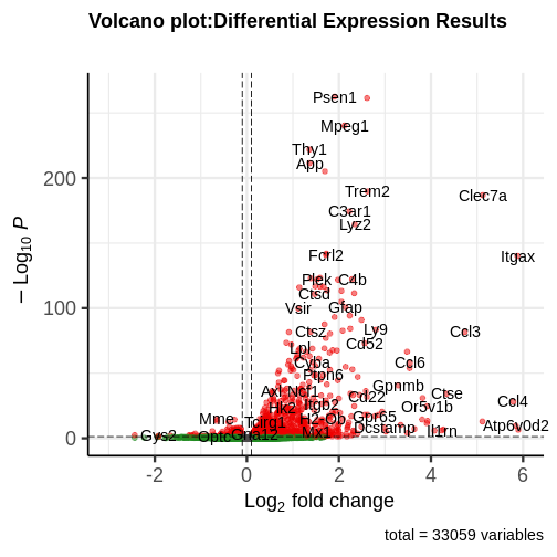
You can see that some top significantly expressed are immune/inflammation-related genes such as Ctsd, C4b, Csf1 etc. These genes are upregulated in the 5XFAD strain.
Principal component plot of the samples
Principal component analysis is a dimension reduction technique that reduces the dimensionality of these large matrixes into a linear coordinate system, so that we can more easily visualize what factors are contributing the most to variation in the dataset by graphing the principal components.
R
ddsHTSeq <- DESeqDataSetFromMatrix(countData = as.matrix(rawdata),
                                   colData   = metadata,
                                   design    = ~ genotype)
WARNING
Warning in DESeqDataSet(se, design = design, ignoreRank): some variables in
design formula are characters, converting to factors
R
ddsHTSeq <- ddsHTSeq[rowSums(counts(ddsHTSeq) > 1) >= 10, ]
dds <- DESeq(ddsHTSeq, parallel = TRUE)
OUTPUT
estimating size factorsOUTPUT
estimating dispersionsOUTPUT
gene-wise dispersion estimates: 2 workersOUTPUT
mean-dispersion relationshipOUTPUT
final dispersion estimates, fitting model and testing: 2 workersOUTPUT
-- replacing outliers and refitting for 42 genes
-- DESeq argument 'minReplicatesForReplace' = 7
-- original counts are preserved in counts(dds)
OUTPUT
estimating dispersionsOUTPUT
fitting model and testingR
vsd <- varianceStabilizingTransformation(dds, blind = FALSE)
plotPCA(vsd, intgroup = c("genotype", "sex", "timepoint"))
OUTPUT
using ntop=500 top features by variance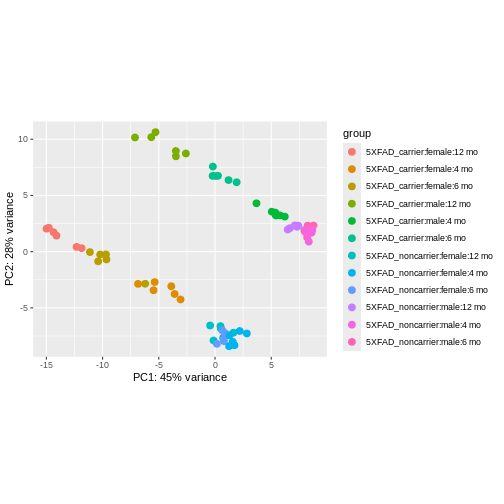
We can see that clustering is occurring, though it’s kind of hard to see exactly how they are clustering in this visualization.
It is also possible to customize the PCA plot using the
ggplot function.
R
pcaData <- plotPCA(vsd,
                   intgroup   = c("genotype", "sex","timepoint"),
                   returnData = TRUE)
OUTPUT
using ntop=500 top features by varianceR
percentVar <- round(100 * attr(pcaData, "percentVar"))

ggplot(pcaData, aes(PC1, PC2,color = genotype, shape = sex)) +
       geom_point(size=3) +
       geom_text(aes(label = timepoint), hjust=0.5, vjust=2, size =3.5) +
       labs(x = paste0("PC1: ", percentVar[1], "% variance"),
            y = paste0("PC2: ", percentVar[2], "% variance"))
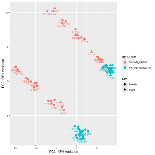
PCA identified genotype and sex being a major source of variation in between 5XFAD and WT mice. Female and male samples from the 5XFAD carriers clustered distinctly at all ages, suggesting the presence of sex-biased molecular changes in animals.
Function for Differential analysis using DESeq2
Finally, we can build a function for differential analysis that consists of all above discussed steps. It will require to input sorted raw count matrix, sample metadata and define the reference group.
R
DEG <- function(rawdata, meta, include.batch = FALSE, ref = ref) {
                dseq_res <- data.frame()
                All_res  <- data.frame()

                if (include.batch) {
                    cat("Including batch as covariate\n")
                    design_formula <- ~ Batch + genotype
                    }
                else {
                    design_formula <- ~ genotype
                    }

                dat2 <- as.matrix(rawdata[, colnames(rawdata) %in%
                                            rownames(meta)])

                ddsHTSeq <- DESeqDataSetFromMatrix(countData = dat2,
                            colData = meta,
                            design = design_formula)

                ddsHTSeq <- ddsHTSeq[rowSums(counts(ddsHTSeq)) >= 10, ]

                ddsHTSeq$genotype <- relevel(ddsHTSeq$genotype, ref = ref)

                dds <- DESeq(ddsHTSeq, parallel = TRUE)

                res <- results(dds, alpha = 0.05)
                #summary(res)

                res$symbol <- map_function.df(res,"ENSEMBL","SYMBOL")

                res$EntrezGene <- map_function.df(res,"ENSEMBL","ENTREZID")

                All_res <<- as.data.frame(res[, c("symbol",
                                                  "EntrezGene",
                                                  "baseMean",
                                                  "log2FoldChange",
                                                  "lfcSE",
                                                  "stat",
                                                  "pvalue",
                                                  "padj")])
              }
Let’s use this function to analyze all groups present in our data.
Differential Analysis of all groups
First, we add a Group column to our metadata table that
will combine all variables of interest (genotype,
sex, and timepoint) for each sample.
R
metadata$Group <- paste0(metadata$genotype,
                         "-",
                         metadata$sex,
                         "-",
                         metadata$timepoint)
unique(metadata$Group)
OUTPUT
 [1] "5XFAD_carrier-female-12 mo"    "5XFAD_noncarrier-male-12 mo"
 [3] "5XFAD_noncarrier-female-12 mo" "5XFAD_carrier-male-12 mo"
 [5] "5XFAD_noncarrier-female-6 mo"  "5XFAD_noncarrier-male-6 mo"
 [7] "5XFAD_carrier-female-6 mo"     "5XFAD_noncarrier-female-4 mo"
 [9] "5XFAD_carrier-female-4 mo"     "5XFAD_carrier-male-6 mo"
[11] "5XFAD_carrier-male-4 mo"       "5XFAD_noncarrier-male-4 mo"
Next, we create a comparison table that has all cases and controls that we would like to compare with each other. Here I have made comparison groups for age and sex-matched 5xFAD carriers vs 5xFAD_noncarriers, with carriers as the cases and noncarriers as the controls:
R
comparisons <-  data.frame(control = c("5XFAD_noncarrier-male-4 mo",
                                       "5XFAD_noncarrier-female-4 mo",
                                       "5XFAD_noncarrier-male-6 mo",
                                       "5XFAD_noncarrier-female-6 mo",
                                       "5XFAD_noncarrier-male-12 mo",
                                       "5XFAD_noncarrier-female-12 mo"),
                           case    = c("5XFAD_carrier-male-4 mo",
                                       "5XFAD_carrier-female-4 mo",
                                       "5XFAD_carrier-male-6 mo",
                                       "5XFAD_carrier-female-6 mo",
                                       "5XFAD_carrier-male-12 mo",
                                       "5XFAD_carrier-female-12 mo"))
R
comparisons
OUTPUT
                        control                       case
1    5XFAD_noncarrier-male-4 mo    5XFAD_carrier-male-4 mo
2  5XFAD_noncarrier-female-4 mo  5XFAD_carrier-female-4 mo
3    5XFAD_noncarrier-male-6 mo    5XFAD_carrier-male-6 mo
4  5XFAD_noncarrier-female-6 mo  5XFAD_carrier-female-6 mo
5   5XFAD_noncarrier-male-12 mo   5XFAD_carrier-male-12 mo
6 5XFAD_noncarrier-female-12 mo 5XFAD_carrier-female-12 mo
Finally, we implement our DEG function on each
case/control comparison of interest and store the result table in a list
and data frame:
R
# initiate an empty list and data frame to save results
DE_5xFAD.list <- list()
DE_5xFAD.df   <- data.frame()

for (i in 1:nrow(comparisons))
  {
    meta <- metadata[metadata$Group %in% comparisons[i,],]
    DEG(rawdata, meta, ref = "5XFAD_noncarrier")

    # append results in data frame
    DE_5xFAD.df <- rbind(DE_5xFAD.df,
                         All_res %>%
                         mutate(model = "5xFAD",
                                sex   = unique(meta$sex),
                                age   = unique(meta$timepoint)))

    # append results in list
    DE_5xFAD.list[[i]] <- All_res
    names(DE_5xFAD.list)[i] <- paste0(comparisons[i,2])
}
WARNING
Warning in DESeqDataSet(se, design = design, ignoreRank): some variables in
design formula are characters, converting to factors
OUTPUT
estimating size factorsOUTPUT
estimating dispersionsOUTPUT
gene-wise dispersion estimates: 2 workersOUTPUT
mean-dispersion relationshipOUTPUT
final dispersion estimates, fitting model and testing: 2 workersOUTPUT
'select()' returned 1:many mapping between keys and columns
'select()' returned 1:many mapping between keys and columns
Let’s explore the result stored in our list:
R
names(DE_5xFAD.list)
OUTPUT
[1] "5XFAD_carrier-male-4 mo"    "5XFAD_carrier-female-4 mo"
[3] "5XFAD_carrier-male-6 mo"    "5XFAD_carrier-female-6 mo"
[5] "5XFAD_carrier-male-12 mo"   "5XFAD_carrier-female-12 mo"
We can easily extract the result table for any group of interest by
using $ and name of group. Let’s check top few rows from
5XFAD_carrier-male-4 mo group:
R
head(DE_5xFAD.list$`5XFAD_carrier-male-4 mo`)
OUTPUT
                   symbol EntrezGene   baseMean log2FoldChange      lfcSE
ENSMUSG00000000001  Gnai3      14679 3707.53159   -0.023085867 0.03816431
ENSMUSG00000000028  Cdc45      12544  159.76225   -0.009444942 0.13226126
ENSMUSG00000000031    H19      14955   35.96987    0.453401511 0.27852555
ENSMUSG00000000037  Scml2     107815  126.82414    0.089394568 0.13774048
ENSMUSG00000000049   Apoh      11818   19.99721    0.115325773 0.31548606
ENSMUSG00000000056   Narf      67608 5344.21741   -0.100413295 0.03811800
                          stat      pvalue      padj
ENSMUSG00000000001 -0.60490724 0.545240632 0.9999514
ENSMUSG00000000028 -0.07141125 0.943070457 0.9999514
ENSMUSG00000000031  1.62786329 0.103553876 0.9999514
ENSMUSG00000000037  0.64900725 0.516333691 0.9999514
ENSMUSG00000000049  0.36554951 0.714701258 0.9999514
ENSMUSG00000000056 -2.63427474 0.008431723 0.5696567
Let’s check the result stored as dataframe:
R
head(DE_5xFAD.df)
OUTPUT
                   symbol EntrezGene   baseMean log2FoldChange      lfcSE
ENSMUSG00000000001  Gnai3      14679 3707.53159   -0.023085867 0.03816431
ENSMUSG00000000028  Cdc45      12544  159.76225   -0.009444942 0.13226126
ENSMUSG00000000031    H19      14955   35.96987    0.453401511 0.27852555
ENSMUSG00000000037  Scml2     107815  126.82414    0.089394568 0.13774048
ENSMUSG00000000049   Apoh      11818   19.99721    0.115325773 0.31548606
ENSMUSG00000000056   Narf      67608 5344.21741   -0.100413295 0.03811800
                          stat      pvalue      padj model  sex  age
ENSMUSG00000000001 -0.60490724 0.545240632 0.9999514 5xFAD male 4 mo
ENSMUSG00000000028 -0.07141125 0.943070457 0.9999514 5xFAD male 4 mo
ENSMUSG00000000031  1.62786329 0.103553876 0.9999514 5xFAD male 4 mo
ENSMUSG00000000037  0.64900725 0.516333691 0.9999514 5xFAD male 4 mo
ENSMUSG00000000049  0.36554951 0.714701258 0.9999514 5xFAD male 4 mo
ENSMUSG00000000056 -2.63427474 0.008431723 0.5696567 5xFAD male 4 mo
Check if result is present for all ages:
R
unique((DE_5xFAD.df$age))
OUTPUT
[1] "4 mo" "6 mo" "12 mo"Check if result is present for both sexes:
R
unique((DE_5xFAD.df$sex))
OUTPUT
[1] "male" "female"Check number of genes in each group:
R
dplyr::count(DE_5xFAD.df, model, sex, age)
OUTPUT
  model    sex   age     n
1 5xFAD female 12 mo 33120
2 5xFAD female  4 mo 32930
3 5xFAD female  6 mo 33249
4 5xFAD   male 12 mo 33059
5 5xFAD   male  4 mo 33119
6 5xFAD   male  6 mo 33375
Check number of genes significantly differentially expressed in all cases compared to age and sex-matched controls:
R
degs.up <- map(DE_5xFAD.list,
               ~ length(which(.x$padj          < 0.05 &
                             .x$log2FoldChange > 0)))

degs.down <- map(DE_5xFAD.list,
                 ~ length(which(.x$padj           < 0.05 &
                                .x$log2FoldChange < 0)))

deg <- data.frame(Case              = names(degs.up),
                  Up_DEGs.pval.05   = as.vector(unlist(degs.up)),
                  Down_DEGs.pval.05 = as.vector(unlist(degs.down)))

knitr::kable(deg)
| Case | Up_DEGs.pval.05 | Down_DEGs.pval.05 |
|---|---|---|
| 5XFAD_carrier-male-4 mo | 86 | 11 |
| 5XFAD_carrier-female-4 mo | 522 | 90 |
| 5XFAD_carrier-male-6 mo | 714 | 488 |
| 5XFAD_carrier-female-6 mo | 1081 | 409 |
| 5XFAD_carrier-male-12 mo | 1098 | 505 |
| 5XFAD_carrier-female-12 mo | 1494 | 1023 |
Interestingly, in females more genes are differentially expressed at all age groups, and more genes are differentially expressed the older the mice get in both sexes.
Pathway Enrichment
We may wish to look for enrichment of biological pathways in a list
of differentially expressed genes. Here we will test for enrichment of
KEGG pathways using using the enrichKEGG function in the
clusterProfiler package.
R
dat <- list(FAD_M_4 = subset(DE_5xFAD.list$`5XFAD_carrier-male-4 mo`[order(DE_5xFAD.list$`5XFAD_carrier-male-4 mo`$padj), ],
                             padj < 0.05) %>%
            pull(EntrezGene),
                 FAD_F_4 = subset(DE_5xFAD.list$`5XFAD_carrier-female-4 mo`[order(DE_5xFAD.list$`5XFAD_carrier-female-4 mo`$padj), ],
                                  padj < 0.05) %>%
            pull(EntrezGene))

# perform enrichment analysis
enrich_pathway <- compareCluster(dat,
                                 fun          = "enrichKEGG",
                                 pvalueCutoff = 0.05,
                                 organism     = "mmu"
                                 )

enrich_pathway@compareClusterResult$Description <-
                          gsub(" - Mus musculus \\(house mouse)",
                               "",
                               enrich_pathway@compareClusterResult$Description)
Let’s plot top enriched functions using the dotplot
function of the clusterProfiler package.
R
clusterProfiler::dotplot(enrich_pathway,
                         showCategory = 10,
                         font.size    = 14,
                         title        = "Enriched KEGG Pathways")
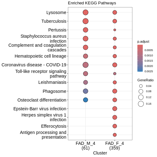
What does this plot infer?
Save Data for Next Lesson
We will use the results data in the next lesson. Save it now and we
will load it at the beginning of the next lesson. We will use R’s
save command to save the objects in compressed, binary
format. The save command is useful when you want to save
multiple objects in one file.
R
save(DE_5xFAD.df, DE_5xFAD.list, file = "results/DEAnalysis_5XFAD.Rdata")
Content from Cross Species Functional Alignment
Last updated on 2026-04-21 | Edit this page
Overview
Questions
- How do we perfrom a cross-species comparison?
- What transcriptomic changes do we observe in mouse models?
- Which aspects of disease does a model capture?
Objectives
- Approaches to align mouse data to human data
- Understand the human AD co-expression modules
- Understand the data from AD mouse models
- Perform differential analysis using DESeq2
- Perform correlation analysis between mouse models and human modules
- Understand the biological domains and subdomains of AD
- Use domain annotations to compare between species
Author: Gregory Cary, Jackson Laboratory
Setup
First, let’s install the necessary packages into the workspace, starting with the annotation packages:
R
# Mouse and Human annotation databases
# BiocManager::install(c('org.Mm.eg.db','org.Hs.eg.db', 'GO.db'))
Next we’ll install the fgsea and
clusterProfiler packages, which will be used for GO term
enrichment.
R
# fgsea package
# BiocManager::install(c('fgsea', 'clusterProfiler'))
Finally we can instally the synapseclient python package
using the reticulate R package, this will enable us
comand-line access to objects in the Synapse data repository.
R
# synapseclient python package
# reticulate::py_install('synapseclient')
Finally we’ll need to generate a personal access token on Synapse.
Login to Synapse, go to
Your Account > Account Settings > Personal Access Tokens > Manage Personal Access Tokens.
Click on Create New Token and make sure to enable both View
and Download permissions. Paste the resulting PAT in the quotes below
and save it to your workspace.
R
# synToken <-
NOTE: This is for learning purposes only. Storing
your PAT in an environmental variable in your workspace is not secure
and you could easily loose access to the PAT. The preferred method is to
store it in a separate file called .synapseConfig under
your home directory.
Now we should be able to login to Synapse through our R session using the following commands:
R
# import the synapseclient python package
syn.client <- reticulate::import('synapseclient')
syn        <- syn.client$Synapse()

# log in to Synapse
# syn$login('', authToken = synToken)
Finally, let’s load the R packages we’ll need for today’s lesson:
R
# load necessary libraries for the analysis
suppressPackageStartupMessages( library(DESeq2) )
suppressPackageStartupMessages( library(org.Mm.eg.db) )
suppressPackageStartupMessages( library(org.Hs.eg.db) )
suppressPackageStartupMessages( library(clusterProfiler) )
suppressPackageStartupMessages( library(fgsea) )
suppressPackageStartupMessages( library(tidyverse) )

# set ggplot plotting theme (personal preference)
theme_set( theme_bw() )
[1] Aligning Human and Mouse Phenotypes
Alzheimer’s Disease (AD) is complex, and we can not expect any single animal model to fully recapitulate all aspects of late onset AD (LOAD) pathology. To study AD with animal models we must find dimensions through which we can align phenotypes between the models and human cohorts. In MODEL-AD we use the following data modalities to identify commonalities between mouse models and human cohorts:
- Imaging (i.e. MRI and PET) to correspond with human imaging studies
(e.g. ADNI)
- Neuropathological and biomarker phenotypes
- Lots of ’omics — genomics, proteomics, and metabolomics
The ’omics comparisons allow for very rich comparisons because a significant proportion of genes are shared between these two species. Furthermore, homology at the anatomical and neuropathological levels is less clear.

In this session we will explore several ways to compare ’omics signatures between human AD patients and mouse models. We’ll focus on transcriptomic alignment for this session, but we’ll consider other modalities in later sessions. We’ll consider several different approaches to compare gene expression between human cohorts and model systems:
- Correlation of genes within human co-expression modules
- correlations will be generally weak for all expression, but animal
models may recapitulate specific aspects of the disease
- we can use subsets of genes from co-expression modules, which
represent genes expressed in similar patterns in AD, and look for
correlations within these subsets
- Correlation of functional enrichment results
- another approach is to consider the functional annotation enriched among differentially expressed genes in human and mouse.
- we can similarly sub-divide these groups of co-functional genes into biological domains to aid our interpretation
Let’s start by briefly reviewing how to assess differential
expression in our mouse RNA-seq datasets using the DESeq2
package. Then we’ll move on to discussing the background of the human
cohorts and co-expression modules.
[2] Differential Expression Analysis in AD Mouse Models
Let’s analyze the 5xFAD RNA-seq expression data we explored yesterday. Specifically, we want to know which genes are differentially expressed at each age as a result of the transgenes that constitute the 5xFAD model.
The 5xFAD mouse model is a 5x transgenic model consisting of mutatnt human transgenes of the amyloid precursor protein (APP) and presenilin 1 (PSEN1) genes. The specific variants are all causal variants for Familial Alzheimer’s Disease (FAD) and include three variants in the APP gene - Swedish (K670N, M671L), Florida (I716V), and London (V717I) - and two in the PSEN1 gene - M146L and L286V. The expression of both transgenes is under control of the neural-specific elements of the mouse Thy1 promoter, which drives overexpression of the transgenes in the brain. More information about this generation and maintenance of this strain can be obtained from the JAX strain catalog.
This model has been extensively characterized by the MODEL-AD consortium, and others, including the study that we explored yesterday (i.e. syn21983020). For more information about this specific MODEL-AD study, see the publication by Oblak et al (2021). The primary patho-physiological phenotypes are summarized in the figure below from AlzForum, and include (1) early deposition of amyloid plaques, (2) gliosis and neuroinflammation, (3) synaptic changes and cognitive impairment, and (4) neuronal loss, specifically in cortical layer V and the subiculum. Importantly, Tau tangles are absent from this model.

But what else can the RNA-seq data tell us about the
transcriptomic response to the 5xFAD model in the brain? To know more,
we need to assess the differentially expressed transcripts. We’ll use
the DESeq2 package to perform differential expression
analysis of the 5xFAD RNA-seq data.
read 5xFAD RNA-seq count data
First, let’s re-access the RNA-seq data and metadata from Synapse
R
# RNA-seq counts
counts <- syn$get('syn22108847') %>% .$path %>% read_tsv()

# biospecimen  metadata
meta <- syn$get('syn22103213') %>% .$path %>% read_csv() %>%
  select(individualID, specimenID)
counts <- read_tsv("data/htseqcounts_5XFAD.txt",
                   show_col_types = FALSE)

# individual metadata
ind_meta <- read_csv("data/Jax.IU.Pitt_5XFAD_individual_metadata.csv",
                     show_col_types = FALSE)

# biospecimen metadata
bio_meta <- read_csv("data/Jax.IU.Pitt_5XFAD_biospecimen_metadata.csv",
                     show_col_types = FALSE)

# assay metadata
rna_meta <- read_csv("data/Jax.IU.Pitt_5XFAD_assay_RNAseq_metadata.csv",
                     show_col_types = FALSE)
# individual metadata, joined to the above
meta <- syn$get('syn22103212') %>% .$path %>% read_csv() %>%
  left_join(., meta, by = 'individualID') %>%
  filter(!is.na(specimenID))
We can modify the metadata to only include covariates we’ll need for this analysis
R
# order rows that have corresponding IDs in the counts table
covars <- meta %>% slice( match(colnames(counts[,-1]), specimenID) )

# compute the age of animals in months
covars <- covars %>%
  mutate(
    dateBirth = mdy(dateBirth),
    dateDeath = mdy(dateDeath),
    age = interval(dateBirth,dateDeath) %/% months(1))

# change the group variable based on the animal genotype
covars <- covars %>%
  mutate( group = if_else(genotype == '5XFAD_carrier', '5xFAD', 'WT') )

# finally, only keep the columns we'll need
covars <- covars %>% select(specimenID, group, sex, age)

head(covars)
First, let’s make sure we have all relevant metadata
R
all(colnames(counts[,-1])==covars$specimenID)
How many animals do we have in each group?
R
covars %>% group_by(group, age, sex) %>% summarise(n = n())
Looks like we have 6 samples each from two genotypes (5xFAD or WT), three ages (4 months, 6 months, and 10 months), and both sexes, for a total of 72 samples.
accounting for transgenes
The 5xFAD model has two copies each of the APP and PSEN1 genes - one endogenous mouse gene, and the orthologous human transgene. The RNA-seq data was assessed using a custom transcriptome definition that included the sequences of both the mouse and human versions of each gene.
Ultimately we are going to sum the counts from both ortholgous genes (human APP and mouse App; human PSEN1 and mouse Psen1). But first, let’s look at the expression of each of these genes in the different groups. To start we’ll filter the counts down to just those four relevant gene IDs and join the counts up with the covariates to explore the expression of these genes.
R
tg.counts <- counts %>%
  filter(gene_id %in% c("ENSG00000080815","ENSMUSG00000019969",
                        "ENSG00000142192","ENSMUSG00000022892")) %>%
  pivot_longer(.,cols = -"gene_id",names_to = "specimenID",values_to="counts") %>%
  left_join(covars ,by="specimenID")

head(tg.counts)
Let’s do a little data housekeeping:
R
# make an age column that is a factor and re-order the levels
tg.counts <- tg.counts %>%
  mutate(
    age.m = str_c(age, 'm'),
    age.m = factor(age.m, levels = c('4m','6m','10m'))
  )

# add gene symbols
tg.counts <- tg.counts %>%
  mutate(
    symbol = case_when(
      gene_id == "ENSG00000142192" ~ "Human APP",
      gene_id == "ENSG00000080815" ~ "Human PSEN1",
      gene_id == "ENSMUSG00000022892" ~ "Mouse App",
      gene_id == "ENSMUSG00000019969" ~ "Mouse Psen1"
      )
  )
Okay, now let’s plot the counts for each gene across the samples:
R
ggplot(tg.counts, aes(x=age.m, y=counts, color=group, shape = sex)) +
  geom_boxplot() +
  geom_point(position=position_jitterdodge())+
  facet_wrap(~symbol, scales = 'free')+
  theme_bw()
The human transgenes all have a counts of zero in the WT animals (where the transgenes are absent), while the endogenous mouse genes are expressed relatively consistently across both groups.
Let’s combine the expression of corresponding human and mouse genes by summing the expression and saving the summed expression as expression of mouse genes, respectively to match with gene names in control mice.
R
# move the gene_id column to rownames, to enable summing across rows
counts <- counts %>% column_to_rownames("gene_id")

#merge mouse and human APP gene raw count
counts[rownames(counts) %in% "ENSMUSG00000022892",] <-
  counts[rownames(counts) %in% "ENSMUSG00000022892",] +
  counts[rownames(counts) %in% "ENSG00000142192",]

counts <- counts[!rownames(counts) %in% c("ENSG00000142192"),]

#merge mouse and human PS1 gene raw count
counts[rownames(counts) %in% "ENSMUSG00000019969",] <-
  counts[rownames(counts) %in% "ENSMUSG00000019969",] +
  counts[rownames(counts) %in% "ENSG00000080815",]

counts <- counts[!rownames(counts) %in% c("ENSG00000080815"),]
We can confirm that the human genes are now absent from the counts table:
R
counts[,1:6] %>% filter(!str_detect(rownames(.), "MUS"))
prepare data and run DESeq analysis
Next we’ll prepare the data for differential expression analysis. We’ll use DESeq2 today, though there are other approaches. Another disclaimer: there are multiple steps to a DESeq2 analysis and we’re not going to get into nitty-gritty details here. We’ll briefly cover some of the basics, but for more information, please refer to the DESeq2 vignette.
Let’s perform this analysis stratified by age group while controlling for the sex of the animals as a covariate. We can start with the youngest animals (4 months old). Let’s sub-set the data and covariates to these data:
R
covars.4m <- covars %>% filter(age == 4)
counts.4m <- counts[,colnames(counts) %in% covars.4m$specimenID]
Next we’ll build the DESeq object
R
ddsHTSeq <- DESeqDataSetFromMatrix(countData=counts.4m,
                                   colData=covars.4m,
                                   design = ~group+sex)
R
ddsHTSeq
Now we have a DESeqDataSet object covering counts data
for 55k genes across 24 mice.
Let’s take a closer look at the counts that go into this object
R
counts.4m[1:5,1:5]
You can see that ENSMUSG00000000003 has 0 reads across
the samples listed here. Let’s find out how many genes are
0 counts across all samples.
R
gene_sums <- data.frame(gene_id = rownames(counts),
                        sums    = Matrix::rowSums(counts))
sum(gene_sums$sums == 0)
We can see that 9691 (17.5%) genes have no reads at all. Let’s filter these out. While it is not necessary to pre-filter low count genes before running the DESeq2 functions, there are two reasons which make pre-filtering useful: by removing rows in which there are very few reads, we reduce the memory size of the dds data object, and we increase the speed of the transformation and testing functions within DESeq2. It can also improve visualizations, as features with no information for differential expression are not plotted.
Here we perform a minimal pre-filtering to keep only rows that have at least 10 reads in at least 6 separate samples.
R
ddsHTSeq <- ddsHTSeq[rowSums(counts(ddsHTSeq) >= 10) >= 6,]
Challenge 1
What proportion of the 55k genes we started with remain after this filter?
R
ddsHTSeq
There are 24765 genes, or 44.6% (24765/55487).
Let’s also make sure DESeq knows which group is our control or
“reference” group. By default this is arbitrarily assigned to the first
group in the factor. We can use the relevel function to set
the reference group to “WT” (wild type).
R
ddsHTSeq$group <- relevel(ddsHTSeq$group,ref="WT")
Now we’re ready to run the differential expression analysis; it’ll take a few seconds to process this step:
R
dds <- DESeq(ddsHTSeq, parallel = TRUE)
What are the results that have been computed:
R
resultsNames(dds)
Because we specified design = ~ group + sex when setting
up the DESeq object, we now have the results from these two contrasts.
We can pull the results specifically for the 5xFAD vs WT comparison
using the results function. The results table contains the
log2 fold change, p-value, and adjusted p-value for each gene in the
analysis.
R
res <- results(dds, contrast = c('group','5xFAD','WT'), alpha=0.05)
fad.res.4m <- as.data.frame(res)
We can get a summary of the DE results using the summary
function:
R
summary(res)
Ok, there are a total of 425 significantly differentially expressed genes at 4 months of age when comparing 5xFAD to WT brain tissue. The vast majority of these (392) are expressed at higher levels in 5xFAD mice relative to WT. Let’s take a look at the most significantly DE genes by ordering the results table by the adjusted p-value:
R
fad.res.4m %>% arrange(padj) %>% select(log2FoldChange, padj) %>% head()
This is a little difficult to interpret given all genes are
identified by their ENSEMBL IDs. Let’s map in the gene symbols using the
org.Mm.eg.db package. This package contains a mapping of
ENSEMBL IDs to gene symbols, and we can use the
AnnotationDbi::mapIds function to get the gene symbols for
our results table.
R
fad.res.4m$symbol <- AnnotationDbi::mapIds(
  org.Mm.eg.db::org.Mm.eg.db,
  keys = rownames(fad.res.4m),
  column = "SYMBOL",
  keytype = "ENSEMBL",
  multiVals = "first"
)

fad.res.4m %>% arrange(padj) %>% select(symbol, log2FoldChange, padj) %>% head()
Ok! Now we can see that among the most significantly up-regulated genes in 5xFAD mice brains at 4 months of age are Psen1 and App (which we saw previously), along with Thy1, Cst7, Ccl6, and Clec7a. Let’s plot all DE genes:
R
ggplot(fad.res.4m, aes(log2FoldChange, -log10(padj)))+
  geom_vline(xintercept = 0, lwd = .1)+
  geom_point(alpha = .3, aes(color = (padj < 0.05 & abs(log2FoldChange) > log2(1.2)) ), show.legend = F)+
  scale_color_manual(values = c('grey','red'))+
  ggrepel::geom_text_repel(
    data = subset(fad.res.4m, padj < 0.05 & abs(log2FoldChange) > log2(1.2)),
    aes(label = symbol), min.segment.length = 0)+
  theme_bw()
Let’s put it all together and compute results for each age group.
This code does all of the steps outlined above for each age cohort. The
input data, DESeq objects, and result tables are stored in
columns of a data frame. Feel free to copy and paste this code, but
investigate it and be sure you understand what each part is doing. It
may take about a minute or two to complete.
R
st = Sys.time()

fad.deg = tibble(
  age = c(4,6,10),
  meta = map(age, ~ covars %>% filter(age == .x)),
  counts = map(meta, ~ counts %>% select(.x %>% pull(specimenID)))
  ) %>%
  rowwise() %>%
  mutate(
    dds = DESeq2::DESeqDataSetFromMatrix(
      countData = counts,
      colData = meta,
      design = ~ sex + group) %>% list()
  ) %>%
  ungroup() %>%
  mutate(
    dds = map(dds, ~ .x[rowSums(counts(.x) >= 10) >= 6,]),
    dds = map(dds, ~ {.x$group = relevel(.x$group, ref = 'WT'); .x}),
    dds = map(dds, ~ DESeq2::DESeq(.x)),
    res = map(dds, ~ results(.x, contrast = c('group','5xFAD','WT'), alpha=0.05)),
    res.t = map(res, ~ as.data.frame(.x) %>%
                  rownames_to_column('Ensembl_gene_id') %>%
                  mutate(symbol = AnnotationDbi::mapIds(
                    org.Mm.eg.db::org.Mm.eg.db,
                    keys = Ensembl_gene_id,
                    column = "SYMBOL",
                    keytype = "ENSEMBL",
                    multiVals = "first")))
      )

ed = Sys.time() - st

print(ed)
What information does the fad.r tibble contain? Let’s
take a look:
R
glimpse(fad.deg)
The first column is the age brackets in integers. The second and third columns are the metadata and count data for each age cohort (24 samples per age bracket). The fourth column is the DESeq object and the fifth and sixth columns are the results from the DE analysis.
So by running:
R
summary(fad.deg$res[[2]])
We can see that there are more significantly DE genes at 6 months than we saw at four months.
Challenge 2
How many up- and down-regulated genes are found for each age?
R
map_dbl(fad.deg$res.t,
  ~.x %>% filter(padj <= 0.05, log2FoldChange > 0) %>%
  pull(Ensembl_gene_id) %>% length)

map_dbl(fad.deg$res.t,
  ~.x %>% filter(padj <= 0.05, log2FoldChange < 0) %>%
  pull(Ensembl_gene_id) %>% length)
There are between 392 and 1855 up-regulated genes, and between 33 and 1827 down-regulated genes.
Challenge 3
How many down-regulated genes overlap between each timepoint?
The comparisons to check are 4m+6m, 4m+10m, and 6m+10m; these are in rows 1+2, 1+3, and 2+3, respectively.
R
length(intersect(
  fad.deg$res.t[[1]] %>%
    filter(padj <= 0.05, log2FoldChange < 0) %>%
    pull(Ensembl_gene_id),
  fad.deg$res.t[[2]] %>%
    filter(padj <= 0.05, log2FoldChange < 0) %>%
    pull(Ensembl_gene_id)
))

length(intersect(
  fad.deg$res.t[[1]] %>%
    filter(padj <= 0.05, log2FoldChange < 0) %>%
    pull(Ensembl_gene_id),
  fad.deg$res.t[[3]] %>%
    filter(padj <= 0.05, log2FoldChange < 0) %>%
    pull(Ensembl_gene_id)
))

length(intersect(
  fad.deg$res.t[[2]] %>%
    filter(padj <= 0.05, log2FoldChange < 0) %>%
    pull(Ensembl_gene_id),
  fad.deg$res.t[[3]] %>%
    filter(padj <= 0.05, log2FoldChange < 0) %>%
    pull(Ensembl_gene_id)
))
It looks like there are 22, 22, and 424 overlapping down-regulated genes, respectively.
This is a good point to save these data before we move on.
R
saveRDS(fad.deg, here::here("5xFAD_DESeq_analysis.rds"))
[3] Overview of Human cohort data
Now that we have our mouse transcriptomes analyzed, let’s switch gears and think about the human datasets. The Accelerating Medicines Partnership-Alzheimer’s Disease Consortium (AMP-AD) has generated extensive sets of ’omics data from a variety of human Alzheimer’s Disease cohorts. AMP-AD researchers are applying systems biology approaches toward the goal of elucidating AD mechanisms and highlighting potential therapeutic targets.
There are three large, independent human cohorts that are part of AMP-AD:
- The Religious Orders Study and the Memory and Aging Project (ROSMAP, syn3219045)
- Mount Sinai Brain Bank (MSBB,
syn3159438)
- Mayo Clinic (Mayo, syn5550404)
These studies have collected postmortem RNA-seq profiles from over
1,200 individuals spanning seven distinct brain regions:
- dorsolateral prefrontal cortex (DLPFC)
- temporal cortex (TCX)
- inferior frontal gyrus (IFG)
- superior temporal gyrus (STG)
- frontal pole (FP)
- parahippocampal gyrus (PHG)
- cerebellum (CBE)
These samples are generally balanced for AD, MCI, and non-affected controls. The data provide a broad assessment on how AD affects multiple brain regions in 3 different populations in the US.

Overview of Human Consensus RNA-Seq Coexpression Modules
Wan, et al. (2020) performed meta analysis including all available AMP-AD RNA-seq datasets and systematically defined correspondences between gene expression changes associated with AD in human brains. Briefly, the RNA-seq read libraries were normalized and covariates were adjusted for each human study separately before testing for differential expression using fixed/mixed effects modeling to account for batch effects. The expression data from each brain region was used to perform co-expression analysis using a variety of different algorithms, generating in total 2,978 co-expression modules across all tissues. Of these, 660 modules showed enrichment for at least one AD-specific differentially expressed gene from the meta-analysis of all cases compared to controls.
Wan et al clustered these modules together using network analyses and found 30 co-expression modules related to LOAD pathology. Among the 30 aggregate co-expression modules, five consensus clusters were described that span brain region and study cohorts. These consensus clusters consist of subsets of modules which are associated with similar AD related changes across brain regions and cohorts. Wan et al looked for enrichment of cell -type signatures within the modules using expression-weighted cell type enrichment analysis (Skene and Grant (2016)) and examined enrichment of functional annotations within the modules.

This figure shows a matrix view of gene content overlap between the 30 co-expression modules. You’ll note a few strongly overlapping group of modules, implicating similar expression profiles in different studies and brain regions, which are the consensus clusters (A-E).
The first module block (consensus cluster A) is enriched for signatures of astrocytes, while the next block (consensus cluster B) is enriched for signatures of other cell types, including endothelial and microglial expressed genes, suggesting an inflammation component. The third module block (consensus cluster C) is strongly enriched for signatures of neuronal gene expression, linking the modules within this cluster to neurodegenerative processes. The fourth module block (consensus cluster D) is enriched for oligodendrocyte and other glial genes, indicating myelination and other neuronal support functions associated with these modules. Finally, consensus cluster E contains mixed modules that don’t have clear cell type enrichments, but do have enrichments for processes involved in response to stress or unfolded proteins. Stress response is not cell specific, so the expression represented by these modules may be throughout many cells in the brain.
Accessing AMP-AD module data
These AMP-AD co-expression modules are very useful for making comparisons between animal models and the human cohorts. In order to use these modules to make the comparisons, we’ll need to download data pertaining to the 30 co-expression modules. These data are available from the Synapse data repository (syn11932957); let’s download and take a closer look at the data.
R
query <- syn$tableQuery("SELECT * FROM syn11932957")
module_table <- read_csv(query$filepath)

head(module_table)
Here you see 9 columns in this table. Columns we’re interested in are:
- column 3:
GeneIDcontains Ensembl gene IDs
- column 4:
Moduleis the module name in which gene is clustered
- column 7:
brainRegionis the tissue of the corresponding module
- column 9:
external_gene_nameare gene symbols
How many unique modules are in the table?
R
length(unique(module_table$Module))
What are the names of the modules?
R
unique(module_table$Module)
How many genes are in each module?
R
table(module_table$Module)
We can visualize this as bar plot using ggplot2 package.
R
ggplot(module_table,aes(y=Module)) +
  geom_bar() +
  theme_bw()
Challenge 4
What are other ways to count genes in each module?
You could also try:
R
dplyr::count(module_table ,Module)
We can also check the total number of unique genes in the table
R
length(unique(module_table$GeneID))
Mouse orthologs of Human module genes
In the module table we’ve downloaded we have human ENSEMBL ids and human gene symbols. In order to compare between human and mouse models, we will need to identify the corresponding (i.e. orthologous) mouse gene IDs. We are going to add the gene IDs of orthologous genes in mouse to the corresponding human genes in the module table.
Orthology mapping can be tricky, but thankfully Wan et al have already identified mouse orthologs for each of the human genes using the HGNC Comparison of Orthology Predictions (HCOP) tool. While there are a variety of different ways to get data about gene orthology, for the sake of simplicity we are going to read that table from Synapse (syn17010253).
R
mouse.human.ortho <- syn$get("syn17010253")$path %>% read_tsv()

head(mouse.human.ortho)
There are 15 columns with various gene identifiers for each species.
We’ll add mouse gene symbols from the ortholog table to the module table
by matching the human ENSEMBL IDs from both tables
(i.e. GeneID from the module table and
human_ensembl_gene from the orthology table).
R
module_table$Mouse_gene_symbol <-
  mouse.human.ortho$mouse_symbol[
    match(module_table$GeneID,mouse.human.ortho$human_ensembl_gene)
    ]
Taking a look at the module table, we can see the new column of mouse orthologs we just added.
R
head(module_table)
Some genes don’t have identified orthologs. Also there’s some redundant information. Let’s only keep the columns of interest and rows that contain a mouse ortholog mapping:
R
ampad_modules <- module_table %>%
  distinct(tissue = brainRegion, module = Module, gene = GeneID, Mouse_gene_symbol) %>%
  filter(Mouse_gene_symbol != "")
Take a look at this new data table:
R
head(ampad_modules)
Challenge 5
How many human genes are we removing that don’t have identified orthologs?
R
dplyr::filter(module_table, is.na(Mouse_gene_symbol)) %>%
  dplyr::select(external_gene_name) %>%
  dplyr::distinct() %>%
  nrow()
2998 genes
Reading differential expression result of human data from meta-analysis
Now we know the genes that are in each AMP-AD co-expression cluster, along with the ID of the corresponding orthologous genes in mouse. We’ll also need to know how the expression of these genes change in AD.
We’ll download the results from differential expression analysis of reprocessed AMP-AD RNA-seq data (all 7 brain regions). Log fold change values for human transcripts can be obtained from Synapse (syn14237651).
R
ampad_modules_raw <- read_tsv(syn$get("syn14237651")$path)
head(ampad_modules_raw)
Data from which tissues are in this table?
R
unique(ampad_modules_raw$Tissue)
All 7 brain regions are represented.
The AMP-AD data has been processed many ways and using different models and comparisons. Let’s take a look at how many ways the data have been analyzed:
R
ampad_modules_raw %>% select(Model, Comparison) %>% distinct()
For our analyses we’ll use data from the “Diagnosis” model and
comparisons between AD cases vs controls. We’ll filter the table for
these conditions and only keep the three columns we’ll need:
Tissue, Gene and logFC.
R
ampad_fc <- ampad_modules_raw %>%
  as_tibble() %>%
  filter(Model == "Diagnosis", Comparison == "AD-CONTROL") %>%
  dplyr::select(tissue = Tissue, gene = ensembl_gene_id, ampad_fc = logFC) %>%
  distinct()
Combine with modules so correlation can be done per module
Next, we will combine the fold change table we just downloaded
(ampad_fc) and module table from before
(ampad_modules). First, let’s look at both tables to check
how can we merge them together?
R
head(ampad_fc)
head(ampad_modules)
The columns common to both tables are gene (the human
Ensembl gene IDs) and tissue (the brain region
corresponding to the module/measurement). So we will merge the data sets
using these two columns.
Reminder: Each gene can be present in multiple brain regions, but should only be in one module per brain region. Let’s double check using the first gene in the table:
R
ampad_modules[ampad_modules$gene %in% "ENSG00000168439",]
This gene is present in six different co-expression modules all from different brain regions. You can do this for any other gene as well.
We’ll merge the two tables using the dplyr::inner_join
function:
R
ampad_modules_fc <- inner_join(ampad_modules, ampad_fc, by = c("gene", "tissue")) %>%
  dplyr::select(symbol = Mouse_gene_symbol, module, ampad_fc)
Take a look at the new table we just made:
R
head(ampad_modules_fc)
We will use the data in ampad_modules_fc to compare with
log fold change data measured in mouse models.
Preparing module information for correlation plots
Let’s package up these data and save this progress so far. This is
some manual book-keeping to arrange the modules into consensus clusters
for plotting later. You can just copy-paste this code into your
Rstudio session.
R
cluster_a <- tibble(
  module = c("TCXblue", "PHGyellow", "IFGyellow"),
  cluster = "Consensus Cluster A (ECM organization)",
  cluster_label = "Consensus Cluster A\n(ECM organization)"
)

cluster_b <- tibble(
  module = c("DLPFCblue", "CBEturquoise", "STGblue", "PHGturquoise", "IFGturquoise", "TCXturquoise", "FPturquoise"),
  cluster = "Consensus Cluster B (Immune system)",
  cluster_label = "Consensus Cluster B\n(Immune system)"
)

cluster_c <- tibble(
  module = c("IFGbrown", "STGbrown", "DLPFCyellow", "TCXgreen", "FPyellow", "CBEyellow", "PHGbrown"),
  cluster = "Consensus Cluster C (Neuronal system)",
  cluster_label = "Consensus Cluster C\n(Neuronal system)"
)

cluster_d <- tibble(
  module = c("DLPFCbrown", "STGyellow", "PHGgreen", "CBEbrown", "TCXyellow", "IFGblue", "FPblue"),
  cluster = "Consensus Cluster D (Cell Cycle, NMD)",
  cluster_label = "Consensus Cluster D\n(Cell Cycle, NMD)"
)

cluster_e <- tibble(
  module = c("FPbrown", "CBEblue", "DLPFCturquoise", "TCXbrown", "STGturquoise", "PHGblue"),
  cluster = "Consensus Cluster E (Organelle Biogensis, Cellular stress response)",
  cluster_label = "Consensus Cluster E\n(Organelle Biogenesis,\nCellular stress response)"
)

module_clusters <- cluster_a %>%
  bind_rows(cluster_b) %>%
  bind_rows(cluster_c) %>%
  bind_rows(cluster_d) %>%
  bind_rows(cluster_e) %>%
  mutate(cluster_label = fct_inorder(cluster_label))

head(module_clusters)

mod <- module_clusters$module

save(ampad_modules_fc,module_clusters,mod, file= here::here("AMPAD_Module_Data.RData"))
[4] Correlation between mouse models and human AD modules
Now we’ll get to the cross-species alignment. Our goal, as demonstrated in the plots below, is to identify modules where the gene expression is correlated between human and mouse orthologs (left) as well as modules where there is no correlation (right).

There are two approaches that we commonly use to compute correlation between mouse data and human AD data:
- Compare change in expression in Human AD cases vs controls with
change in expression in mouse models for each gene in a given
module:
- LogFC(h) = log fold change in expression of human AD patients compared to control patients.
- LogFC(m) = log fold change in expression of mouse AD models compared to control mouse models.
\[cor.test(LogFC(h), LogFC(m))\]
- Compare Human AD expression changes to mouse genetic effects for
each gene in a given module:
- h = human gene expression (Log2 RNA-seq Fold Change AD/control)
- β = mouse gene expression effect from linear regression model (Log2 RNA-seq TPM)
\[cor.test(LogFC(h), β)\]
Both approaches allow us to assess directional coherence between gene expression for genes in AMP-AD modules and the effects of genetic manipulations in mice. For this session we are going to use the first approach; we’ll return to approach #2 later in the week.
Challenge 6
What are the relative advantages of each approach?
\[cor.test(LogFC(h), LogFC(m))\]
• direct comparison of effect sizes and direction • intuitive interpretation
\[cor.test(LogFC(h), β)\]
• identify the genetic contributions • human AD data often has age, sex, and other covariates regressed out, to derive the AD specific effect • controlling for analogous variables by computing the genetic effect (β) is often advantageous
Others?
Step 0: Reading Gene Expression Count matrix from Previous Lesson
First we’ll read the results saved after differential expression analysis (above). We’ll only keep the information about which age cohort and the differential expression results.
R
fad.deg <- load("results/DEAnalysis_5XFAD.Rdata")
WARNING
Warning in readChar(con, 5L, useBytes = TRUE): cannot open compressed file
'results/DEAnalysis_5XFAD.Rdata', probable reason 'No such file or directory'
ERROR
Error in `readChar()`:
! cannot open the connection
R
head(fad.deg)
ERROR
Error:
! object 'fad.deg' not found
Let’s also load the AMP-AD module data.
R
load("data/AMPAD_Module_Data.RData")
Step 1: Measure the correlation between mouse models for each sex at each age and AMP-AD modules using common genes from both datasets
We compute a Pearson correlation between changes in expression for each gene within a given module (log fold change for cases vs controls) with each mouse model (log fold change of the 5xFAD mice vs sex- and age-matched B6 mice).
First, we’ll combine both mouse fad.deg and human
ampad_modules_fc log fold change data sets for all
genes.
R
model_vs_ampad <- inner_join(fad.deg,
                             ampad_modules_fc,
                             by = c("symbol"),
                             multiple = "all")
Note: for this join we specify
multiple = "all" so that the same gene can be matched
across multiple human tissues and multiple mouse ages.
R
head(model_vs_ampad)
Now we’ll create a list column containing data frames using the tidyr::nest function. Nesting is implicitly a summarizing operation: you get one row for each group defined by the non-nested columns.
R
df <- model_vs_ampad %>%
  dplyr::select(module, age, symbol, log2FoldChange, ampad_fc) %>%
  group_by(module, age) %>%
  nest(data = c(symbol, log2FoldChange, ampad_fc))

head(df)
And we can also look at some of the nested data:
R
head(df$data[[1]])
These are the mouse and human log fold-change values for all genes in the TCXblue module; the mouse data corresponds to 4 month old 5xFAD mice.
The total number of groups in the data table:
R
dim(df)
Next, we’ll compute correlation coefficients using the
cor.test function:
R
cor.df <- df  %>%
  mutate(
      cor_test = map(data, ~ cor.test(.x[["log2FoldChange"]],
                                      .x[["ampad_fc"]], method = "pearson")),
      estimate = map_dbl(cor_test, "estimate"),
      p_value = map_dbl(cor_test, "p.value")
      ) %>%
  ungroup() %>%
  dplyr::select(-cor_test)
Here we’re using purrr::map based functions to apply the
correlation test to every entry in the data column. We can
pull out specific features from the cor_test list column,
including the computed correlation coefficient (estimate)
and the significance (p.value).
In the end we should have correlation coefficients and significance values for every comparison in our data table:
R
head(cor.df)
Step 2: Annotate correlation table to prepare for visualization
These steps will make it easier to make a nice looking plot during the next step. We’ll add a column that flags whether the correlation is significant or not, and we’ll add in the information about which consensus cluster each module belongs to:
R
model_module <- cor.df %>%
  mutate(significant = p_value < 0.05) %>%
  left_join(module_clusters, by = "module") %>%
  dplyr::select(cluster, cluster_label, module, age,
                correlation = estimate, p_value, significant)

head(model_module)
Step 3: Create a dataframe to use as input for plotting the results
More preparations for plotting, here we’ll get all of the values in the right order so that they are grouped together nicely on the plot.
R
correlation_for_plot <- model_module %>%
    arrange(cluster) %>%
    mutate(
      module = factor(module,levels=mod),
      age = factor(age, levels = c('10m','6m','4m'))
      )
head(correlation_for_plot)
Visualizing the Correlation plot
Now, we will use the above matrix and visualize the correlation
results using ggplot2 package functions.
R
data <- correlation_for_plot
range(correlation_for_plot$correlation)

ggplot() +

  # the AMP-AD modules will be along the x-axis, the mouse models will be along the y-axis
  geom_tile(data = data, aes(x = .data$module, y = .data$age), colour = "black", fill = "white") +

  # each tile of the grid will be filled with a circle where the fill and size correspond to the correlation coefficient
  geom_point(data = data, aes(x = .data$module, y = .data$age,
                              colour = .data$correlation, size = abs(.data$correlation))) +

  # we'll draw a box arround significant correlations
  geom_point(data = dplyr::filter(data, .data$significant),
             aes(x = .data$module, y = .data$age, colour = .data$correlation),
             color="black",shape=0,size=9) +

  # plot the x-axis on the top of the plot, set the parameters of the scales
  scale_x_discrete(position = "top") +
  scale_size(guide = "none", limits = c(0, 0.4)) +
  scale_color_gradient2(limits = c(-0.5, 0.5), low = "#85070C", high = "#164B6E",
                                 name = "Correlation", guide = guide_colorbar(ticks = FALSE)) +

  # remove axis labels
  labs(x = NULL, y = NULL) +

  # facet the plot based on age range for the mice (rows) and consensus cluster (columns)
  facet_grid( rows = vars('5xFAD'), cols = dplyr::vars(.data$cluster_label),
                       scales = "free", space = "free",switch = 'y') +

  # specify how different aspects of the plot will look
  theme(
    strip.text.x = element_text(size = 10,colour = c("black")),
    strip.text.y.left = element_text(angle = 0,size = 12),
    axis.ticks = element_blank(),
    axis.text.x = element_text(angle = 90, hjust = 0, size = 12),
    axis.text.y = element_text(angle = 0, size = 12),
    panel.background = element_blank(),
    plot.title = element_text(angle = 0, vjust = -54, hjust = 0.03,size=12,face="bold"),
    plot.title.position = "plot",
    panel.grid = element_blank(),
    legend.position = "right"
  )
In the above plot, categories along the x-axis are the 30 AMP-AD co-expression modules grouped into 5 consensus clusters, while the categories along the y-axis show the different groupings of mouse models tested (split by age). Positive correlations are shown in blue and negative correlations in red. Color intensity and size of the circles are proportional to the correlation coefficient. Black squares around dots represent significant correlation at p-value=0.05 and non-significant correlations are left blank.
5xFAD mice display gene expression alterations that are correlated with human disease across all five consensus clusters, with the strongest correlations observed among modules/genes in Consensus Cluster B, which generally consists of immune system pathways and functions.
Examining individual correlation results
Let’s say we want to know more about a single comparison in the plot
above and which genes are contributing to the correlation result. Maybe
we’re really interested in the correlations to the FPbrown module
between 5xFAD mice at 4 months and 6 months. We can plot the individual
correlations for each comparison in the plot above with the data we
have. We’ll label genes with large fold change in the mouse using the
ggrepel::geom_label_repel function.
R
# specify which comparisons to consider
m <- 'FPbrown'
a <- c('4m','6m')

# filter the correlation data frame to these comparisons
indiv.corr <- cor.df %>% filter(module == m, age %in% a) %>% unnest(data) %>%
  mutate( facet = str_c(age, '\n', 'r = ',signif(estimate,3),' ; p = ',signif(p_value,3) ))

# plot
ggplot(indiv.corr, aes( log2FoldChange , ampad_fc ))+
  geom_vline(xintercept = 0, lwd = .1)+
  geom_hline(yintercept = 0, lwd = .1)+
  geom_point( size = .5, color = 'darkred')+
  geom_smooth(method = 'lm', lwd = .5)+
  ggrepel::geom_text_repel( data = arrange(indiv.corr, desc(abs(log2FoldChange))),
                             aes(label = symbol), size = 3, min.segment.length = 0 ) +
  labs(x = '5xFAD logFC', y = 'AMP-AD logFC',
       title = unique(indiv.corr$module))+
  facet_wrap(~facet)+
  theme_bw()
Here we can see that the 5xFAD logFC are pretty small in general. The correlations are relatively weak and driven by individual genes that have relatively large changes (e.g. Heatr4, Nirp1a, Rpl39l). If we compare a different module, say STGblue, we can see a stronger relationship between mouse and human expression changes.
R
m <- 'STGblue'
a <- c('4m','6m')

# filter the correlation data frame to these comparisons
indiv.corr <- cor.df %>% filter(module == m, age %in% a) %>% unnest(data) %>%
  mutate( facet = str_c(age, '\n', 'r = ',signif(estimate,3),' ; p = ',signif(p_value,3) ))

# plot
ggplot(indiv.corr, aes( log2FoldChange , ampad_fc ))+
  geom_vline(xintercept = 0, lwd = .1)+
  geom_hline(yintercept = 0, lwd = .1)+
  geom_point( size = .5, color = 'darkred')+
  geom_smooth(method = 'lm', lwd = .5)+
  ggrepel::geom_text_repel( data = arrange(indiv.corr, desc(abs(log2FoldChange))),
                             aes(label = symbol), size = 3, min.segment.length = 0 ) +
  labs(x = '5xFAD logFC', y = 'AMP-AD logFC',
       title = unique(indiv.corr$module))+
  facet_wrap(~facet)+
  theme_bw()
These correlations are much stronger (r is approximately 0.3 vs 0.1 for the previous module), and there is a consistent pattern between young mice and old mice, with similar genes being expressed in similar ways (e.g. Itgax and Clec7a are up-regulated at both ages). These significant positive correlations suggest that the 5xFAD model captures inflammatory changes observed in human AD patients.
[5] Detecting functional coherence of gene sets from omics data
Most omics analyses produce data on many thousands of genomic features (i.e. transcripts, proteins, etc.) for each condition tested. Simply looking at these lists of genes and associated statistics can be daunting and uninformative. We need approaches to identify which biological functions are being impacted by a given experiment from these systems-level measurements.
Gene functional enrichment analysis describes a variety of statistical methods that identify groups of genes that share a particular biological function or process and show differential association with experimental conditions. Most approaches compare some statistically valid set of differentially expressed features to sets of functional annotations for those features. There are many different functional annotation sets available, some of the more commonly used include:
- gene function resources, such as the Gene Ontology (i.e. GO)
- pathway databases, such as Reactome or KEGG
- disease and phenotype ontologies, such as the Human Phenotype Ontology, the Mammalian Phenotype Ontology, and the Disease Ontology
These are the resources that are the foundation for many genomics knowledge bases, such as MGI, monarch initiative, and the Alliance of Genome Resources. The precise nature of each of these resources varies, but the core information contained within each is the relationship of sets of genes to biologically meaningful annotations. These annotations are typically expertly curated from the published literature.
There are a variety of statistical approaches that can be employed to test for functional enrichment among genes identified from an omics dataset. Two of the most common broad classes of tests are over-representation analysis (ORA) and gene set enrichment analysis (GSEA). For example, consider the figure below from Zhao & Rhee, Trends in Genetics (2023). Let’s consider each in a bit more detail.

Over-representation analysis
ORA involves statistical tests of overlap between two
lists of genes: one derived from the experiment and one from the
functional annotations. For example, one might ask what is the overlap
between the genes in an annotation class, such as “Lysosome”, and the
genes that are significantly up-regulated in a given experimental
condition. These tests usually rely on some form of Fisher’s exact test
(e.g. fisher.test()) or hypergeometric test
(e.g. phyper()). If the gene lists consist of a larger
number of overlapping genes than would be expected at random - given the
sample sizes involved - then there is said to be a statistical
over-representation of the annotation class within the experimental
condition.
Of course, these overlap tests are generally considered for all
annotation classes, which can number in the hundreds to thousands.
Performing this many statistical tests ensures that many will be
identified as significant by chance. Therefore, there is typically a
requirement to correct for multiple testing errors
(e.g. p.adjust()).
There are many R packages available to handle the statistical tests
and corrections involved in ORA. Today we’ll use
clusterProfiler::enrichGO(), which wraps statistical
testing for overlap with GO terms and multiple test correction in one
function.
Let’s start by considering the enrichments from the mouse data analyzed previously. We’ll start by considering the genes that are significantly DE in 6 month old animals
R
gene.list.up <- fad.deg %>%
  filter(age == '6m',
         padj <= 0.05,
         log2FoldChange > 0) %>%
  arrange(desc(log2FoldChange)) %>%
  filter(!duplicated(symbol), !is.na(symbol)) %>%
  pull(symbol) %>%
  unique()

gene.list.dn <- fad.deg %>%
  filter(age == '6m',
         padj <= 0.05,
         log2FoldChange < 0) %>%
  arrange(desc(log2FoldChange)) %>%
  filter(!duplicated(symbol), !is.na(symbol)) %>%
  pull(symbol) %>%
  unique()

length(gene.list.up)
length(gene.list.dn)
There are a total of # r length(gene.list.up) significantly up-regulated genes and r length(gene.list.dn) significantly down-regulated genes in this cohort. Now test for over representation of GO terms among the DEGs. First, we need to identify the universe of all possible genes which includes the genes that were both measured by the experiment and contained within the annotation set.
R
univ <- as.data.frame(org.Mm.egGO) %>%
  pull(gene_id) %>%
  unique() %>%
  bitr(., fromType = "ENTREZID", toType = 'SYMBOL', OrgDb = org.Mm.eg.db, drop = T) %>%
  pull('SYMBOL') %>%
  intersect(., fad.deg$symbol)
Now let’s test for enriched GO terms (this can take 3-4 minutes)
R
enr.up <- enrichGO(gene.list.up,
                   ont = 'all',
                   OrgDb = org.Mm.eg.db,
                   keyType = 'SYMBOL',
                   universe = univ
                   )
enr.dn <- enrichGO(gene.list.dn,
                   ont = 'all',
                   OrgDb = org.Mm.eg.db,
                   keyType = 'SYMBOL',
                   universe = univ
                   )
How many significant terms are identified:
R
enr.up@result %>% filter(p.adjust <= 0.05) %>% pull(ID) %>% unique() %>% length()
enr.dn@result %>% filter(p.adjust <= 0.05) %>% pull(ID) %>% unique() %>% length()
Challenge 7
How many significant terms are identified from the up-regulated gene list if you do not specify the “universe”?
R
enrichGO(gene.list.up, ont = 'all', OrgDb = org.Mm.eg.db, keyType = 'SYMBOL') %>%
    .@result %>% filter(p.adjust <= 0.05) %>% pull(ID) %>% unique() %>% length()
Plot the top 10 significant terms:
R
cowplot::plot_grid(
  dotplot(enr.dn, showCategory = 10) + ggtitle('down'),
  dotplot(enr.up, showCategory = 10) + ggtitle('up')
)
From this we can see that nervous system related terms (e.g. “dendrite development” and “protein localization to synapse”) are down in 5xFAD mice at 6 months, while immune functions (e.g. “regulation of innate immune response” and “leukocyte mediated immunity”) are up in 5xFAD mice at 6 months.
Gene set enrichment analysis
GSEA is an alternative approach that uses a statistical
measure from the omics data (e.g. the log fold change or significance)
to rank the genes. An “enrichment score” is calculated for each
annotation set based on where the genes annotated to the term sit in the
overall distribution.
Let’s analyze those same data with the
fgsea::fgseaMultilevel() function. First we’ll specify the
gene list and use the log2FoldChange value to rank the
genes in the list.
R
gene.list <- fad.deg %>%
  filter(age == '6m', padj <= 0.05) %>%
  arrange(desc(log2FoldChange)) %>%
  filter(!is.na(symbol),!duplicated(symbol)) %>%
  pull(log2FoldChange, name = symbol)
We’ll also need a list of GO terms and the genes annotated. We can
get this from the org.Mm.eg.db annotation package using the
AnnotationDbi::select function
R
# Get GO annotations
go.terms <- AnnotationDbi::select(
    org.Mm.eg.db,
    keys = keys( org.Mm.eg.db , keytype = "SYMBOL"),
    columns = c("GO", "SYMBOL"),
    keytype = "SYMBOL"
)

# Create the list of gene sets
go.gene.sets <- split(go.terms$SYMBOL, go.terms$GO)

# Filter gene sets by size (minSize and maxSize are arguments in fgsea)
min_size <- 15
max_size <- 500
go.sets.filtered <- go.gene.sets[sapply(go.gene.sets, function(x) length(x) >= min_size && length(x) <= max_size)]
Now we’ll test for enrichment:
R
gse.enr <- fgsea::fgseaMultilevel(
    pathways = go.sets.filtered,
    stats = gene.list,
    minSize = min_size,
    maxSize = max_size,
    nproc = 1 )
Let’s take a look
R
gse.enr %>% arrange(padj) %>% head(n = 10)
This isn’t especially informative without the GO term names. Let’s pull those in
R
# get term names from the GO.db package
go_term_map <- AnnotationDbi::select(
    GO.db::GO.db,
    keys = gse.enr$pathway,
    columns = c("GOID", "TERM"),
    keytype = "GOID"
)

# join with results table
gse.enr <- inner_join(gse.enr, go_term_map %>% select(pathway = GOID, TERM)) %>% relocate(TERM, .after = pathway)

# now take another look
gse.enr %>% arrange(padj) %>% head(n = 10)
This is more helpful. We can see that the GO terms associated with up-regulated genes include “inflammatory response” and “chemotaxis”, while there’s one term among the top 10 that is associated with down-regulated genes, “chemical synaptic transmission”.
How many significant terms are identified:
R
gse.enr %>% filter(padj <= 0.05) %>% pull(pathway) %>% unique() %>% length()
Challenge 8
The tally above represents all genes, both up- and down-regulatd. To
compare between GSEA and ORA, can you identify how many GSEA enriched
terms are associated with up-regulated genes and how many are associated
with down-regulated genes? (Hint: the NES value within the
results relates to the directionality of enrichment).
R
gse.enr %>% filter(padj <= 0.05, NES < 0) %>% pull(pathway) %>% unique() %>% length()
gse.enr %>% filter(padj <= 0.05, NES > 0) %>% pull(pathway) %>% unique() %>% length()
40 terms are up-regulated, while only 2 are associated with down-regulated genes
Challenge 9
You may notice that your numbers of significantly enriched terms are slightly different. Why would this be the case?
fgsea uses a permutation-based approach to estimate the
significance of the gene set enrichments. Because this involves random
sampling, running the analysis multiple times with the same settings can
result in subtle, minor differences in the output, particularly in the
p-values.
Increasing the nPermSimple parameter increases the
number of permutations performed. This leads to a more thorough sampling
of the null distribution, thereby improving the precision of the
estimated p-values, especially for highly significant pathways. However,
it’s a trade-off, as a higher nPermSimple value will also
increase the computational time required to run the analysis.
Let’s compute the enriched terms for all age groups:
R
fad.enr <- fad.deg %>%
  filter(!is.na(symbol)
          , padj <= 0.05
          ) %>%
  group_by(age) %>%
  summarise(gl = log2FoldChange %>% setNames(., symbol) %>% sort(decreasing = T) %>% list()) %>%
  ungroup() %>%
  mutate(
  gse = map(
    gl,
    ~ fgsea::fgseaMultilevel(
      pathways =  go.sets.filtered,
      stats = .x,
      minSize = min_size,
      maxSize = max_size,
      nproc = 1
    )
  ),
  res = map(gse, ~ {
    go_term_map <- AnnotationDbi::select(
      GO.db::GO.db,
      keys = .x$pathway,
      columns = c("GOID", "TERM"),
      keytype = "GOID"
    )

    inner_join(.x, go_term_map %>% select(pathway = GOID, TERM)) %>%
      relocate(TERM, .after = pathway)
  }))

saveRDS(fad.enr, here::here('results', '5xFAD_fgsea_results.rds'))
Common pitfalls & best practices
These kinds of functional enrichment analyses are very common, but not all results reported are equal! A recent paper describes an “Urgent need for consistent standards in functional enrichment analysis”. They examine how the results of functional enrichment analyses are reported in the literature, and identify several common shortcomings. Watch out for these common mistakes when performing and reporting your own analyses! We’ll have more opportunities to discuss issues with reproducibility in computational biology research in future sessions.

[6] Alzheimers’s Disease Biological Domains
While these results are informative and help to provide essential biological context to the results of the omics experiment, it is difficult to understand all of the enriched terms and what that means for the biology of disease. It would be useful to group each of the enriched terms within broader areas of disease biology. There are several common molecular endophenotypes that are detected within human Alzheimer’s cohorts across omics data types (transcriptomics, proteomics, and genetics). Several of these endophenotypic areas are shown in the figure below (source: Jesse Wiley).

These endophenotypes describe molecular processes that are dysregulated by or during the disease process. Very similar sets of endophenotypes have been identified among the targets of therapeutics in clinical trials for AD (see below, Cummings et al, Alzheimer’s disease drug development pipeline: 2024, Alz Dem TRCI.


In order to formalize and operationalize these endophenotypic areas, the Emory-Sage-SGC-JAX (ESSJ) TREAT-AD center has developed the Biological Domains of AD. In the enumeration of these domains, several criteria were established; the defined biological domains should be:
-
objective: leverage existing well-annotated resources
-
automatable: in CADRO, therapeutics and targets are
manually assigned
-
intelligible: groupings should be easy to understand
- modifiable: definitions should be (and are!) continuously be updated.
In all, 19 distinct biological domains (aka biodomains) have been
identified. These biological domains are defined using sets of GO terms
that align with the endophenotype. For example, terms like “cytokine
receptor binding” and “leukocyte migration” are annotated to the
Immune Response biodomain, while terms like “postsynaptic
density” and “synaptic vesicle cycle” are annotated to the
Synapse biodomain. Of all terms in the GO, 6,837 terms
(15.7%) are annotated to one of the biological domains. Because the GO
terms have genes annotated, genes can be associated with specific
endophenotypes via the biological domain groupings of terms. In all,
16,275 genes are annotated to at least 1 biodomain term. While the
biodomains exhibit very few overlapping GO terms (panel A), due to gene
pleiotropy (etc) the number of overlapping genes between biological
domains is quite a bit higher (panel B). The development of the
biological domains is described in more detail in the published paper Genetic and Multi-omic Risk Assessment
of Alzheimer’s Disease Implicates Core Associated Biological
Domains.

The ESSJ TREAT-AD center has developed approaches to group terms within each biodomain into functionally coherent sub-domains. The sub-domains are driven by gene co-annotation and disease risk score enrichment.

Download and explore the biological domain annotations
First let’s download the biodomain definition file from synapse.
R
# biodomain definitions
biodom <- readRDS(syn$get('syn25428992')$path)

# biodomain labels and colors
dom.lab <- read_csv(syn$get('syn26856828')$path)
What is in the dom.lab file?
R
glimpse(dom.lab)
This file contains some useful standardized abbreviations and colors that will be useful as we work with and plot domain information later.
What is in the biodom file?
R
glimpse(biodom)
You can see the file is a list of GO term accessions
(GO_ID) and names (GOterm_Name) as well as the
corresponding endophenotype areas (e.g. Biodomain and
Subdomain) to which the term is annotated. There are also
gene annotations for each term. These annotation sets come from two
sources: (1) the symbol and uniprot
annotations are drawn directly from the Gene Ontology via the provided
API, (2) ensembl_id, entrez_id, and
hgnc_symbol are from BioMart annotations
(e.g. biomaRt::getLDS()).
We can see how many GO terms are annotated to each biodomain:
R
biodom %>%
  group_by(Biodomain) %>%
  summarise(n_term = length(unique(GO_ID))) %>%
  arrange(n_term)
The biodomains range in size from Tau Homeostasis (10
terms) up to Synapse (1,379 terms).
What about the size of the subdomains? For simplicity let’s focus on
the Subdomains within the Synapse domain.
R
biodom %>%
  filter(Biodomain == 'Synapse') %>%
  group_by(Subdomain) %>%
  summarise(n_term = length(unique(GO_ID))) %>%
  arrange(n_term)
There are 8 subdomains within the Synapse biodomain,
plus a set of terms that aren’t assigned to any subdomain (i.e. where
Subdomain is NA). The subdomains range in size
from axon regeneration (20 terms) up to
trans-synaptic signaling (162 terms). There are 822 terms
within the Synapse domain that aren’t assigned to any
sub-domains.
We can also investigate the individual genes annotated to each biodomain GO term.
R
biodom %>% filter(GOterm_Name == 'amyloid-beta formation') %>% pull(symbol) %>% unlist()
So the genes associated with amyloid-beta formation
within the APP Metabolism biodomain include PSEN1, PSEN2,
BACE1, ABCA7, NCSTN, and others.
Annotate enriched terms with biological domain
Let’s re-characterize the 5xFAD functional enrichments we computed previously with the biological domain annotations and see if we can get more context about what is changing in that model. We’ll focus on the GSEA results and start by annotating the results with biodomain groupings.
R
gse.enr.bd = gse.enr %>%
  left_join(., biodom %>% select(Biodomain, pathway = GO_ID), by = 'pathway') %>%
  relocate(Biodomain)

head(gse.enr.bd %>% select(pathway, TERM, Biodomain, padj, NES), n = 10)
Not all of the enriched terms are annotated to a biological domain.
Some terms are too broad and not specific (e.g. ‘cell mophogenesis’ or
‘MAPK cascade’), while others may not have been captured by a biological
domain annotation yet (e.g. ‘transcription cis-regulatory region
binding’). Remember that the conception of the biodomains
involved a requirement that they be modifiable, and these terms may be
added to the biodomain definintions in the future. Let’s modify the
Biodomain value for terms that aren’t annotated to a domain
to ‘none’.
R
gse.enr.bd$Biodomain[is.na(gse.enr.bd$Biodomain)] <- 'no domain'
head(gse.enr.bd %>% select(pathway, TERM, Biodomain, padj, NES), n = 10)
How many terms are enriched from each domain?
R
bd.tally = tibble(domain = c(unique(biodom$Biodomain), 'no domain')) %>%
  rowwise() %>%
  mutate(
    n_term = biodom$GO_ID[ biodom$Biodomain == domain ] %>% unique() %>% length(),
    n_sig_term = gse.enr.bd$pathway[ gse.enr.bd$Biodomain == domain ] %>% unique() %>% length()
    )
arrange(bd.tally, desc(n_sig_term))
Many enriched terms don’t map to a domain r bd.tally %>%
filter(domain == ‘no domain’) %>% pull(n_sig_term) %>% sum()), but
nearly half do (r bd.tally %>% filter(domain != ‘no domain’) %>%
pull(n_sig_term) %>% sum()). Of those that do, the vast majority map
into the Immune Response biodomain.
We can plot the enrichment results, stratified by biodomain:
R
enr.bd_plot <- full_join(gse.enr.bd, dom.lab, by = c('Biodomain' = 'domain')) %>%
  filter(!is.na(Biodomain)) %>%
  mutate(Biodomain = factor(Biodomain, levels = arrange(bd.tally, n_sig_term) %>% pull(domain))) %>%
  arrange(Biodomain, padj)

ggplot(enr.bd_plot, aes(NES, Biodomain)) +
  geom_violin(data = subset(enr.bd_plot, NES > 0),
              aes(color = color), scale = 'width')+
  geom_violin(data = subset(enr.bd_plot, NES < 0),
              aes(color = color), scale = 'width')+
  geom_jitter(aes(size = -log10(padj), fill = color),
              color = 'grey20', shape = 21, alpha = .3)+
  geom_vline(xintercept = 0, lwd = .1)+
  scale_y_discrete(drop = F)+
  scale_fill_identity()+scale_color_identity()
This makes it really clear that in the 6 month old 5xFAD mice, the
enriched Immune Response domain terms are all associated
with up-regulated genes, while the enriched Synapse domain
terms are associated with a mix of up- and down-regulated genes. It also
highlights the several other domains with significantly enriched terms
(e.g. Proteostasis, Structural Stabilization,
Lipid Metabolism, Endolysosome, etc; even
APP Metabolism).
Now let’s look across age groups to see how domain enrichments change:
R
enr.bd_plot <- fad.enr %>% select(age, res) %>% unnest(res) %>%
  full_join(., biodom %>% select(pathway = GO_ID, Biodomain, Subdomain)) %>%
  full_join(., dom.lab, by = c('Biodomain' = 'domain')) %>%
  filter(!is.na(age)) %>%
  mutate(
    Biodomain = if_else(is.na(Biodomain), 'none', Biodomain),
    Subdomain = if_else(is.na(Subdomain), 'none', Subdomain),
    age = factor(age, levels = c('4m','6m','10m'))
         ) %>%
  mutate(n_sig = length(unique(pathway)), .by = Biodomain) %>%
  mutate(Biodomain = fct_reorder(Biodomain, n_sig)) %>%
  arrange(Biodomain, padj)

ggplot(enr.bd_plot, aes(NES, Biodomain)) +
  facet_grid(cols = vars(age), scales = 'free')+
  geom_violin(data = subset(enr.bd_plot, NES > 0),
              aes(color = color), scale = 'width')+
  geom_violin(data = subset(enr.bd_plot, NES < 0),
              aes(color = color), scale = 'width')+
  geom_jitter(aes(size = -log10(padj), fill = color),
              color = 'grey20', shape = 21, alpha = .3)+
  geom_vline(xintercept = 0, lwd = .1)+
  scale_y_discrete(drop = F)+
  scale_fill_identity()+scale_color_identity()
The earliest transcriptomic changes in the 5xFAD animals are
associated with Immune Response and
Lipid Metabolism domain terms. By 6 months, there are
enrichments for several other domains (as above), and by 10 months the
term enrichments are even more exaggerated (i.e. more
significance, larger NES values, etc).
We can also break down these results by sub-domain to get a more clear idea of the processes affected in each case
R
enr.bd_plot <- fad.enr %>% select(age, res) %>% unnest(res) %>%
  full_join(., biodom %>% select(pathway = GO_ID, Biodomain, Subdomain)) %>%
  full_join(., dom.lab, by = c('Biodomain' = 'domain')) %>%
  filter(!is.na(age)) %>%
  mutate(
    Biodomain = if_else(is.na(Biodomain), 'none', Biodomain),
    Subdomain = if_else(is.na(Subdomain), 'none', Subdomain),
    sd_lab = str_c(abbr,'_',Subdomain),
    age = factor(age, levels = c('4m','6m','10m'))
         )

ggplot(enr.bd_plot, aes(NES, sd_lab)) +
  facet_grid(cols = vars(age), rows = vars(abbr), scales = 'free', space = 'free_y')+
  geom_violin(data = subset(enr.bd_plot, NES > 0), aes(color = color), scale = 'width')+
  geom_violin(data = subset(enr.bd_plot, NES < 0), aes(color = color), scale = 'width')+
  geom_jitter(aes(size = -log10(padj), fill = color), color = 'grey20', shape = 21, alpha = .3)+
  geom_vline(xintercept = 0, lwd = .1)+
  scale_y_discrete(label = ~ str_remove_all(.x, '^[A-Za-z]{2}_'), drop = F)+
  scale_fill_identity()+scale_color_identity()
What trends do you notice from these results? Which sub-domain processes are affected at the earliest ages? Are there any sub-domains that change across the age groups?
Challenge 10
How could you plot the results from the ORA to show biodomain enrichements?
R
enr.ora = bind_rows(enr.up@result %>% mutate(dir = 'up'),
                    enr.dn@result %>% mutate(dir = 'dn')) %>%
  left_join(., biodom %>% select(Biodomain, ID = GO_ID), by = 'ID') %>%
  relocate(Biodomain)

enr.ora$Biodomain[is.na(enr.ora$Biodomain)] <- 'none'

bd.tally = tibble(domain = c(unique(biodom$Biodomain), 'none')) %>%
  rowwise() %>%
  mutate(
    n_term = biodom$GO_ID[biodom$Biodomain == domain] %>% unique() %>% length(),
    n_sig_term = enr.ora$ID[enr.ora$Biodomain == domain] %>% unique() %>% length()
  )

enr.ora <- full_join(enr.ora, dom.lab, by = c('Biodomain' = 'domain')) %>%
  mutate(Biodomain = factor(Biodomain, levels = arrange(bd.tally, n_sig_term) %>% pull(domain))) %>%
  arrange(Biodomain, p.adjust) %>%
  mutate(
    signed_logP = -log10(p.adjust),
    signed_logP = if_else(dir == 'dn', -1 * signed_logP, signed_logP)
  )

ggplot(enr.ora, aes(signed_logP, Biodomain)) +
  geom_violin(data = subset(enr.ora, dir == 'up'),
              aes(color = color),
              scale = 'width') +
  geom_violin(data = subset(enr.ora, dir == 'dn'),
              aes(color = color),
              scale = 'width') +
  geom_jitter(
    aes(size = Count, fill = color),
    color = 'grey20',
    shape = 21,
    alpha = .3
  ) +
  geom_vline(xintercept = 0, lwd = .1) +
  scale_y_discrete(drop = F) +
  scale_fill_identity() + scale_color_identity()
Based on the gene list (up or down) we can add a sign to the
significance. When we plot this we can see there are many more
significantly enriched terms from the ORA. The dominant signal is still
the up-regulation of terms from the Immune Response
biodomain. There is also nearly exclusive up-regulation of terms from
the Autophagy, Oxidative Stress, and
APP Metabolism domains. The most down-regulated terms are
from the Synapse biodomain.
Challenge 11
Which biodomain terms are over-represented among the gene
co-expression modules? Choose one module and test for over-represented
terms at a p.adjust value less than 0.05.
What if you look at the most significantly enriched terms,
with p.adjust values less than 1e-5?
R
stg_blue.ora <- ampad_modules %>%
  filter(module == 'STGblue') %>%
  pull(Mouse_gene_symbol) %>%
  enrichGO(., org.Mm.eg.db, keyType = 'SYMBOL')

inner_join(stg_blue.ora@result,
           biodom %>% select(ID = GO_ID, Biodomain:Subdomain)) %>%
  group_by(Biodomain) %>%
  summarise(n = length(unique(ID))) %>%
  arrange(desc(n))

inner_join(stg_blue.ora@result,
           biodom %>% select(ID = GO_ID, Biodomain:Subdomain)) %>%
  filter(p.adjust <= 1e-5) %>%
  group_by(Biodomain) %>%
  summarise(n = length(unique(ID))) %>%
  arrange(desc(n))
At the default p-value the domains with the most terms enriched
include Synapse, Lipid Metabolism, and
Immune Response. If we filter to the most
significantly enriched terms, terms from the
Immune Response and Structural Stabilization
domains are represented.
Comparing enrichments
Now we know which domain processes are affected in the mouse model, let’s consider how we can compare the functional enrichments in these models with functional enrichments from the AMP-AD cohorts. We’ll need to compute and examine the functional enrichments from the human cohort data.
First let’s get the human GO set gene annotations
R
# Get GO annotations
hs.go.terms <- AnnotationDbi::select(
    org.Hs.eg.db,
    keys = keys( org.Hs.eg.db , keytype = "SYMBOL"),
    columns = c("GO", "SYMBOL"),
    keytype = "SYMBOL"
)

# Create the list of gene sets
hs.go.gene.sets <- split(hs.go.terms$SYMBOL, hs.go.terms$GO)

# Filter gene sets by size (minSize and maxSize are arguments in fgsea)
min_size <- 15
max_size <- 500
hs.go.sets.filtered <- hs.go.gene.sets[sapply(hs.go.gene.sets, function(x) length(x) >= min_size && length(x) <= max_size)]
Now we can run the enrichments
R
hs.gsea <- ampad_modules_raw %>%
  filter(
    Model == "Diagnosis",
    Comparison == "AD-CONTROL",
    Tissue %in% c('DLPFC', 'PHG','TCX'),
    !is.na(hgnc_symbol)
    , adj.P.Val <= 0.05
    ) %>%
  group_by(Study, Tissue) %>%
  summarise(gl = logFC %>% setNames(., hgnc_symbol) %>% sort(decreasing = T) %>% list()) %>%
  ungroup() %>%
  mutate(
    gse = map(gl,
        ~fgsea::fgseaMultilevel(
              pathways =  hs.go.sets.filtered,
              stats = .x,
              minSize = min_size,
              maxSize = max_size,
              nproc = 1
            )),
    res = map(gse, ~ {
            go_term_map <- AnnotationDbi::select(
              GO.db::GO.db,
              keys = .x$pathway,
              columns = c("GOID", "TERM"),
              keytype = "GOID"
            )

            inner_join(.x, go_term_map %>% select(pathway = GOID, TERM)) %>%
              relocate(TERM, .after = pathway)
          })
  )
Let’s map the biodomains onto the enriched GO terms, and plot the results
R
enr.bd_plot <- hs.gsea %>% select(Study, res) %>% unnest(res) %>%
  left_join(., biodom %>% select(Biodomain, Subdomain, pathway = GO_ID), by = 'pathway') %>%
  full_join(., dom.lab, by = c('Biodomain' = 'domain')) %>%
  mutate(
    Biodomain = if_else(is.na(Biodomain), 'none', Biodomain),
    Subdomain = if_else(is.na(Subdomain), 'none', Subdomain)
         ) %>%
  mutate(n_sig = length(unique(pathway)), .by = Biodomain) %>%
  mutate(Biodomain = fct_reorder(Biodomain, n_sig)) %>%
  arrange(Biodomain, padj)

ggplot(enr.bd_plot, aes(NES, Biodomain)) +
  facet_grid(cols = vars(Study), space = 'free', scales = 'free')+
  geom_violin(data = subset(enr.bd_plot, NES > 0),
              aes(color = color), scale = 'width')+
  geom_violin(data = subset(enr.bd_plot, NES < 0),
              aes(color = color), scale = 'width')+
  geom_jitter(aes(size = -log10(padj), fill = color),
              color = 'grey20', shape = 21, alpha = .3)+
  geom_vline(xintercept = 0, lwd = .1)+
  scale_y_discrete(drop = F)+
  scale_fill_identity()+scale_color_identity()
We can see fairly similar domain term enrichments from the
transcriptomic data across AMP-AD cohorts. There is strong evidence for
up-regulation among transcripts annotated to GO terms in the
Immune Response, Structural Stabilization, and
Vasculature domains, along with similarly strong evidence
of down-regulation among transcripts annotated to GO terms in the
Synapse domain.
Now lets compare enrichments between species. First we’ll combine the enrichment results for both species and plot them side-by-side:
R
enr.bd_plot <-
  bind_rows(
    fad.enr %>% mutate(model = str_c('5xFAD, ',age)) %>% select(model, res) %>% unnest(res),
    hs.gsea %>% mutate(model = str_c(Study,', ', Tissue)) %>% select(model, res) %>% unnest(res)) %>%
  left_join(., biodom %>% select(Biodomain, Subdomain, pathway = GO_ID), by = 'pathway') %>%
  full_join(., dom.lab, by = c('Biodomain' = 'domain')) %>%
  filter(!is.na(model)) %>%
  mutate(
    Biodomain = if_else(is.na(Biodomain), 'none', Biodomain),
    Subdomain = if_else(is.na(Subdomain), 'none', Subdomain)
         ) %>%
  mutate(n_sig = length(unique(pathway)), .by = Biodomain) %>%
  mutate(Biodomain = fct_reorder(Biodomain, n_sig)) %>%
  arrange(Biodomain, padj)

ggplot(enr.bd_plot, aes(NES, Biodomain)) +
  facet_wrap(~model, nrow = 1)+
  geom_violin(data = subset(enr.bd_plot, NES > 0),
              aes(color = color), scale = 'width')+
  geom_violin(data = subset(enr.bd_plot, NES < 0),
              aes(color = color), scale = 'width')+
  geom_jitter(aes(size = -log10(padj), fill = color),
              color = 'grey20', shape = 21, alpha = .3)+
  geom_vline(xintercept = 0, lwd = .1)+
  scale_y_discrete(drop = F)+
  scale_fill_identity()+scale_color_identity()
Ok, there’s definitely similarity in terms of the direction of
enrichment for domain terms between the human and mouse data. But how
can we assess if the same processes are affected in both mouse and
human? Well, let’s take a look at Immune Response terms
more specifically.
R
comb.gsea <- fad.enr %>% mutate(model = str_c('5xFAD, ',age)) %>% select(model, res) %>% unnest(res) %>%
  inner_join(., hs.gsea$res[[1]] %>% select(pathway, hs.NES = NES, hs.padj = padj)) %>%
  left_join(., biodom %>% select(Biodomain, Subdomain, pathway = GO_ID), by = 'pathway') %>%
  mutate(across(contains('NES'), ~if_else(is.na(.x), 0, .x)))

ggplot(
  data = subset(comb.gsea, Biodomain == "Immune Response"),
  aes(NES, hs.NES))+
  facet_wrap(~model)+
  geom_point()
In this case, there are several Immune Response terms
that are significantly enriched in both datasets and all overlapping
terms are enriched with a positive NES value, indicating they are
up-regulated processes in both AD vs Control and the 5xFAD vs WT. We can
more systematically compare enriched terms within each Biodomain. First,
lets generate a list of GO terms that is specific to each Biodomain and
each Subdomain.
R
# curate biodomain and sub-domain gene lists
bd.terms <- tibble( set = unique(biodom$Biodomain) ) %>%
  mutate( terms = map(set, ~ biodom %>% filter(Biodomain == .x) %>% pull(GO_ID)) )

sd.terms <- full_join( biodom, dom.lab, by = c('Biodomain'='domain') )  %>%
  mutate( Subdomain = if_else(is.na(Subdomain), 'none', Subdomain) ) %>%
  select(Biodomain, abbr, Subdomain, subdomain_idx) %>% distinct() %>%
  rowwise() %>%
  mutate(
    set = paste0(abbr,'_',Subdomain),
    bd = Biodomain, sdi = subdomain_idx,
    terms = biodom %>% filter(Biodomain == bd, subdomain_idx == sdi) %>% pull(GO_ID) %>% list()
    )

# combine
bd.term.list = bind_rows(bd.terms, sd.terms %>% select(set, terms)) %>%
  filter(set != 'NA_none')

rm(bd.terms, sd.terms)
Next let’s combine all of the human GSEA results with each of the 5xFAD age-stratified GSEA results. Any term that is enriched with an adjusted p-value > 0 we will set the NES value to 0 and the p-value to 1.
R
fad.vs.amp <- crossing(fad = str_c('5xFAD, ', fad.enr$age),
                       amp = str_c(hs.gsea$Study,', ', hs.gsea$Tissue) ) %>%
  mutate(data = map2(fad, amp, ~ {
    mm = fad.enr %>% mutate(model = str_c('5xFAD, ', age)) %>% filter(model == .x) %>% pull(res) %>% .[[1]] %>%
          select(GOID = pathway, term = TERM, mm.nes = NES, mm.padj = padj)
    hs = hs.gsea %>% mutate(model = str_c(Study,', ', Tissue)) %>% filter(model == .y) %>% pull(res) %>% .[[1]] %>%
          select(GOID = pathway, term = TERM, hs.nes = NES, hs.padj = padj)
    full_join(mm, hs, by = c('GOID','term'), na_matches = 'never') %>%
    mutate(
      across(contains('padj'), ~ if_else(is.na(.x), 1, .x)),
      across(contains('nes'), ~ if_else(is.na(.x), 0, .x)),
      hs.nes = if_else(hs.padj > 0.05, 0, hs.nes),
      mm.nes = if_else(mm.padj > 0.05, 0, mm.nes)
    )
    }))
Then we can go through each of the GO term lists and perform the
correlation analysis. First we’ll make a list combining all mouse
comparisons and each GO term list to test using the
crossing function:
R
comp <- crossing(fad.vs.amp, set = bd.term.list$set)

head(comp)
Now we can add a column for the term sub-set to consider for each correlation:
R
comp <- comp %>%
    mutate( data = map2(data, set, ~ .x %>% filter(GOID %in% bd.term.list$terms[[which(bd.term.list$set == .y)]])),
            n.terms = map_dbl(data, ~nrow(.x)),
            n.sig.both = map_dbl(data, ~.x %>% filter(mm.padj <= 0.05 & hs.padj <= 0.05) %>% nrow()),
            jaccard = n.sig.both/n.terms )

head(comp)
For several term sets there aren’t many terms enriched. We won’t be able to compute correlations with these, so we’ll filter them out.
For the correlation we’ll use a nonparametric, rank-based Kendall correlation. Given that we don’t expect NES values to be normally distributed, and that all we’re really care to know is whether the terms are enriched in the same direction or opposite directions between mouse and human, this will do the job.
R
comp <- comp %>%
  filter(n.terms > 2) %>%
  mutate(
    cor = map(data, ~ cor.test(.x[['hs.nes']], .x[['mm.nes']], method = 'kendall')),
    correlation = map_dbl(cor, ~broom::tidy(.x) %>% pull(estimate)),
    p.value = map_dbl(cor, ~broom::tidy(.x) %>% pull(p.value))
  )

head(comp)
Ok, now let’s take a look at the correlation among enriched Biodomain
terms (without an _ character in the set
name):
R
tmp <- comp %>%
  filter(grepl('_',set)==F) %>%
  mutate(fad = factor(fad, c('5xFAD, 10m','5xFAD, 6m','5xFAD, 4m')))

ggplot(tmp, aes(set, fad)) +
  facet_grid(rows = vars(amp))+
  geom_tile(colour = "black", fill = "white") +
  geom_point(aes(fill = correlation, size = jaccard ), color = 'black', shape = 21, stroke = .3) +
  geom_point(data = subset(tmp, p.value <= 5e-2), color="black", shape=0, size= 5, stroke = .8) +
  scale_size( "Jaccard index", range = c(.5, 4), limits = c(1e-90,NA)) +
  scale_fill_gradient2(
    "Kendall's \u03C4 coefficient",
    low = "#85070C", high = "#164B6E", mid = 'grey95'
    , guide = guide_colorbar(ticks = T) ) +
  scale_x_discrete(position = "top", drop = T) +
  labs(x = NULL, y = NULL) +
  theme(
    plot.margin = margin(5,50,5,5),
    strip.text.x = element_text(size = 10,colour = c("black")),
    strip.text.y.left = element_text(angle = 0,size = 12),
    axis.ticks = element_blank(),
    axis.text.x = element_text(angle = 45, hjust = 0, size = 12),
    axis.text.y = element_text(angle = 0, size = 12),
    panel.background = element_blank(),
    plot.title = element_text(angle = 0, vjust = -54, hjust = 0.03,size=12,face="bold"),
    plot.title.position = "plot",
    panel.grid = element_blank(),
    legend.position = "bottom",
    legend.box = 'vertical'
  )
The largest overlap is with the Immune Response domain
terms, which are positively correlated between older 5xFAD and the Mayo
and MSSM cohorts. There are also positively correlated terms for the
Apoptosis, Autophagy,
Lipid Metabolism, Structural Stabilization,
and Vasculature domains.
We can also look at the subdomains to get a more specific picture. Let’s filter to only include significant correlations or any correlation with a tau statistic with an absolute value > 0.2:
R
l <- comp %>%
  filter(
    grepl('_',set)==T,
     (p.value < 5e-2 | abs(correlation) > 0.3)) %>%
  pull(set)

tmp <- comp %>%
  ungroup() %>%
  filter(set %in% l) %>%
  mutate(max.n = max(n.terms), .by = set) %>%
  mutate(
    fad = factor(fad, c('5xFAD, 10m','5xFAD, 6m','5xFAD, 4m') %>% rev),
    set1 = str_split_fixed(set, '_', 2)[,2] %>% str_c('[',max.n,'] ',.),
    abbr = str_split_fixed(set, '_', 2)[,1],
         )

ggplot(tmp, aes(fad,set1)) +
  facet_grid(rows = vars(abbr), cols = vars(amp), scales='free', space='free')+
  geom_tile(colour = "black", fill = "white") +
  geom_point(aes(fill = correlation, size = jaccard ), color = 'black', shape = 21, stroke = .3) +
  geom_point(data = subset(tmp, p.value <= 5e-2), color="black", shape=0, size= 5, stroke = .8) +
  scale_size( "Jaccard index", range = c(.5, 4), limits = c(1e-90,NA)) +
  scale_fill_gradient2(
    "Kendall's \u03C4 coefficient",
    low = "#85070C", high = "#164B6E", mid = 'grey95'
    , guide = guide_colorbar(ticks = T) ) +
  scale_x_discrete(position = "top", drop = T) +
  # scale_y_discrete(position = 'right', limits = rev)+
  labs(x = NULL, y = NULL) +
  theme(
    plot.margin = margin(5,50,5,5),
    strip.text.x = element_text(size = 10,colour = c("black")),
    strip.text.y.left = element_text(angle = 0,size = 12),
    axis.ticks = element_blank(),
    axis.text.x = element_text(angle = 45, hjust = 0, size = 12),
    axis.text.y = element_text(angle = 0, size = 12),
    panel.background = element_blank(),
    plot.title = element_text(angle = 0, vjust = -54, hjust = 0.03,size=12,face="bold"),
    plot.title.position = "plot",
    panel.grid = element_blank(),
    legend.position = "bottom",
    legend.box = 'vertical'
  )
This tells us that the positive correlations in
Immune Response are primarily due to terms within “cytokine
production”, “neuroinflammatory response”, and “behavioral defense
response”, while the correlations in the Apoptosis domain
are primarily related to “NF-kappaB signaling”, and the late
Vasculature correlations have to do with
“angiogenesis”.
Are the phagocytosis subdomain terms really negatively correlated?
R
comp %>% filter(set == 'IR_phagocytosis', amp == 'MAYO, TCX', fad == '5xFAD, 10m') %>% pull(data) %>% .[[1]]
Not really – it is just that different terms from the subdomain are enriched in each species. All terms from the subdomain are enriched among up-regulated genes in each species.
Challenge 12
One could also perform a correlation analysis on a gene-by-gene basis like we did with the co-expression modules, but instead using the genes within each of the biodomains and subdomains. Compute these results and compare the the correlations of enriched terms and modules.
first set up the lists of genes associated with biodomain and subdomain term lists
R
bd.genes <- tibble(set = unique(biodom$Biodomain)) %>%
  mutate(genes = map(
    set,
    ~ biodom %>% filter(Biodomain == .x) %>% pull(symbol) %>% unlist
  ))

sd.genes <- full_join(biodom, dom.lab, by = c('Biodomain' = 'domain'))  %>%
  mutate(Subdomain = if_else(is.na(Subdomain), 'none', Subdomain)) %>%
  select(Biodomain, abbr, Subdomain, subdomain_idx) %>% distinct() %>%
  rowwise() %>%
  mutate(
    set = paste0(abbr, '_', Subdomain),
    bd = Biodomain,
    sdi = subdomain_idx,
    genes = biodom %>% filter(Biodomain == bd, subdomain_idx == sdi) %>% pull(symbol) %>% unlist %>% list()
  )

# combine
bd.gene.lists = bind_rows(bd.genes, sd.genes %>% select(set, genes)) %>%
  filter(set != 'NA_none')

rm(bd.genes, sd.genes)
next add expression data for human genes
R
bd.genes <- ampad_modules_raw %>%
  filter(Model == "Diagnosis",
         Comparison == "AD-CONTROL",
         Tissue == 'TCX',!is.na(hgnc_symbol)) %>%
  select(hgnc_symbol, logFC, adj.P.Val) %>%
  left_join(.,
            mouse.human.ortho %>% select(hgnc_symbol = human_symbol, symbol = mouse_symbol)) %>%
  filter(!is.na(symbol)) %>% distinct() %>%
  left_join(bd.gene.lists %>% unnest(genes) %>% rename(hgnc_symbol = genes),
            .) %>%
  filter(!is.na(logFC))
now join the data and perform the correlation analysis
R
model_vs_ampad <- inner_join(fad.deg,
                             bd.genes,
                             by = c("symbol"),
                             multiple = "all") %>%
  mutate(model = str_c('5xFAD, ', age)) %>%
  select(model,
         set,
         symbol,
         log2FoldChange,
         padj,
         hgnc_symbol,
         logFC,
         adj.P.Val) %>%
  filter(!is.na(set)) %>%
  nest(
    data = c(symbol, log2FoldChange, padj, hgnc_symbol, logFC, adj.P.Val),
    .by = c(model, set)
  ) %>%
  mutate(data = map(data, ~ distinct(.x)), n = map_dbl(data, ~ nrow(.x))) %>%
  filter(n > 3)

cor.df <- model_vs_ampad %>%
  mutate(
    cor_test = map(data, ~ cor.test(.x[["log2FoldChange"]], .x[["logFC"]], method = "pearson")),
    correlation = map_dbl(cor_test, "estimate"),
    p_value = map_dbl(cor_test, "p.value")
  ) %>%
  ungroup() %>%
  dplyr::select(-cor_test) %>%
  mutate(significant = p_value < 0.05)
finally, plot the biodomain correlations
R
tmp <- cor.df %>% filter(grepl('_', set) == F) %>%
  mutate(model = factor(model, c('5xFAD, 10m', '5xFAD, 6m', '5xFAD, 4m') %>% rev))

ggplot(data = tmp, aes(set, model)) +
  geom_tile(color = 'black', fill = 'white') +
  geom_point(aes(color = correlation, size = abs(correlation))) +
  geom_point(
    data = subset(tmp, significant),
    stroke = 1.2,
    shape = 0,
    size = 6
  ) +
  scale_x_discrete(position = 'top') +
  scale_y_discrete(limits = rev, position = 'right') +
  scale_size() + #guide = 'none'
  scale_color_gradient2(
    name = "Correlation",
    low = "#85070C",
    high = "#164B6E",
    guide = guide_colorbar(ticks = FALSE)
  ) +
  labs(x = NULL, y = NULL) +
  theme(
    # strip.text.x = element_text(angle = 90, size = 10,colour = c("black")),
    strip.text.y.left = element_text(angle = 0, size = 12),
    axis.ticks = element_blank(),
    axis.text.x = element_text(
      angle = 45,
      hjust = 0,
      vjust = 0,
      size = 12
    ),
    axis.text.y = element_text(angle = 0, size = 12),
    panel.background = element_blank(),
    plot.title = element_text(
      angle = 0,
      vjust = -54,
      hjust = 0.03,
      size = 12,
      face = "bold"
    ),
    plot.title.position = "plot",
    panel.grid = element_blank(),
    legend.position = "bottom",
    plot.margin = margin(2, 2, 2, 20)
  )
You can also plot the subdomain correlations, though it is best to filter these to the strongest and most significant correlations.
R
l <- cor.df %>%
  filter(grepl('_', set) == T, (p_value < 5e-2 &
                                  abs(correlation) > 0.25)) %>%
  pull(set)

tmp <- cor.df %>%
  ungroup() %>%
  filter(set %in% l) %>%
  mutate(max.n = max(n), .by = set) %>%
  mutate(
    model = factor(model, c('5xFAD, 10m', '5xFAD, 6m', '5xFAD, 4m') %>% rev),
    set1 = str_split_fixed(set, '_', 2)[, 2] %>% str_c('[', max.n, '] ', .),
    abbr = str_split_fixed(set, '_', 2)[, 1]
  )

ggplot(data = tmp, aes(model, set1)) +
  facet_grid(
    rows = vars(abbr),
    scales = 'free',
    space = 'free',
    switch = 'y'
  ) +
  geom_tile(color = 'black', fill = 'white') +
  geom_point(aes(color = correlation, size = abs(correlation))) +
  geom_point(
    data = subset(tmp, significant),
    stroke = 1.2,
    shape = 0,
    size = 6
  ) +
  scale_x_discrete(position = 'bottom') +
  scale_y_discrete(limits = rev, position = 'right') +
  scale_size() + #guide = 'none'
  scale_color_gradient2(
    name = "Correlation",
    low = "#85070C",
    high = "#164B6E",
    guide = guide_colorbar(ticks = FALSE)
  ) +
  labs(x = NULL, y = NULL) +
  theme(
    # strip.text.x = element_text(angle = 90, size = 10,colour = c("black")),
    strip.text.y.left = element_text(angle = 0),
    axis.ticks = element_blank(),
    axis.text.x = element_text(angle = 45, hjust = 1),
    axis.text.y = element_text(angle = 0),
    panel.background = element_blank(),
    plot.title = element_text(
      angle = 0,
      vjust = -54,
      hjust = 0.03,
      size = 12,
      face = "bold"
    ),
    plot.title.position = "plot",
    panel.grid = element_blank(),
    legend.position = "left",
    plot.margin = margin(2, 2, 2, 20)
  )
Most biodomains have a significant positive correlation with AD transcriptomes, some get stronger at older ages of 5xFAD. The most significant correlations among subdomains are for the APP Metabolism, Apoptosis, Autophagy, Mitochondrial Metabolism, and Myelination domains. There is also positive correlation for “tau-protein kinase activity.
[7] Conclusion:
Overall, by aligning human and mouse omics signatures through the lens of domains affected in each context, we can get a better understanding of the relationships between the biological processes affected in each context.
- AMP-AD gene modules represent major transcriptomic heterogeneity in AD
- Correlation of logFC is a practical approach for human-mouse alignment of AD-associated transcriptomic signatures
- Functional gene set signatures are also a useful point of comparison between species
- Subsetting functions into associated Biological Domains and Subdomains allows for more granular comparisons
Session Info
R
sessionInfo()
R version 4.5.3 (2026-03-11)
Platform: x86_64-pc-linux-gnu
Running under: Ubuntu 24.04.4 LTS

Matrix products: default
BLAS:   /usr/lib/x86_64-linux-gnu/openblas-pthread/libblas.so.3
LAPACK: /usr/lib/x86_64-linux-gnu/openblas-pthread/libopenblasp-r0.3.26.so;  LAPACK version 3.12.0

locale:
 [1] LC_CTYPE=en_US.UTF-8       LC_NUMERIC=C
 [3] LC_TIME=en_US.UTF-8        LC_COLLATE=en_US.UTF-8
 [5] LC_MONETARY=en_US.UTF-8    LC_MESSAGES=en_US.UTF-8
 [7] LC_PAPER=en_US.UTF-8       LC_NAME=C
 [9] LC_ADDRESS=C               LC_TELEPHONE=C
[11] LC_MEASUREMENT=en_US.UTF-8 LC_IDENTIFICATION=C

time zone: Etc/UTC
tzcode source: system (glibc)

attached base packages:
[1] stats     graphics  grDevices utils     datasets  methods   base

loaded via a namespace (and not attached):
 [1] BiocManager_1.30.27 compiler_4.5.3      cli_3.6.5
 [4] tools_4.5.3         pillar_1.11.1       otel_0.2.0
 [7] glue_1.8.0          yaml_2.3.12         vctrs_0.7.2
[10] knitr_1.51          xfun_0.57           lifecycle_1.0.5
[13] rlang_1.2.0         renv_1.2.0          evaluate_1.0.5
Content from Choosing the right animal models
Last updated on 2026-04-21 | Edit this page
Overview
Questions
- What are some approaches that have been used to reduce the heterogeneity in human AD patient populations?
- How well do the changes we observe in AD mouse models align with human AD data?
- How do we perform corss-species comparison?
- Which animal models best capture features of human AD subtypes?
Objectives
- Approaches to align mouse data to human data
- Review the human AD co-expression modules
- Understand the data from AD mouse models
- Perform correlation analysis between mouse models and human modules
- Perform correlation analysis using the human subtypes
- Understand the biological domains and subdomains of AD
- Use domain annotations to compare between species
Authors: Ravi Pandey & Greg Cary, Jackson Laboratory
Load required libraries
R
library(dplyr)
library(tibble)
#library(limma)
library(corrplot)
OUTPUT
corrplot 0.95 loadedR
library(ggplot2)
library(tidyr)
library(purrr)
library(forcats)
library(gt)
OUTPUT
Attaching package: 'gt'OUTPUT
The following object is masked from 'package:cowplot':

    as_gtable
Mouse models of AD serve as indispensable platforms for comprehensively characterizing AD pathology, disease progression, and biological mechanisms. However, selection of the right model in preclinical research and translation of findings to clinical populations are intricate processes that require identification of pathophysiological resemblance between model organisms and humans. Many existing clinical trials that showed promising efficacy in one particular mouse model later do not align with human trial results, assuming that study had consisted of a heterogeneous group of participants, and individual animal models may only recapitulate features of a subgroup of human cases.

To improve interspecies translation, it is necessary to comprehensively compare molecular signatures in mouse models with subgroup of human AD cases with distinct molecular signatures.
Through omics approaches, we can assess how genetic perturbations in mice align with changes observed in human LOAD study cohorts. This allows us to identify mouse models and genetic factors that correspond to specific subsets of human AD subtypes. Within these subtypes, genesets are highly co-expressed and represent distinct molecular pathways.
Overview of Human AD Data
Three independent human brain transcriptome studies ROSMAP [Religious Orders Study and the Memory and Aging Project], MSSM [Mount Sinai School of Medicine], and Mayo collected human postmortem brain RNA-seq data from seven distinct regions: dorsolateral prefrontal cortex (DLPFC), temporal cortex (TCX), inferior frontal gyrus (IFG), superior temporal gyrus (STG), frontal pole (FP), parahippocampal gyrus (PHG), and cerebellum (CBE).
AMP-AD Modules
Wan, et al. performed multi method co-expression network analysis followed by differential analysis and found 30 co-expression modules related LOAD pathology from human cohort study. Among the 30 aggregate co-expression modules, five consensus clusters have been described by Wan, et al. These consensus clusters consist of a subset of modules which are associated with similar AD related changes across the multiple studies and brain regions.

Here we are showing matrix view of gene content overlap between these module, and you can see few strongly overlapping group of modules, implicating similar pathology in different studies in different brain regions.
AD Subtypes
Post mortem transcriptomics from AMP-AD and similar studies have enabled the partitioning of AD cases into potential disease subtypes. These studies have often stratified AD subjects into inflammatory and non-inflammatory subtypes.
| Study | Cohort | Tissue | DataTypes | Methods | Subtypes |
|---|---|---|---|---|---|
| Milind et al.,2020 | ROS/MAP, MSBB, MAYO | DLPFC, PHG, FP,TCX | RNASEQ | Iterative WGCNA followed by NbClust R package | 2,2, 3 |
| Neff et al., 2021 | MSBB & ROSMAP | PHG,DLPFC | RNASEQ | WSCNA, Hierarchical and K-means clustering | 5 |
| Yasser et al.,2022 | ROSMAP | DLPFC | Multi-Omics | Novel ML framework mcTI | 3 |
| Mukherjee et al., 2020 | ROS/MAP & MAYO | DLPFC & TCX | RNASEQ | DDRTree manifold learning approach using Monocle 2 R package | 6 |
| Laura Heath et al.(unpublished) | ROS/MAP | DLPFC | RNASEQ, PROTEOMICS, METABOLOMICS | DDRTree manifold learning approach | ~7 |
| Zheng et al. 2021 | ROS/MAP | DLPFC | RNASEQ | Non-negative Matrix (NMF) | 2 |
| Yang et al., 2023 | ROS/MAP | DLPFC | Multi-Omics | Similarity Network Fusion | 2 and 5 |
| Lee et al., 2023 | ROS/MAP | DLPFC, AC, PCC | RNASEQ | CCA, k-means clustering, NMF | 2 |
For this workshop, we will work with Milind’s and Neff’s subtype.
Milind’s AD Subtype
Milind et al. integrated post mortem brain co-expression data from the frontal cortex, temporal cortex, and hippocampus brain regions and stratified patients into different molecular subtypes based on molecular profiles in three independent human LOAD cohorts (ROS/MAP, Mount Sinai Brain Bank, and Mayo Clinic).
Two distinct LOAD subtypes were identified in the ROSMAP cohort, three LOAD subtypes were identified in the Mayo cohort, and two distinct LOAD subtypes were identified in the MSBB cohort. Similar subtype results were observed in each cohort, with LOAD subtypes found to primarily differ in their inflammatory response based on differential expression analysis.

Neff’s AD Subtype
Neff et al. investigated molecular subtypes of AD in the MSBB-AD study and replicated findings in the ROSMAP. They have adopted weighted sample gene network analysis (WSCNA) clustering algorithm to identify subgrups of AD patients. WSCNA identifies five subtypes in the MSBB-AD (clusters A, B1, B2, C1, and C2) across all 151 participants with PHG transcriptomic data. These subtypes were classified into three larger classes: typical AD (subtype C1 & C2), intermediate (subtype B1 & B2), or atypical AD (subtype A), by molecular presentation when compared to the Blalock signatures of AD.


Overview of Mouse Model
We are going to utilize transcriptomics data from mouse models expressing human risk variants created on a more LOAD-susceptible genetic background expressing humanized APOE with the ε4 variant and the R47H mutation in Trem2, two of the strongest genetic risk factors for LOAD. Chracaterization of these mouse models is publsihed here: In vivo validation of late-onset Alzheimer’s disease genetic risk factors

In this session, we are going to reproduce some of the results published in the paper
Mouse Data
The NanoString Mouse AD gene expression panel was used for gene expression profiling on the nCounter platform (NanoString, Seattle, WA, USA). NanoString gene expression panels are comprised of 770 probes. Mouse NanoString gene expression data were collected from brain hemisphere homogenates at 4 and 12 months of age for both sexes. The nSolver software was used for generating NanoString gene expression counts.
Normalization was done by dividing counts within a lane by geometric mean of the designated housekeeping genes from the same lane. Next, normalized count values were log-transformed and corrected for potential batch effects using ComBat.
You can find data associated with this study on synapse: https://www.synapse.org/Synapse:syn21595258
Synapse Data Download
You can download the data from Synapse data repository. API clients provide a way to use Synapse programmatically. Installation instructions are available at Synapse API Documentation Site.
The Synapse command line client is implemented in Python and comes with the Synapse Python package. To install the Synapse command line client, make sure that you have Python and pip installed. For more information, see the Python and pip installation instructions.
First, Define the data directory:
R
datadir <- "/sbgenomics/projects/asliuyar/asliuyar/ad-omics/data/7_ADsubtypes_Pandey_Cary/"
Count matrix
You can access the data from synapse
R
NS.INTENSITY <- fread(synapser::synGet("syn59479928")$path,check.names = F,header=T)
Above command will download the relevent file in your working directory.
Now, let’s read the downloaded file
R
NS.INTENSITY <- read.csv(paste0(datadir,                            "Nanostringdata_logNormalized_BatchCorrected_MergedTg_LOAD1_PrimaryScreenPaper.csv"),
                         check.names = F,
                         row.names=1)
Let’s examine the data,
R
NS.INTENSITY [1:5,1:9]
Here, row’s represent gene names and columns are all mouse samples.
R
dim(NS.INTENSITY)
Total 763 genes were quantified for 718 mouse samples.
Metadata
You can access the biospecimen and individual metadata file associated with this study from synapse.
R
# biospecimen metadata
bio_meta <- fread(synapser::synGet("syn58614964")$path,check.names = F,header=T)

# individual metadata
ind_meta <- fread(synapser::synGet("syn59479967")$path,check.names = F,header=T)
You can process and join these files to create final metadata file as discussed earlier in this course.
To expedite the analysis, we’ll utilize the metadata file provided in the session’s data folder for subsequent analyses.
R
metadata <- read.csv(paste0(datadir,
                            "metadata_NSdata.csv"),
                     check.names = F)
R
head(metadata)
You might be familiar with most of the co-variates beside Binding Density. Briefly, In NanoString nCounter technology, binding density refers to the number of fluorescent spots (reporter probes) per square micron on the imaging surface of a sample in the nCounter cartridge.
Binding density can be influenced by several factors, including RNA input mass, number of targets and expression of targets.Highly expressed genes and/or higher RNA mass result in higher binding density. Low binding density amy indicate that the assay is not sensitive enough to detect the target molecules, while high binding density can indicate over-saturation where multiple probes might be overlapping, potentially leading to underestimation of target molecule counts.
We can modify the metadata to only include covariates we’ll need for this analysis
R
metadata <- metadata %>%
  dplyr::select(Sample, Sex=SEX, Age=AGE,
                Genotype, BD=BindingDensity)
R
head(metadata)
Using pivot_longer() function to “lengthens” data
i.e. increasing the number of rows and decreasing the number of
columns.
R
NS.INTENSITY.long <- NS.INTENSITY %>%
  tibble::rownames_to_column(., "symbol") %>%
  pivot_longer(cols=-symbol,
               names_to="Sample",
               values_to="value")
R
head(NS.INTENSITY.long)
Next, we will join the countdata with metadata by Sample
column
R
mydat_with_metadata <- NS.INTENSITY.long %>%
  left_join(metadata,by="Sample")
Let’s check the joined data table
R
head(mydat_with_metadata)
Create design matrix
Let’s create design matrix for multiple regression analyses. In this formulation, B6J will be used as the control for the 5xFAD and LOAD1 mouse models, whereas LOAD1 served as controls for GWAS-based models in order to estimate the effects of individual variants.
R
mydat_with_design <- mydat_with_metadata %>%
  mutate(sex = ifelse(Sex %in% "M",1,0))  %>%
  mutate(APOE4.Trem2.R47H=ifelse(Genotype %in% c("APOE4Trem2","LOAD1","A/T.MIXED-WT","A/T.IL1RAP-KO","A/T.CR1<B>","LOAD1.Shc2","LOAD1.Slc6a17","LOAD1.Erc2","A/T.SNX1-KI","A/T.CLASP2-KI","A/T.MTHFR-KI","A/T.ABCA7-KI","A/T.CEACAM1-KO","A/T.PLCG2.M28L","hATA","HFD.A/T.MIXED-WT","HFD.A/T.MTHFR-KI","HFD.hATA","HFD.A/T.PLCG2.M28L","A/T.SORL1","A/T.MTMR4","A/T.MEOX2"),1,0)) %>%
  mutate(FADX5=ifelse(Genotype %in% c("Tg","5xFAD"),1,0)) %>%
  mutate(MTHFR.KI=ifelse(Genotype %in% c("A/T.MTHFR-KI","HFD.A/T.MTHFR-KI"),1, 0)) %>%
  mutate(PLCG2.M28L=ifelse(Genotype %in% c("A/T.PLCG2.M28L","HFD.A/T.PLCG2.M28L"),1, 0)) %>%
  mutate(ABCA7.KI=ifelse(Genotype %in% c("A/T.ABCA7-KI"),1, 0)) %>%
  mutate(CEACAM1.KO=ifelse(Genotype %in% c("A/T.CEACAM1-KO"),1, 0)) %>%
  mutate(SNX1=ifelse(Genotype %in% c("A/T.SNX1-KI"),1, 0)) %>%
  mutate(CLASP2=ifelse(Genotype %in% c("A/T.CLASP2-KI"),1, 0)) %>%
  mutate(SORL1=ifelse(Genotype %in% c("A/T.Sorl1"),1, 0)) %>%
  mutate(MTMR4=ifelse(Genotype %in% c("A/T.Mtmr4"),1, 0)) %>%
  mutate(MEOX2=ifelse(Genotype %in% c("A/T.MEOX2"),1, 0)) %>% mutate(SHC2=ifelse(Genotype %in% c("LOAD1.Shc2"),1, 0)) %>%
  mutate(SLC6A17=ifelse(Genotype %in% c("LOAD1.Slc6a17"),1, 0)) %>%
  dplyr::select(-Sex,-Genotype)
R
head(mydat_with_design)
Determine the effects of each factor in mouse models
Now, we will determine the effects of each factor (sex and genetic variants) by fitting a multiple regression model using the lm function in R.
We are going to focus on only 12 months old mice data.
R
lm.results <- mydat_with_design %>% filter(Age == 12) %>% split(.$symbol) %>%
  map(
    ~ lm(
    value ~ sex + BD +  APOE4.Trem2.R47H + FADX5 + MTHFR.KI + ABCA7.KI + CEACAM1.KO + SNX1 + CLASP2 + PLCG2.M28L + SORL1 + MTMR4 + SHC2 + MEOX2 + SLC6A17,
    data = .x
  )
) %>% map(summary)
Results of regression analysis for each gene for each factor is
stored in lm.results.
Let’s check the result:
R
lm.results[1]
Now, we will extract effect i.e. regression coefficients for each gene for each factor from output and will store in a data frame.
R
effects <- as.data.frame(bind_rows(
lapply(lm.results, function(x) x$coefficients[,"Estimate"] ))
) %>%
mutate(names = names(lm.results)) %>%
column_to_rownames(.,var="names")
let’s see few entries of this data
R
head(effects)
rename columns for clear annotation
R
colnames(effects) <- c("(Intercept)",
"Sex (Male)",
"BD",
"LOAD1",
"5xFAD",
"Mthfr*677C>T",
"Abca7*A1527G",
"Ceacam1 KO",
"Snx1*D465N",
"Clasp2*L163P",
"Plcg2*M28L",
"Sorl1*A528T",
"Mtmr4*V297G",
"Shc2*V433M",
"Meox2 KO (HET)",
"Slc6a17*P61P"
)
R
head(effects)
we will only keep factor of interest.
R
ns_effects <- effects %>%
tibble::rownames_to_column(.,"symbol") %>%
dplyr::select(-"(Intercept)", -"BD") %>%
pivot_longer(cols=-symbol,
names_to="Variant",
values_to="value")
R
head(ns_effects)
You can save the results for future use.
We will use these values to perform correlation analyses with human AD Data.
Correlation between mouse models and human AD modules
- Compare Human AD to mouse genetic effects for each orthologous gene
in a given module
- h = human gene expression (Log2 RNA-seq Fold Change control/AD)
- β = mouse gene expression effect from linear regression model (Log2 RNA-seq TPM) \[cor.test(LogFC(h), β)\]
These appraoches allow us to assess directional coherence between AMP-AD modules and the effects of genetic perturbations in mice. In this lesson, we are going to use second approach.
Log2FC values for human transcripts were obtained through the AD Knowledge Portal55 (https://www.synapse.org/#!Synapse:syn14237651).
Let’s start!
Loading AMP-AD module data
R
lnames = load(paste0(datadir,"AMPADModuleData_Correlation.RData"))
Let’s check AMP-AD data
R
lnames
R
head(ampad_modules_fc)
First, we will join regression coefficients and human ampad_modules_fc log fold change datasets for all genes.
R
ns_vs_ampad_fc <- ns_effects %>%
inner_join(ampad_modules_fc,
by = c("symbol")
)
R
head(ns_vs_ampad_fc)
Now, we will create a list-columns of data frame using nest function of tidyverse package. Nesting is implicitly a summarising operation: you get one row for each group defined by the non-nested columns.
R
df <- ns_vs_ampad_fc %>%
group_by(module,Variant) %>%
nest(data = c(symbol, value, ampad_fc))
R
head(df)
R
head(df[1,]$data)
Next, we compute correlation coefficients using cor.test function built in R as following:
R
cor.df <- df %>%
mutate(
cor_test = map(data, ~ cor.test(.x[["value"]],
.x[["ampad_fc"]],
method = "pearson")),
estimate = map_dbl(cor_test, "estimate"),
p_value = map_dbl(cor_test, "p.value")
) %>%
ungroup() %>%
dplyr::select(-cor_test)
R
head(cor.df)
We will do some data wrangling to convert it into usable format for plotting.
First, label correlations significant based on p-value, then join module cluster information to correlation table
R
variant_module.df <- cor.df %>%
mutate(significant = p_value < 0.05,age_group="12 Months") %>%
left_join(module_clusters, by = "module") %>%
dplyr::select(cluster, cluster_label, module,Variant,age_group, correlation = estimate, p_value, significant)
R
ordered.variant <- c("Sex (Male)", "5xFAD", "LOAD1",
"Abca7*A1527G", "Ceacam1 KO", "Mthfr*677C>T","Shc2*V433M","Slc6a17*P61P","Clasp2*L163P","Sorl1*A528T",
"Meox2 KO (HET)","Snx1*D465N" ,"Plcg2*M28L","Mtmr4*V297G")
ordered.variant <- (ordered.variant)
# Create a version of the data for plotting - clean up naming, order factors, etc
correlation_for_plot <- variant_module.df %>%
arrange(cluster) %>%
mutate(
Variant =factor(Variant,levels=ordered.variant),
Variant = fct_rev(Variant),
module = factor(module,levels=mod),
)
R
plot.12M = correlation_for_plot %>%
mutate(Background = ifelse(Variant %in% c("Sex (Male)"),"Female",
ifelse(Variant %in% c("5xFAD", "LOAD1"), "B6", "LOAD1")
))
plot.12M$Background <- factor(plot.12M$Background, levels = c("Female", "B6", "LOAD1"))
range(plot.12M$correlation)
Visualizing the Correlation plot
Now, we will use above matrix and visualize the correlation results using ggplot2 package.
R
data <- plot.12M
ggplot2::ggplot() +
ggplot2::geom_tile(data = data, ggplot2::aes(x = .data$module, y = .data$Variant), colour = "black", fill = "white") +
ggplot2::geom_point(data = dplyr::filter(data), ggplot2::aes(x = .data$module, y = .data$Variant, colour = .data$correlation, size = abs(.data$correlation))) +
ggplot2::geom_point(data = dplyr::filter(data, .data$significant),aes(x=.data$module,y=.data$Variant, colour = .data$correlation),color="black",shape=0,size=9) +
ggplot2::scale_x_discrete(position = "top") +
ggplot2::scale_size(guide = "none", limits = c(0, 0.6)) +
ggplot2::scale_color_gradient2(limits = c(-0.6, 0.6), breaks = c(-0.6, 0, 0.6), low = "#85070C", high = "#164B6E", name = "Correlation", guide = ggplot2::guide_colorbar(ticks = FALSE)) +
ggplot2::labs(x = NULL, y = NULL) +
ggplot2::ggtitle(label= "12 months",subtitle= "Perturbation | Control") +
ggplot2::facet_grid(rows = dplyr::vars(.data$Background),cols = dplyr::vars(.data$cluster_label), scales = "free", space = "free",switch="y") +
ggplot2::theme(
strip.text.x = ggplot2::element_text(size = 11),
strip.text.y.left = ggplot2::element_text(angle = 0,size = 12),
strip.background.y = ggplot2::element_rect(fill="grey95"),
axis.ticks = ggplot2::element_blank(),
axis.text.x = ggplot2::element_text(angle = 90, hjust = 0,size=16),
axis.text.y = ggplot2::element_text(size=14,face="italic"),
plot.title = ggplot2::element_text(angle = 0, vjust = -56, hjust = 0.066,size=14,face="bold"),
plot.subtitle = ggplot2::element_text(angle = 0, vjust = -65, hjust = 0.03,size=12,face="bold"),
panel.background = ggplot2::element_blank(),
plot.title.position = "plot",
panel.grid = ggplot2::element_blank(),
legend.position = "right"
)
In above plot, top row represent 30 AMP-AD modules grouped into 5 consensus clusters describing the major functional groups of AD-related alterations and left column represent mouse models. Positive correlations are shown in blue and negative correlations in red. Color intensity and size of the circles are proportional to the correlation coefficient. Black square around dots represent significant correlation at p-value=0.05 and non-significant correlations are left blank.
Challenge 1
What can you conclude from the plot? Which variants capture effect of neurodegeneration
Correlation between mouse models and Milind’s AD Subtypes
Milind’s subtype data
Briefly, Synapse repository syn23660885 contains code, data, and analyses for Milind’s LOAD subtypes. Subtype assignment of each patient for each cohort are here on synpase: https://www.synapse.org/Synapse:syn23660969. Using patient’s ID from these files and normalized expression from AMP-AD cohorts (https://www.synapse.org/Synapse:syn30821562), you can calculate change in gene expression for subtype patients vs controls. These matrix can be used to perform correlation analysis with mouse models.
Here, we have provided final processed data that is stored in project’s data folder.
R
load(paste0(datadir,"Nikhil_SubtypeData.RData"))
This data object contains 3 files: ampad_subtype_fc,
module_cohort, subtypes
Let’s briefly check the data objects:
R
head(ampad_subtype_fc)
head(module_cohort)
head(subtypes)
R
ns_effects <- effects %>% tibble::rownames_to_column(., "Gene") %>%
dplyr::select(-"(Intercept)", -"BD") %>%
pivot_longer(cols=-Gene,
names_to="Variant",
values_to="value")
R
model_vs_subtype_fc <- ns_effects %>%
inner_join(ampad_subtype_fc, by = c("Gene")) %>%
group_by(subtype,Variant) %>%
nest(data = c(Gene, value, ampad_fc)) %>%
mutate(
cor_test = map(data, ~ cor.test(.x[["value"]], .x[["ampad_fc"]], method = "pearson")),
estimate = map_dbl(cor_test, "estimate"),
p_value = map_dbl(cor_test, "p.value")
) %>%
ungroup() %>%
dplyr::select(-cor_test)
Process data for plotting —- Flag for significant results, add cluster information to modules
R
df <- model_vs_subtype_fc %>%
mutate(significant = p_value < 0.05,age_group="12 Months") %>%
left_join(module_cohort, by = "subtype") %>%
dplyr::select(cluster, cluster_label, subtype,Variant,age_group, correlation = estimate, p_value, significant)
#ordered.variant <- rev(ordered.variant)
Create a version of the data for plotting - clean up naming, order factors, etc
R
ordered.variant <- c("Sex (Male)", "5xFAD", "LOAD1",
"Abca7*A1527G", "Ceacam1 KO", "Mthfr*677C>T","Shc2*V433M","Slc6a17*P61P","Erc2*N542S","Clasp2*L163P","Sorl1*A528T" ,
"Meox2 KO (HET)","Snx1*D465N", "Plcg2*M28L","Mtmr4*V297G")
subtype_nanostring_for_plot.12M <- df %>%
arrange(cluster) %>%
mutate(
Variant =factor(Variant,levels=ordered.variant),
Variant =fct_rev(Variant)
)
R
range(subtype_nanostring_for_plot.12M$correlation)
dd.subtype_PS = subtype_nanostring_for_plot.12M %>% mutate(Background = ifelse(Variant %in% c("Sex (Male)"),"Female",ifelse(Variant %in% c("5xFAD","LOAD1"),"B6","LOAD1")))
dd.subtype_PS$Background <- factor(dd.subtype_PS$Background,levels = c("Female","B6","LOAD1"))
Function for creating correlation plot
R
subtype_variant_corrplot <- function(data,ran) {
ggplot2::ggplot() +
ggplot2::geom_tile(data = data, ggplot2::aes(x = .data$subtype, y = .data$Variant), colour = "black", fill = "white") +
ggplot2::geom_point(data = dplyr::filter(data), ggplot2::aes(x = .data$subtype, y = .data$Variant, colour = .data$correlation, size = abs(.data$correlation))) +
ggplot2::geom_point(data = dplyr::filter(data, .data$significant),aes(x=.data$subtype,y=.data$Variant, colour = .data$correlation),color="black",shape=0,size=9) +
ggplot2::scale_x_discrete(position = "top") +
ggplot2::scale_size(guide = "none", limits = c(0, ran)) +
ggplot2::scale_color_gradient2(limits = c(-ran, ran), breaks = c(-ran, 0, ran), low = "#85070C", high = "#164B6E", name = "Correlation", guide = ggplot2::guide_colorbar(ticks = FALSE)) +
ggplot2::labs(x = NULL, y = NULL) +
ggplot2::ggtitle(label= "12 months",subtitle= "Perturbation | Control") +
ggplot2::facet_grid(rows = dplyr::vars(.data$Background),cols = dplyr::vars(.data$cluster_label), scales = "free", space = "free",switch="y") + theme(strip.placement.x = "outside") +
ggplot2::theme(
strip.text.x = ggplot2::element_text(size = 11),
strip.text.y.left = ggplot2::element_text(angle = 0,size = 12),
strip.background.y = ggplot2::element_rect(fill="grey95"),
axis.ticks = ggplot2::element_blank(),
axis.text.x = ggplot2::element_text(angle = 0, hjust = 0.5,size=11),
axis.text.y = ggplot2::element_text(face = "italic",size=12),
plot.title = ggplot2::element_text(angle = 0, vjust = -15, hjust = 0.05,size=13,face="bold"),
plot.subtitle = ggplot2::element_text(angle = 0, vjust = -16, hjust = 0.03,size=11,face="bold"),
panel.background = ggplot2::element_blank(),
plot.title.position = "plot",
panel.grid = ggplot2::element_blank(),
legend.position = "bottom"
)
}
Let’s plot the results
R
subtype_variant_corrplot(dd.subtype_PS,0.4)
We can see that mouse model of AD may match to a particular subset of human AD subtypes but not all subtypes simultaneously, and that risk for these subtypes may be influenced by distinct AD genetic factors.
We can see that mouse model of AD may match to a particular subset of human AD subtypes but not all subtypes simultaneously, and that risk for these subtypes may be influenced by distinct AD genetic factors.
Neff’s subtype data
Synapse repository syn25944417 contains code, data, and analyses for Neff’s LOAD subtypes for MSBB cohort. Subtype assignments from the Neff Synapse project here: https://www.synapse.org/Synapse:syn25944448. You can use the MSBB biospecimen metadata file from syn21893059 to curate the subtypes with RNA-Seq IDs and individual IDs.
Next, you can (if have permission) extract normalized expression of all human genes for these individuals (https://www.synapse.org/Synapse:syn16795937) and perform differential analysis to calculate log fold change expression.
Here, we have provided final processed data that is stored in project’s data folder.
R
load(paste0(datadir,"Neff_Subtype.RData"))
R
head(neff_subtype_fc)
Challenge 2
You all should create correlation plot for mouse data compared with Neff’s subtype data. Identify mouse variants significantly positive correlated with subtype C1 and subtype A.
Biodomain Correlations
We can also use the gene sub-sets defined by the AD Biodomains and Subdomains to frame these correlations. Let’s see how that works, starting with how the LOAD1 mouse strain effects correlate with the logFC values from AMP-AD cohorts.
First, we’ll download the Biodomain definitions. However, this time there’s something different. What’s different between this table and the one we used in the earlier session?
R
# biodomain definitions
biodom <- readRDS(synGet('syn26592124')$path)
# biodomain labels and colors
dom.lab <- read_csv(synGet('syn26856828')$path)
Challenge 4
What’s different about this biodom table?
R
biodom %>% filter(GOterm_Name == 'amyloid-beta formation') %>% pull(symbol) %>% unlist()
This table contains mouse gene IDs!
To perform the correlation on subsets of genes defined by the
domains, we need to specify the genes in each biodomain and subdomain.
For each subdomain we’ll prefix the subdomain name with the biodomain
abbreviation. This is because some subdomains are shared between two
different domains. For example, both the Autophagy and
Immune Response domains have a subdomain called
“phagocytosis”. In each case there are slightly different sets of terms
contained within the subdomain. We’ll keep track by adding a domain
prefix, e.g. “IR_phagocytosis” and “Au_phagocytosis”.
Let’s collect the gene lists:
R
# first set up the list of genes associated with each biodomain
bd.genes <- tibble( set = unique(biodom$Biodomain) ) %>%
mutate( genes = map(set, ~ biodom %>% filter(Biodomain == .x) %>% pull(symbol) %>% unlist) )
# then the list of genes associated with each subdomain
sd.genes <- full_join( biodom, dom.lab, by = c('Biodomain'='domain') ) %>%
mutate( Subdomain = if_else(is.na(Subdomain), 'none', Subdomain) ) %>%
select(Biodomain, abbr, Subdomain, subdomain_idx) %>% distinct() %>%
rowwise() %>%
mutate(
set = paste0(abbr,'_',Subdomain),
bd = Biodomain, sdi = subdomain_idx,
genes = biodom %>% filter(Biodomain == bd, subdomain_idx == sdi) %>% pull(symbol) %>% unlist %>% list()
)
# now combine the two lists
bd.gene.lists = bind_rows(bd.genes, sd.genes %>% select(set, genes)) %>%
filter(set != 'NA_none')
rm(bd.genes, sd.genes)
We’ll also need the cohort data fold change data, and to map the orthologous mouse genes.
R
# ortholog map between human and mouse provided by Wan et al
mouse.human.ortho <- read_tsv(synapser::synGet("syn17010253")$path)
# AMP-AD cohort differential expression table
ampad_modules_raw <- read_tsv(synapser::synGet("syn14237651")$path) %>%
inner_join(., mouse.human.ortho %>% select(hgnc_symbol = human_symbol, mouse_symbol))
AMP-AD Cohort Correlation
We’ll start by examining how the LOAD1 strain effects (β) correlate with the human AMP-AD cohort logFC values, like we did above with the co-expression modules. This time we’ll use the biodomain and subdomain gene lists to sub-set the genes for correlation analysis. We’ll compute correlations to one tissu for each cohort.
First we can generate a nested table with the AMP-AD data, but filtering for the appropriate contrasts and tissues (DLPFC = ROSMAP, TCX = MAYO, and PHG = MSSM).
R
hs.lfc <- ampad_modules_raw %>%
filter(
Model == "Diagnosis",
Comparison == "AD-CONTROL",
Tissue %in% c('PHG','TCX','DLPFC'),
!is.na(mouse_symbol)
) %>%
rename(symbol = mouse_symbol) %>%
nest(
data = c(hgnc_symbol, symbol, logFC, adj.P.Val),
.by = c(Study, Tissue)
)
head(hs.lfc)
And look at one of those nested tables:
R
head(hs.lfc$data[[1]])
A note about gene homology
You’ll notice in the table above that there are two
identical logFC values for the human gene ANGPT1. This
is because it aligns with two separate mouse genes: Angpt1 and Angpt2.
Each of these mouse genes are paralogs of each other and they form an
orthogroup with the human ANGPT1 gene. There are even more mouse genes
for SLC7A2! There are other ways to map orthologous genes between
sepecies (such as the gprofiler2::gorth function), and I
encourage you to try them out. This is a non-trivial task and care
should be given to how to structure these relationships to best address
the questions of your research.
We can prepare the LOAD1 mouse effects in an analogous way:
R
load1.effects <- ns_effects %>% rename(mm.beta = value) %>% nest(data = c(symbol, mm.beta))
Now join the two datasets based on the mouse gene symbols. If we
perform an inner_join we’ll get only the genes that are
present in both datasets
R
load1.vs.amp <- crossing(load1 = load1.effects$Variant, amp = hs.lfc$Study) %>%
mutate(data = map2(load1, amp, ~ {
mm = load1.effects %>% filter(Variant == .x) %>% pull(data) %>% .[[1]]
hs = hs.lfc %>% filter(Study == .y) %>% pull(data) %>% .[[1]]
inner_join(mm, hs, by = 'symbol', na_matches = 'never')
}))
head(load1.vs.amp)
One last piece of information – let’s add in the biodomain/subdomain gene lists and subset each mouse X human data table for the genes in each subset:
R
cor.df <- crossing(load1.vs.amp, set = bd.gene.lists$set) %>%
mutate(
data = map2(
data, set,
~ .x %>% filter( symbol %in% bd.gene.lists$genes[[which(bd.gene.lists$set == .y)]] ) ),
n.genes = map_dbl(data, ~nrow(.x))
)
head(cor.df)
Finally, we can perform a correlation analysis for each comparison. We’ll filter to remove any comparison that contains < 3 genes. Also, since we’re running so many comparisons (~150 for each mouse-human pair), we should correct for multiple hypothesis testing. The way this is set up is extreme (i.e. against all comparisons, not just those within a mouse-human pairing), but it will help us to narrow down to the most significant results.
R
cor.df <- cor.df %>%
filter(n.genes > 3) %>%
mutate(
cor = map(data, ~ cor.test(.x[['logFC']], .x[['mm.beta']], method = 'pearson')),
correlation = map_dbl(cor, ~broom::tidy(.x) %>% pull(estimate)),
p.value = map_dbl(cor, ~broom::tidy(.x) %>% pull(p.value)),
p.adj = p.adjust(p.value, method = 'BH'),
significant = p.adj < 0.05
)
Let’s plot the results of the correlation. We’ll start at the biodomain level by filtering the gene set for those that don’t include an underscore (“_“) in their name.
R
tmp <- cor.df %>% filter(grepl('_',set)==F)
ggplot(data = tmp, aes(set, load1))+
facet_grid(rows = vars(amp), switch = 'y')+
geom_tile(color = 'black', fill = 'white')+
geom_point(aes(color = correlation, size = abs(correlation)))+
geom_point(data = subset(tmp, significant),
stroke = 1.2,shape = 0, size = 6)+
scale_x_discrete(position = 'top')+
scale_y_discrete(limits = rev, position = 'right')+
scale_size()+#guide = 'none'
scale_color_gradient2(name = "Correlation", low = "#85070C", high = "#164B6E",
guide = guide_colorbar(ticks = FALSE) )+
labs(x = NULL, y = NULL)+
theme(
# strip.text.x = element_text(angle = 90, size = 10,colour = c("black")),
strip.text.y.left = element_text(angle = 0,size = 12),
axis.ticks = element_blank(),
axis.text.x = element_text(angle = 45, hjust = 0, vjust = 0, size = 12),
axis.text.y = element_text(angle = 0, size = 12),
panel.background = element_blank(),
plot.title = element_text(angle = 0, vjust = -54, hjust = 0.03,size=12,face="bold"),
plot.title.position = "plot",
panel.grid = element_blank(),
legend.position = "bottom",
plot.margin = margin(2,2,2,20)
)
We can also take a look at the subdomains. Let’s focus on just one cohort here - MSSM - to simplify the plot.
R
# the list of subdomains to plot
l <- cor.df %>%
filter(
amp == 'ROSMAP',
grepl('_',set)==T,
(p.adj < 5e-2) ) %>%
pull(set)
# prepare the cor.df for plotting
tmp <- cor.df %>% ungroup() %>%
filter(amp == 'ROSMAP') %>%
mutate(max.n = max(n.genes), .by = set) %>%
filter(set %in% l) %>%
mutate(
set1 = str_split_fixed(set, '_', 2)[,2] %>%
str_trunc(., 40) %>%
str_c('[',max.n,'] ',.),
abbr = str_split_fixed(set, '_', 2)[,1]
)
# plot
ggplot(data = tmp, aes(set1, load1))+
facet_grid(cols = vars(abbr), #rows = vars(amp),
scales = 'free', space = 'free', switch = 'y')+
geom_tile(color = 'black', fill = 'white')+
geom_point(aes(color = correlation, size = abs(correlation)))+
geom_point(data = subset(tmp, significant), stroke = 1.2,shape = 0, size = 6)+
scale_x_discrete(position = 'top')+
scale_y_discrete(limits = rev, position = 'left')+
scale_size()+#guide = 'none'
scale_color_gradient2(name = "Correlation", low = "#85070C", high = "#164B6E",
guide = guide_colorbar(ticks = FALSE) )+
labs(x = NULL, y = NULL)+
theme(
# strip.text.x.top = element_text(angle = 90, size = 10,colour = c("black")),
strip.text.y.left = element_text(angle = 0),
axis.ticks = element_blank(),
axis.text.x.top = element_text(angle = 90, hjust = 0),
axis.text.y = element_text(angle = 0),
panel.background = element_blank(),
plot.title = element_text(angle = 0, vjust = -54, hjust = 0.03,size=12,face="bold"),
plot.title.position = "plot",
panel.grid = element_blank(),
legend.position = "left",
plot.margin = margin(2,2,2,20)
)
Challenge 5
How do these correlation results compare with those above when considering the co-expression modules? What is similar? What is different?
Challenge 6
Are there different subdomains that have significant correlations for the other AMP-AD cohorts?
AMP-AD Subtype Correlation
Now we’ve seen how the effects from each variant from the LOAD1 study (mouse β) compare to the expression in the whole cohorts, let’s explore how the mouse effects correlate with sub-type vs control LogFC. We’ll start with Millind’s MAYO subtypes. So let’s join together the mouse effects and human LogFCs into one table for each comparison.
R
# some variable renaming
stype.effects <- ampad_subtype_fc %>% rename(symbol = Gene) %>% nest(data = c(symbol, ampad_fc))
neff.effects <- neff_subtype_fc %>% rename(symbol = Gene) %>% nest(data = c(symbol, ampad_fc))
# Just the ROSMAPs
stype.effects.RM <- stype.effects %>% filter(grepl('MSBB', subtype))
# stype.effects.RM <- neff.effects
# Join the tables together for each comparison
load1.vs.stype <- crossing(load1 = load1.effects$Variant, stype = stype.effects.RM$subtype) %>%
mutate(
data = map2(load1, stype,
~ {
mm = load1.effects %>% filter(Variant == .x) %>% pull(data) %>% .[[1]]
hs = stype.effects.RM %>% filter(subtype == .y) %>% pull(data) %>% .[[1]]
inner_join(mm, hs, by = 'symbol', na_matches = 'never')
}
)
)
Now let’s create a subset for each of the gene sets defined by the biodomains and subdomains. Then we can compute a correlation for each.
R
cor.df <- crossing(load1.vs.stype, set = bd.gene.lists$set) %>%
mutate(
data = map2(
data, set,
~ .x %>% filter( symbol %in% bd.gene.lists$genes[[which(bd.gene.lists$set == .y)]] ) ),
n.genes = map_dbl(data, ~nrow(.x))
) %>%
filter(n.genes > 3) %>%
mutate(
cor = map(data, ~ cor.test(.x[['ampad_fc']], .x[['mm.beta']], method = 'pearson')),
correlation = map_dbl(cor, ~broom::tidy(.x) %>% pull(estimate)),
p.value = map_dbl(cor, ~broom::tidy(.x) %>% pull(p.value)),
p.adj = p.adjust(p.value, method = 'BH'),
significant = p.adj < 0.05
)
And plot the correlation result for the biodomain gene sets
R
tmp <- cor.df %>% filter(grepl('_',set)==F)
ggplot(data = tmp, aes(set, stype))+
facet_grid(rows = vars(load1), switch = 'y')+
geom_tile(color = 'black', fill = 'white')+
geom_point(aes(color = correlation, size = abs(correlation)))+
geom_point(data = subset(tmp, significant),
stroke = 1.2,shape = 0, size = 6)+
scale_x_discrete(position = 'top')+
scale_y_discrete(limits = rev, position = 'right')+
scale_size()+#guide = 'none'
scale_color_gradient2(name = "Correlation", low = "#85070C", high = "#164B6E",
guide = guide_colorbar(ticks = FALSE) )+
labs(x = NULL, y = NULL)+
theme(
# strip.text.x = element_text(angle = 90, size = 10,colour = c("black")),
strip.text.y.left = element_text(angle = 0,size = 12),
axis.ticks = element_blank(),
axis.text.x = element_text(angle = 45, hjust = 0, vjust = 0, size = 12),
axis.text.y = element_text(angle = 0, size = 12),
panel.background = element_blank(),
plot.title = element_text(angle = 0, vjust = -54, hjust = 0.03,size=12,face="bold"),
plot.title.position = "plot",
panel.grid = element_blank(),
legend.position = "bottom",
plot.margin = margin(2,2,2,20)
)
And for the subdomains, we’ll focus on only those that are significant and have at least 10 genes
R
# the list of subdomains to plot
l <- cor.df %>%
filter(
grepl('_',set)==T,
(p.adj < 5e-2) ) %>%
pull(set)
# prepare the cor.df for plotting
tmp <- cor.df %>% ungroup() %>%
mutate(max.n = max(n.genes), .by = set) %>%
filter(set %in% l, max.n > 10) %>%
mutate(any.sig = any(p.adj < 5e-2), .by = load1) %>%
filter( any.sig ) %>%
mutate(
set1 = str_split_fixed(set, '_', 2)[,2] %>%
str_trunc(., 40) %>%
str_c('[',max.n,'] ',.),
abbr = str_split_fixed(set, '_', 2)[,1]
)
# plot!
ggplot(data = tmp, aes(set1, stype))+
facet_grid(rows = vars(load1), cols = vars(abbr),
scales = 'free', space = 'free', switch = 'y')+
geom_tile(color = 'black', fill = 'white')+
geom_point(aes(color = correlation, size = abs(correlation)))+
geom_point(data = subset(tmp, significant), stroke = 1.2,shape = 0, size = 6)+
scale_x_discrete(position = 'top')+
scale_y_discrete(limits = rev, position = 'right')+
scale_size()+#guide = 'none'
scale_color_gradient2(name = "Correlation", low = "#85070C", high = "#164B6E",
guide = guide_colorbar(ticks = FALSE) )+
labs(x = NULL, y = NULL)+
theme(
strip.text.y.left = element_text(angle = 0),
axis.ticks = element_blank(),
axis.text.x = element_text(angle = 90, hjust = 0),
axis.text.y = element_text(angle = 0),
panel.background = element_blank(),
plot.title = element_text(angle = 0, vjust = -54, hjust = 0.03,size=12,face="bold"),
plot.title.position = "plot",
panel.grid = element_blank(),
legend.position = "left",
plot.margin = margin(2,2,2,20)
)
Wan et al mouse model compendium
Our ability to use the domains to assess the LOAD1 primary screen study is constrained because the mice were only assessed for the expression of the 770 genes that contained probes in the Nanostring probe set. This is well suited for the module-level correlation analysis, because the Nanostring genes were selected based on coverage of the co-expression modules. However we can also perform these analyses with RNA-seq data.
We’ve talked about the Wan, et al.
study already this week in the context of the consensus co-expression
module generation for AMP-AD cohorts. Another useful
resource that this study generated is a compendium of mouse model
RNA-seq data from various sources. We can use these data as another
dataset to use to explore correlations between mouse and human. The data
are part of the AD_CrossSpecies study which can be accessed
on Synapse at syn16779040.
First, let’s list the files in the
Analysis > Differential Expression folder for the study
(syn17009951):
R
synapser::synLogin()
f <- synapser::synGetChildren('syn17009951')$asList() %>%
tibble(entries = .) %>%
unnest_wider(entries) %>%
mutate( study = str_split_fixed(name, '_', 2)[,1] )
head(f)
This shows the files in the synapse directory along with the filename and the synapse ID for each.
How many are there?
R
dim(f)
There are 234 results files in this directory! Let’s not work with all of them, but instead focus on a subset. To know which ones to use we’ll need more information about these data. So let’s read the metadata file for DEG analyses:
R
m <- read_tsv( synapser::synGet('syn17023327')$path ) %>%
left_join(., f, by = c('Filename'='study'))
head(m)
This file gives information about each of the DEG results listed in the directory above. This information includes the following critical deails:
-
Study_name: GSE or Syn ID denoting the original RNAseq or microarray data source.
-
Annotation: The unique, manually-curated annotation for the DEG set, following the convention:category_experimental condition_sex_age_brain region_cell type_ transgene. Let’s break down each of these pieces of information:-
categorydenotes the human disease being modeled or “other” (e.g. AD, HD, SCA, ALS) -
experimental conditiondenotes the specific mouse genotype or treatment condition -
sex, male or female mice -
age, in months of the animals -
brain regionsampled (e.g. hippocampus, spinal cord) -
cell typesampled (e.g. neuron, microglia) -
transgenefor AD models only “APP” vs. “tau” is noted - If unknown or not applicable for a given analysis, the above fields are replaced with “na”
-
Great! These annotation fields will help us to filter for the data that we want.
Let’s do a little processing and join these files together:
R
# Join the list of files from Synapse with the metadata
wan_mice <- f %>%
select(id, study) %>%
left_join(
.,
m %>% select(Filename, Study_name, Annotation, Experimental_condition, Control_condition),
by = c('study'='Filename'))
# split and re-name the annotation fields
anno.cols <- wan_mice %>%
select(Annotation) %>% distinct() %>%
mutate(anno = str_split_fixed(Annotation,'_', 7) %>%
as.data.frame() %>%
rename_with(~c('category',
'exptCondition',
'sex',
'age',
'brainRegion',
'cellType',
'transgene'))) %>%
unnest_wider(anno) %>%
mutate(across(-Annotation, ~ str_trim(.x, 'both')))
# Add the annotation columns to the original table
wan_mice <- left_join(wan_mice, anno.cols) %>% relocate(category:transgene, .after = Annotation)
So how many of these studies are categorized as AD models?
R
wan_mice %>% group_by(category) %>% summarise(n = length(unique(study)))
Only 43 are considered AD models. Let’s take a closer look at the AD mice category:
R
wan_mice %>% filter(category == 'AD') %>% group_by(transgene) %>% summarise(n = length(unique(study)))
Over half of the AD mouse model datasets are related to mice carrying an APP transgene, there are 10 related to mice carrying a Tau transgene, and 7 in the “other” category. What’s in this other category?
R
wan_mice %>% filter(category == 'AD', transgene == 'other') %>% select(exptCondition, sex, age, brainRegion)
Let’s select a subset to work with. You can choose your own here, but I’m going to pick the neurodegenerative disease models (AD, PD, HD, FTD-ALS, SCA, and CJD). I’m going to filter to only include studies that look at brain expression (i.e. not sampling cell types), and I’m going to exclude a couple of other categories (e.g. “spinal cord” and “motor neurons”). I encourage you to choose your own adventure here.
R
wan.data <- wan_mice %>%
filter(
category %in% c('AD', 'HD', 'FTD-ALS', 'PD', 'SCA', 'CJD', 'Rett'),
cellType == 'na',
brainRegion != 'spinal cord',
brainRegion != 'motor neurons'
)
So this should be far fewer than 234 studies
R
nrow(wan.data)
Ok, 87 seems like a more manageable number. Now let’s read in the data from Synapse. Each DEG results table has similarly labelled columns – let’s grab the gene IDs, log2FoldChange values, and padj significance values for each. This step can take a little while.
R
st = Sys.time()
wan.data$d <- map(
1:nrow(wan.data),
~ read_tsv( synapser::synGet(wan.data$id[.x])$path, show_col_types = F ) %>% select(Gene, IsDEG,log2FoldChange, padj)
, .progress = T)
ed = Sys.time()-st
print(ed)
AMP-AD Module Correlation
Like with the LOAD1 study we can start with the correlation to the co-expression module data. Wan, et al. included similar analyses in their results.
R
# prepare the module table
mod.lfc <- ampad_modules_fc %>% nest(data = c(symbol, ampad_fc))
# prepare the mouse data
wan.lfc <- wan.data %>% unnest(d) %>% rename(symbol = Gene) %>% select(-IsDEG) %>%
nest(data = c(symbol, log2FoldChange, padj))
# Join the tables together for each comparison
wan.vs.mod <- crossing(wan.lfc, mod = mod.lfc$module) %>%
mutate(
data = map2(data, mod,
~ {
mm = .x
hs = mod.lfc %>% filter(module == .y) %>% pull(data) %>% .[[1]]
inner_join(mm, hs, by = 'symbol', na_matches = 'never')
}
)
)
Compute the correlation
R
cor.df <- wan.vs.mod %>%
mutate(
cor = map(data, ~ cor.test(.x[['ampad_fc']], .x[['log2FoldChange']], method = 'pearson')),
correlation = map_dbl(cor, ~broom::tidy(.x) %>% pull(estimate)),
p.value = map_dbl(cor, ~broom::tidy(.x) %>% pull(p.value)),
p.adj = p.adjust(p.value, method = 'BH'),
significant = p.adj < 0.05
) %>%
left_join(., module_clusters, by = c('mod'='module'))
Plot the correlation
R
tmp <- cor.df %>% ungroup() %>%
mutate(model_name = str_c('[',category,'] ',study,': ', exptCondition, ' (', transgene,')'))
ggplot(data = tmp, aes(mod, model_name))+
facet_grid(cols = vars(cluster_label), switch = 'y', scales='free',space= 'free')+
geom_tile(color = 'black', fill = 'white')+
geom_point(aes(color = correlation, size = abs(correlation)))+
geom_point(data = subset(tmp, significant),
stroke = 1.2,shape = 0, size = 6)+
scale_x_discrete(position = 'top')+
scale_y_discrete(limits = rev, position = 'left')+
scale_size()+#guide = 'none'
scale_color_gradient2(name = "Correlation", low = "#85070C", high = "#164B6E",
guide = guide_colorbar(ticks = FALSE) )+
labs(x = NULL, y = NULL)+
theme(
# strip.text.x = element_text(angle = 90, size = 10,colour = c("black")),
strip.text.y.left = element_text(angle = 0,size = 12),
axis.ticks = element_blank(),
axis.text.x = element_text(angle = 45, hjust = 0, vjust = 0, size = 12),
axis.text.y = element_text(angle = 0, size = 12),
panel.background = element_blank(),
plot.title = element_text(angle = 0, vjust = -54, hjust = 0.03,size=12,face="bold"),
plot.title.position = "plot",
panel.grid = element_blank(),
legend.position = "bottom",
plot.margin = margin(2,2,2,20)
)
Challenge 7
This is a lot of information! Take a minute to explore the plot and discuss with your neighbor what trends you notice. We’ll come back to discuss as a group.
Some things I notice: (1) The AD models are fairly
similar and many show strong positive correlation to clusters A and B
(2) The HD models show negative correlations to clusters A
and B, but have the strongest correlations with cluster E (3) The
SCA models tend to look a bit like the AD
models
Biodomain Correlation
We can also perform the correlation by biodomain genes. Here we join up the whole cohort
R
hs.lfc <- ampad_modules_raw %>%
filter(
Model == "Diagnosis",
Comparison == "AD-CONTROL",
Tissue %in% c('PHG','TCX','DLPFC'),
!is.na(mouse_symbol)
) %>%
rename(symbol = mouse_symbol) %>%
nest(
data = c(hgnc_symbol, symbol, logFC, adj.P.Val),
.by = c(Study, Tissue)
)
wan.lfc <- wan.data %>% unnest(d) %>% rename(symbol = Gene) %>% select(-IsDEG) %>%
nest(data = c(symbol, log2FoldChange, padj))
# Join the tables together for each comparison
wan.vs.amp <- crossing(wan.lfc, amp = hs.lfc$Study) %>%
mutate(
data = map2(data, amp,
~ {
mm = .x
hs = hs.lfc %>% filter(Study == .y) %>% pull(data) %>% .[[1]]
inner_join(mm, hs, by = 'symbol', na_matches = 'never')
}
)
)
R
cor.df <- crossing(wan.vs.amp, set = bd.gene.lists$set) %>%
mutate(
data = map2(
data, set,
~ .x %>% filter( symbol %in% bd.gene.lists$genes[[which(bd.gene.lists$set == .y)]] ) ),
n.genes = map_dbl(data, ~nrow(.x))
) %>%
filter(n.genes > 3) %>%
mutate(
cor = map(data, ~ cor.test(.x[['logFC']], .x[['log2FoldChange']], method = 'pearson')),
correlation = map_dbl(cor, ~broom::tidy(.x) %>% pull(estimate)),
p.value = map_dbl(cor, ~broom::tidy(.x) %>% pull(p.value)),
p.adj = p.adjust(p.value, method = 'BH'),
significant = p.adj < 0.05
)
R
tmp <- cor.df %>% filter(grepl('_',set)==F, amp == 'MSSM') %>%
mutate(model_name = str_c('[',category,'] ',study,': ', exptCondition, ' (', transgene,')'))
ord <- tmp %>% filter(set == 'Lipid Metabolism') %>% arrange(desc(correlation)) %>% pull(model_name)
tmp <- tmp %>% mutate(model_name = fct_relevel(model_name, ord))
ggplot(data = tmp, aes(set, model_name))+
facet_grid(rows = vars(amp), switch = 'y')+
geom_tile(color = 'black', fill = 'white')+
geom_point(aes(color = correlation, size = abs(correlation)))+
geom_point(data = subset(tmp, significant),
stroke = 1.2,shape = 0, size = 6)+
scale_x_discrete(position = 'top')+
scale_y_discrete(limits = rev, position = 'right')+
scale_size()+#guide = 'none'
scale_color_gradient2(name = "Correlation", low = "#85070C", high = "#164B6E",
guide = guide_colorbar(ticks = FALSE) )+
labs(x = NULL, y = NULL)+
theme(
# strip.text.x = element_text(angle = 90, size = 10,colour = c("black")),
strip.text.y.left = element_text(angle = 0,size = 12),
axis.ticks = element_blank(),
axis.text.x = element_text(angle = 45, hjust = 0, vjust = 0, size = 12),
axis.text.y = element_text(angle = 0, size = 12),
panel.background = element_blank(),
plot.title = element_text(angle = 0, vjust = -54, hjust = 0.03,size=12,face="bold"),
plot.title.position = "plot",
panel.grid = element_blank(),
legend.position = "bottom",
plot.margin = margin(2,2,2,20)
)
subtypes
R
# some variable renaming
stype.effects <- ampad_subtype_fc %>% rename(symbol = Gene) %>% nest(data = c(symbol, ampad_fc))
neff.effects <- neff_subtype_fc %>% rename(symbol = Gene) %>% nest(data = c(symbol, ampad_fc))
# Just the ROSMAPs
# stype.effects.RM <- stype.effects %>% filter(grepl('Mayo', subtype))
stype.effects.RM <- neff.effects
wan.lfc <- wan.data %>% unnest(d) %>% rename(symbol = Gene) %>% select(-IsDEG) %>%
nest(data = c(symbol, log2FoldChange, padj))
# Join the tables together for each comparison
cor.df <- crossing(wan.lfc, stype = stype.effects.RM$subtype) %>%
mutate(
data = map2(data, stype,
~ {
mm = .x
hs = stype.effects.RM %>% filter(subtype == .y) %>% pull(data) %>% .[[1]]
inner_join(mm, hs, by = 'symbol', na_matches = 'never') %>% distinct()
}
)
) %>%
mutate(
cor = map(data, ~ cor.test(.x[['ampad_fc']], .x[['log2FoldChange']], method = 'pearson')),
correlation = map_dbl(cor, ~broom::tidy(.x) %>% pull(estimate)),
p.value = map_dbl(cor, ~broom::tidy(.x) %>% pull(p.value)),
p.adj = p.adjust(p.value, method = 'BH'),
significant = p.adj < 0.05
)
R
tmp <- cor.df %>%
mutate(model_name = str_c('[',category,'] ',study,': ', exptCondition, ' (', transgene,')'))
ord <- tmp %>% filter(stype == 'subtype C1') %>% arrange(desc(correlation)) %>% pull(model_name)
tmp <- tmp %>% mutate(model_name = fct_relevel(model_name, ord))
ggplot(data = tmp, aes(stype, model_name))+
# facet_grid(rows = vars(Annotation), switch = 'y')+
geom_tile(color = 'black', fill = 'white')+
geom_point(aes(color = correlation, size = abs(correlation)))+
geom_point(data = subset(tmp, significant),
stroke = 1.2,shape = 0, size = 6)+
scale_x_discrete(position = 'top')+
scale_y_discrete(limits = rev, position = 'right')+
scale_size()+#guide = 'none'
scale_color_gradient2(name = "Correlation", low = "#85070C", high = "#164B6E",
guide = guide_colorbar(ticks = FALSE) )+
labs(x = NULL, y = NULL)+
theme(
# strip.text.x = element_text(angle = 90, size = 10,colour = c("black")),
strip.text.y.left = element_text(angle = 0,size = 12),
axis.ticks = element_blank(),
axis.text.x = element_text(angle = 45, hjust = 0, vjust = 0, size = 12),
axis.text.y = element_text(angle = 0, size = 12),
panel.background = element_blank(),
plot.title = element_text(angle = 0, vjust = -54, hjust = 0.03,size=12,face="bold"),
plot.title.position = "plot",
panel.grid = element_blank(),
legend.position = "bottom",
plot.margin = margin(2,2,2,20)
)
Conclusion
- AD is complex and human patient populations are heterogenous
- Molecular subtyping is one way to reduce that complexity
- We can use identified human subtypes to help characterize mouse models
- Each existing mouse model of AD may match to a particular subset of human AD subtypes but not all subtypes simultaneously.
- Most of the molecular AD subtypes were identified using transcriptomics data and there seems to be similarities between AD subtypes across studies.
R
sessionInfo()
R version 4.5.3 (2026-03-11)
Platform: x86_64-pc-linux-gnu
Running under: Ubuntu 24.04.4 LTS
Matrix products: default
BLAS: /usr/lib/x86_64-linux-gnu/openblas-pthread/libblas.so.3
LAPACK: /usr/lib/x86_64-linux-gnu/openblas-pthread/libopenblasp-r0.3.26.so; LAPACK version 3.12.0
locale:
[1] LC_CTYPE=en_US.UTF-8 LC_NUMERIC=C
[3] LC_TIME=en_US.UTF-8 LC_COLLATE=en_US.UTF-8
[5] LC_MONETARY=en_US.UTF-8 LC_MESSAGES=en_US.UTF-8
[7] LC_PAPER=en_US.UTF-8 LC_NAME=C
[9] LC_ADDRESS=C LC_TELEPHONE=C
[11] LC_MEASUREMENT=en_US.UTF-8 LC_IDENTIFICATION=C
time zone: Etc/UTC
tzcode source: system (glibc)
attached base packages:
[1] stats4 stats graphics grDevices utils datasets methods
[8] base
other attached packages:
[1] gt_1.3.0 corrplot_0.95 lubridate_1.9.5
[4] forcats_1.0.1 stringr_1.6.0 purrr_1.2.1
[7] readr_2.2.0 tidyr_1.3.2 tibble_3.3.1
[10] tidyverse_2.0.0 data.table_1.18.2.1 clusterProfiler_4.18.4
[13] dplyr_1.2.1 cowplot_1.2.0 GO.db_3.22.0
[16] org.Hs.eg.db_3.22.0 org.Mm.eg.db_3.22.0 AnnotationDbi_1.72.0
[19] IRanges_2.44.0 S4Vectors_0.48.1 Biobase_2.70.0
[22] BiocGenerics_0.56.0 generics_0.1.4 ggplot2_4.0.2
loaded via a namespace (and not attached):
[1] DBI_1.3.0 gson_0.1.0 rlang_1.2.0
[4] magrittr_2.0.5 DOSE_4.4.0 otel_0.2.0
[7] compiler_4.5.3 RSQLite_2.4.6 png_0.1-9
[10] systemfonts_1.3.2 vctrs_0.7.2 reshape2_1.4.5
[13] pkgconfig_2.0.3 crayon_1.5.3 fastmap_1.2.0
[16] XVector_0.50.0 tzdb_0.5.0 enrichplot_1.30.5
[19] bit_4.6.0 xfun_0.57 cachem_1.1.0
[22] aplot_0.2.9 jsonlite_2.0.0 blob_1.3.0
[25] tidydr_0.0.6 tweenr_2.0.3 BiocParallel_1.44.0
[28] cluster_2.1.8.2 parallel_4.5.3 R6_2.6.1
[31] stringi_1.8.7 RColorBrewer_1.1-3 GOSemSim_2.36.0
[34] Rcpp_1.1.1 Seqinfo_1.0.0 knitr_1.51
[37] ggtangle_0.1.1 R.utils_2.13.0 timechange_0.4.0
[40] Matrix_1.7-5 splines_4.5.3 igraph_2.2.2
[43] tidyselect_1.2.1 qvalue_2.42.0 yaml_2.3.12
[46] codetools_0.2-20 lattice_0.22-9 plyr_1.8.9
[49] treeio_1.34.0 withr_3.0.2 KEGGREST_1.50.0
[52] S7_0.2.1 evaluate_1.0.5 gridGraphics_0.5-1
[55] polyclip_1.10-7 scatterpie_0.2.6 xml2_1.5.2
[58] Biostrings_2.78.0 pillar_1.11.1 BiocManager_1.30.27
[61] ggtree_4.0.5 renv_1.2.0 ggfun_0.2.0
[64] hms_1.1.4 scales_1.4.0 tidytree_0.4.7
[67] glue_1.8.0 gdtools_0.5.0 lazyeval_0.2.3
[70] tools_4.5.3 ggnewscale_0.5.2 fgsea_1.36.2
[73] ggiraph_0.9.6 fs_2.0.1 fastmatch_1.1-8
[76] grid_4.5.3 ape_5.8-1 nlme_3.1-169
[79] patchwork_1.3.2 ggforce_0.5.0 cli_3.6.5
[82] rappdirs_0.3.4 fontBitstreamVera_0.1.1 gtable_0.3.6
[85] R.methodsS3_1.8.2 yulab.utils_0.2.4 sass_0.4.10
[88] digest_0.6.39 fontquiver_0.2.1 ggrepel_0.9.8
[91] ggplotify_0.1.3 htmlwidgets_1.6.4 farver_2.1.2
[94] memoise_2.0.1 htmltools_0.5.9 R.oo_1.27.1
[97] lifecycle_1.0.5 httr_1.4.8 fontLiberation_0.1.0
[100] bit64_4.6.0-1 MASS_7.3-65